
There’s no denying that the world of design is complex, and designers pull from various resources and creative concepts when creating iconic designs. They draw on school resources such as math and science and depend on letters to form iconic designs that stand out from the competition.
Regarding letters in logos and iconic emblems, it seems that T is one of the most popular choices for design. Whether it’s because of the versatile and adaptable look of the letter or its ability to fit and work well in any location, we know that the letter T is chosen for various designs.
Whether it’s a wordmark design or a design-based emblem, we can find the letter in various famous designs. Specifically, it seems that car brands specifically love to utilize the letter T in their logos. Perhaps this is because many famous car brand names begin with T, but whatever the reason, we know that car brands utilize the letter T within their logos.
In this article, we’ll look at some of the most famous car brand logos of all time with the letter T included in the design. Let’s take a look at how this letter fits into a variety of logos.
Famous Car Brand Logos That Start With A “T”
Thai Rung
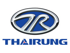
You may know Thai Rung as Thailand’s most famous and profitable carmaker, and it has been producing cars since the 60s. The company’s logo is unique and individual to their brand, showcasing the company name below a stylish and sleek emblem.
The emblem features an oval that is primarily dark blue except for the metallic grey letters inside the frame and the edge of the oval. The design inside the oval has concepts that merge and into the frame. This is a symbol of the Thai alphabet on the left and the letter R on the right. Below the design is the company name, the same dark blue as the design, with a red triangle in the center of the letter ‘A.’
The design is sleek and unique, creating a memorable and bright symbol.
TMC Costin
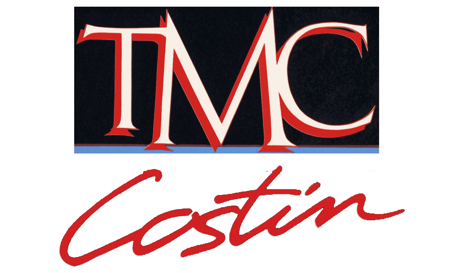
This front-engine sports car was designed in Ireland in the ’80s and was inspired by the contemporary Lotus cars. This car was popular during its time and was built by Thompson Manufacturing Company.
The logo was different and iconic, featuring the company name in a shiny, bright red. The emblem showed the first part of the company name on a black rectangle with the letters in white and outlined in red. These letters were in bold and simple font, while the rest of the company name was in a stylish, cursive font. This part of the name was in all red on a white background.
Think Global

The German brand of electric cars, Think Global, specializes in company vehicles. However, they stopped production in 2011 and stopped producing cars after releasing three fully-fledged models.
The logo for the company depicted the company name written in a think font with an exclamation point used as the letter ‘I.’ The design was pretty basic and simplistic, featuring thick black letters on a white background. The letter ‘I’ was the only one that stood out, while the remainder were clean and easy.
Tata Motors
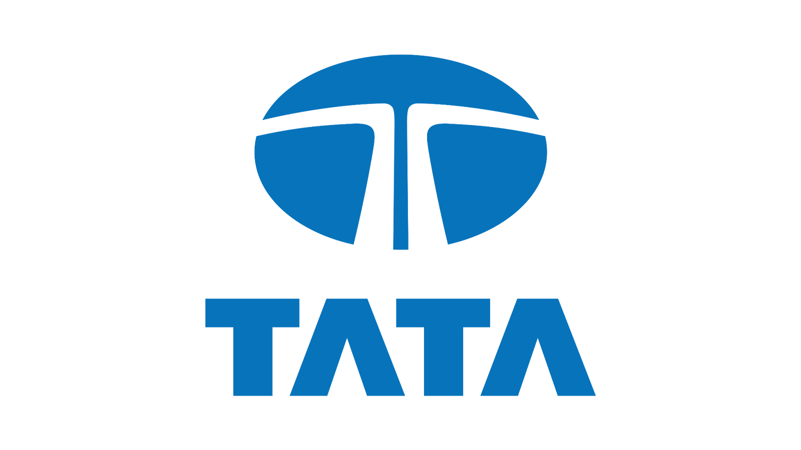
This Indian corporation specializes in vehicle manufacturing and is known for creating buses, small trucks, small SUVs, and a variety of other vehicles. This is one of the largest car makers in India, and its sleek and stylish logo reflects the brand and what it offers.
The logo showcases the company name in chunky, abstract block letters. The wordmark, obviously reflecting the name, shows two Ts in a stunning blue. The design is above the wordmark, showing an oval with two white shapes in the middle.
These two lines almost appear to be paths, going up and then each shifting to the side. This forms an abstract T, embellishing the design and pulling on the company name to create a unique design.
Thames
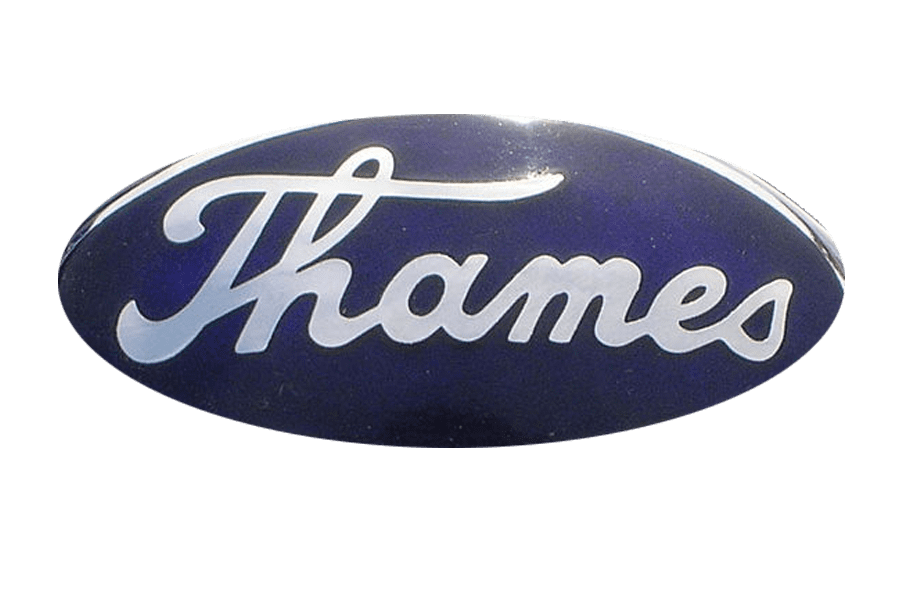
Ford created Ford Thames when they produced a series of cars meant explicitly for the British market in the 50s and 60s. Their logo is very similar to the Ford logo. However, it’s different since the company is an offshoot of Ford.
The cars sold to the British market featured a distinct and very iconic logo with a dark blue oval with “Thames” written in a stylish font. The font was similar to Ford’s logo, a cursive handwritten style that stood out and yet linked it back to Ford. This unique logo uses the company name with a T to create a stylish and iconic emblem.
TAZ

TAZ (Trnava Automotive Factories’) was a Slovak car manufacturer that operated in the late 20th century. The brand operated as a subsidiary of Skoda during that time, but it didn’t last long.
During the period when they existed, the brand built Skoda vehicles, mainly vans. Their logo was different and stood out from others for the unique way they incorporated the company name.
The design showed a circle with an inner circle, both in bold blue. Inside the innermost circle was the company name, written in thick, chunky letters and with the ‘A’ twice as large as the other two letters.
The letters all connect with one line between them, creating a unique and iconic emblem that has made its mark in the car brand industry.
Talbot

Talbot was a British car brand that produced various cars, including family and sports cars.
Over time, they became a part of the Rootes Group, known for producing sub-brands such as Sunbeam and Sicma, amongst many other prominent brands. Talbot’s logo was primarily made around a T and the company name in a thick, dark blue font.
The design itself featured a circle with some parts in the same blue as the wordmark and other parts in white, and in the center, it showed a T, also shown with some parts in blue and others in white. The letter was displayed on a bright red background, and the entire design was placed on a white background to ensure it stood out and made an impact.
Toyota
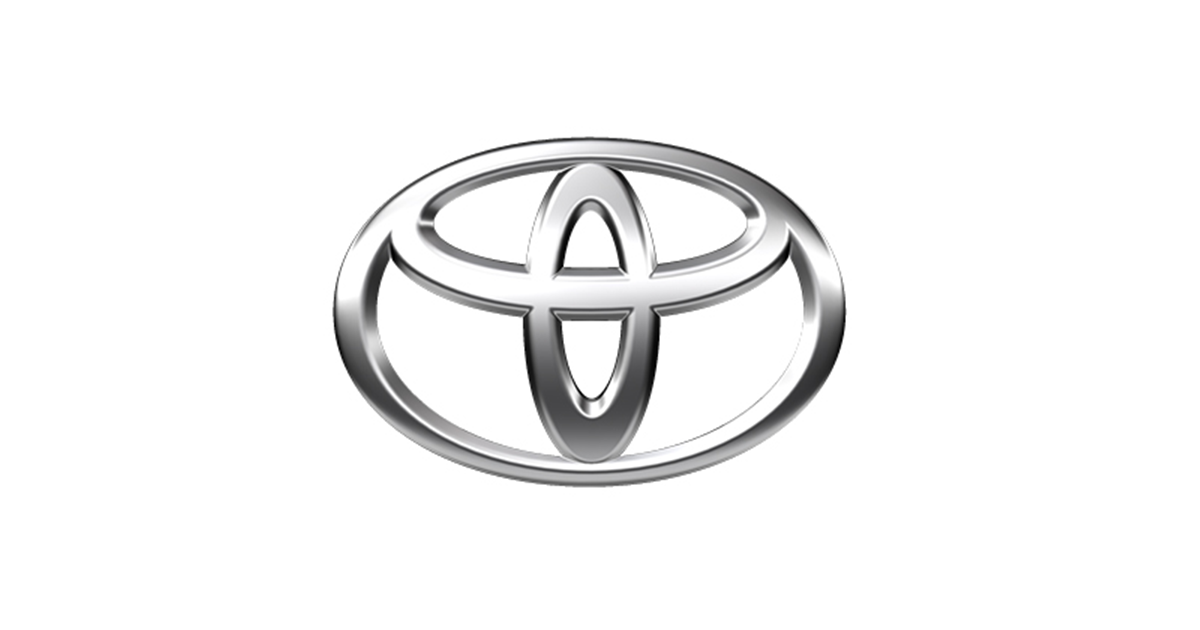
The giant carmaker Toyota is known for its cars, which have been produced worldwide. Toyota cars are some of the most famous worldwide, and their logo is proudly displayed on everything they sell.
The Toyota emblem combines unique elements to create the letter T. The main shape of the logo uses ovals in a few different sizes. One oval appears vertical, with the other horizontal at the top, creating the letter T.
The most extensive oval works as a frame for the letter, encasing both smaller ovals. The ovals are shown in black on a white background, creating a simplistic yet purposeful design that symbolizes the brand and what it sells.
Tara International

This Indian manufacturer is primarily known for building electric scooters, minibusses, trikes, and cars.
Although the brand’s logo is based mainly around a star, it also includes the letter T to include the company name.
The emblem features half a star on the left and, to the right, where the remaining two points of the star should be, the company name is shown.
The star itself is blue with a thin red outline, with the center transparent on a white background. The company name shows the first part in bright red lines and the second part in white letters on a blue rectangle.
The blue part of the star and the rectangle the name is shown on are connected, coming together to stand out on a white background.
Tatra
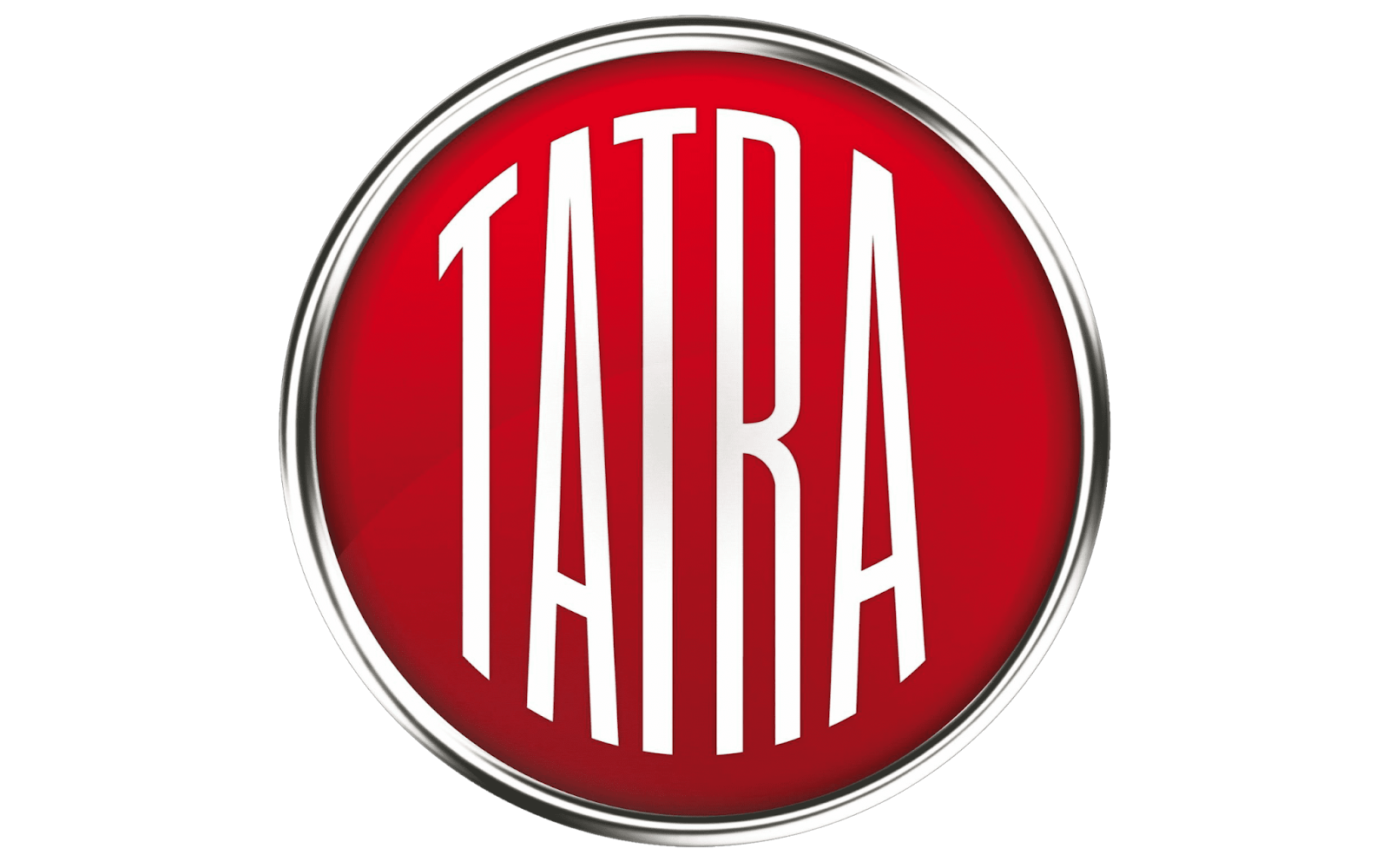
The ancient automotive company from Czechia, Tatra, produced its first car in the late 19th century. In the past, they’ve made a variety of car parts, but today, they’re mainly known for producing trucks.
Since their name includes two ‘T’s, it’s only natural that the letter is a part of their logo. Their iconic emblem features the company name in white on a bright red circle. The circle is enclosed in a thin silver circle, and the entire thing is placed on a white background.
The font used for the company name is thin and simple, enabling the name to stand out and easily be seen.
Tofas
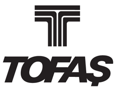
Tofas, a Turkish manufacturing brand, is a car company known for producing compact cars.
The brand utilizes a T for their logo, showing the company name in large, thick, and black letters on a white background. The letters are tall and all slightly tilted to the right, connected to each other so they all touch.
Above the company name, a large T is shown in thick black lines. The background is white, so the letter appears to have white and black lines. The logo is unique and stands out for its creativity and uniqueness.
Tesla

Tesla is the American carmaker owned by billionaire Elon Musk. It has an iconic emblem that embraces the first letter of the company name.
Tesla is known for its electric and hybrid cars, and it has quickly become known as the leading company in producing new and constantly emerging EV technology.
The company is proud of its name––a fact that’s clear when you see its logo. The entire company logo is essentially a “T,” shown in bright red on a white background. The only difference is that the forms on the letter are sharp and acute, almost making the design appear like a nail.
It’s been said that the design is supposed to resemble the insides of an electric engine, and it’s hard to miss when you compare the two.
Tornado

Another famous car brand is Tornado Cars, a British brand that was around in the 50-60s.
The brand was known for producing compact cars, and its logo reflected its drive to deliver high-quality, high-performance compact car models.
The emblem showed a vintage and rustic shield, with the company name in a unique font at the top of the shield.
The shape of a T in red was shown inside and outlined in rustic silver. The remainder of the shield was demonstrated in an almost purple-like blue, and everything was outlined in the same rust-colored silver.
The logo reflected the brand while also establishing it as a unique brand that stood out from the competition.
Conclusion
The world of design is complex and many designers depend on letters and numbers to create stunning symbols to represent brands.
When it comes to car brands, the letter ‘T’ is incredibly popular, especially car brands.
Of course, the company logo has to reflect the brand and be able to demonstrate what they do and who they are.
In this article, we looked at some of the most famous car brand logos of all time, both new and old, that start with T.