DoorDash has gone through a few different logos since its creation in 2013.
The company was started a little over a decade ago by four Stanford University students.
It has since grown to serve over 20 million consumers and has gained an easily recognizable image.
The Beginning of DoorDash
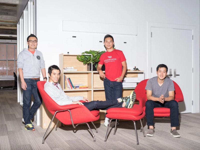
The concept of DoorDash was first thrown around in the fall of 2012 by founders Evan Moore, Tony Xu, Andy Fang, and Stanley Tang. The group was working on a project at the time that would be technology for small business owners and was in the process of getting feedback for another app that they had built.
They had discussions with real business owners at the time to see if they could find an app that would solve some of their day-to-day struggles.
The first app was not a success. However, one business manager gave them a new idea. During their studies, they overhead one business manager turning down a delivery order. This seemed to be a recurring complaint over the next few weeks as they continued to conduct more interviews with other small businesses.
This sparked a new idea for the group—creating an app that would work as a package delivery type service, but only for on-demand food. This would also present a new opportunity for restaurants that formerly did not offer delivery options, which was common in the area at the time.
Palo Alto Delivery
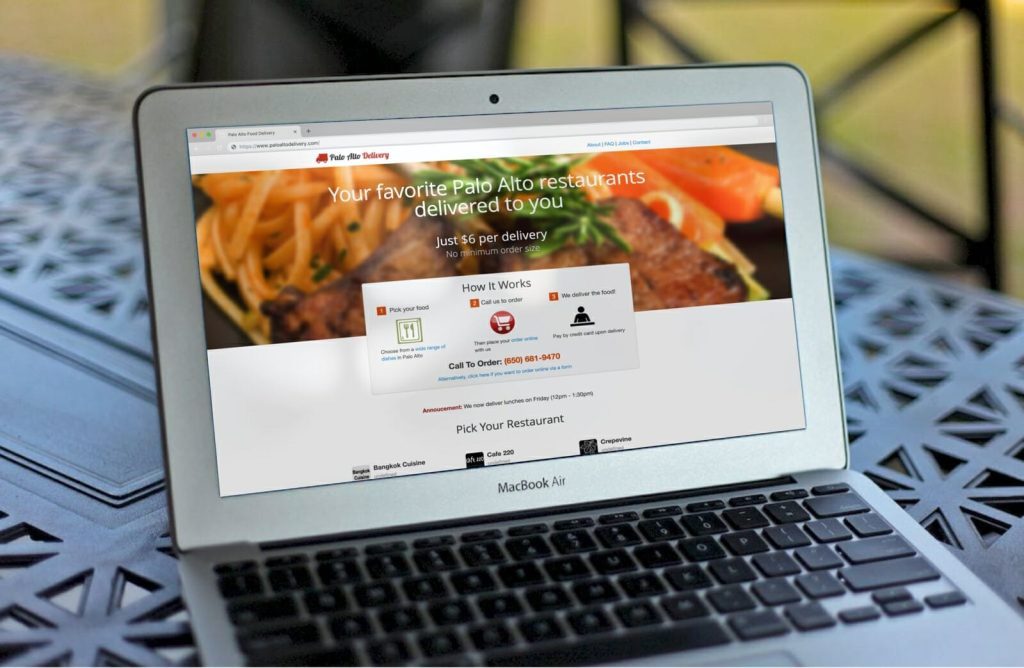
DoorDash did not start nearly as big as it is today. In fact, it did not even start under the same name. The group of Stanford students launched their first website for their business, “Palo Alto Delivery,” in January 2013. Food delivery was a common problem on campus at the time.
The founders of the business decided to take one afternoon to make a quick landing page for their new business idea. The website consisted of PDFs of menus for local restaurants and their personal phone number at the bottom of each listing. Just like that, PaloAltoDelivery.com was up and running.
As for the delivery part itself, the founders made up the entirety of the delivery drivers at the time and started by only making deliveries to other Stanford students. The business had minimal software to work with at the time, as well.
They started by only using technology such as the “Find My Friends” app, Google Voice, and their own personal vehicles. They used student housing as an office and did all their advertising through university bulletin boards.
DoorDash Today
Today, DoorDash is worth more than $70 billion. They have undergone a complete rebranding and have provided new opportunities to business owners, customers, and employees across the world.
The company has expanded its brand to include even more offerings than simple food deliveries, especially after the pandemic. Some of these new services include grocery delivery, convenience store items, and package pickup services.
DoorDash now operates in 28 countries outside the U.S., primarily in continental Europe, Japan, and Australia. The company has significantly diversified its business model, partnering with over 100,000 non-restaurant stores for on-demand delivery.
In 2024, they added new grocery partners like Royal Ahold Delhaize NV, bringing nearly 2,000 additional grocery stores onto their delivery platform. The company has also launched innovative services like dark stores selling over 2,000 items deliverable in less than 30 minutes and even introduced a co-branded credit card with Chase.
The Original DoorDash Logo
The DoorDash logo is easily recognizable today, but it has not always looked the same. The brand quickly expanded after its initial launch in 2013. It was not even a year-long before “Palo Alto Delivery” became “DoorDash.”
The company has shown so much growth and potential that by the summer of 2013, PaloAltoDelivery.com got an investment of $120,000 from Y Combinator in exchange for a 7% ownership stake. This prompted the company to officially become DoorDash by June 2013.
As the business got more serious, it needed an official logo. The first official logo was also launched in 2013. However, it looks a lot different from the version we see today.
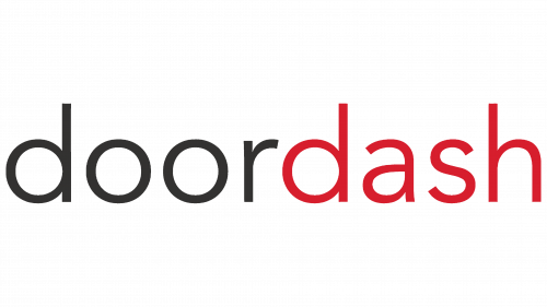
The logo simply had the words “doordash” written in all lowercase letters using a simple, austere sans typeface.
The words were not differentiated by a space or capital letter, but instead, the “door” portion was written in a dark gray color, while the “dash” portion was displayed in bright red. It was a much more minimalistic approach than the logo used today.
The Second DoorDash Logo
The DoorDash logo was updated in the following year. This time, they went for much less of a minimalistic approach.
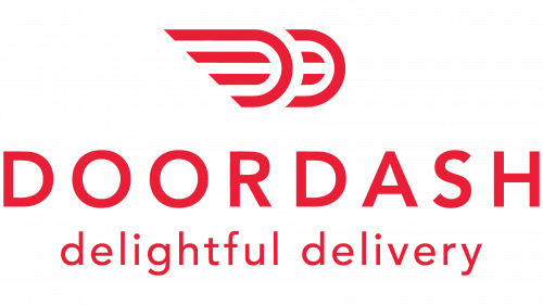
Although all of this logo was displayed in the same red color, it also included a graphic element and the short “delightful delivery” slogan. “DOORDASH” was the main focus of the logo, being displayed the largest across the logo center in all bold uppercase letters. The “delightful delivery” slogan was written beneath it in slightly smaller lowercase letters.
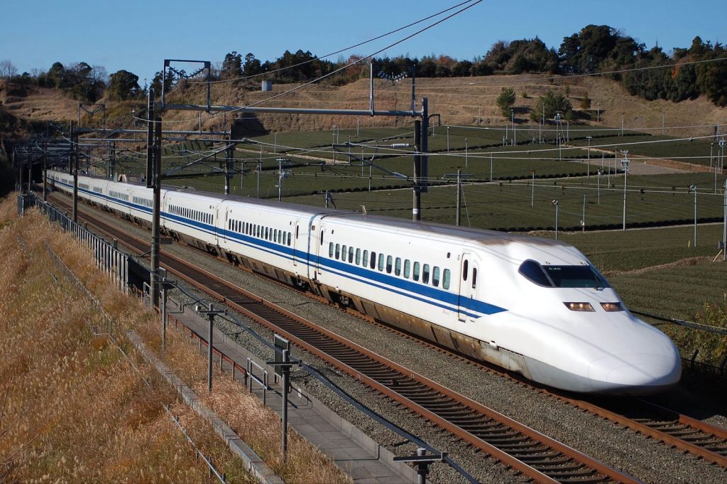
Perhaps the biggest addition to this new logo was the icon at the top. It showcased a pair of wings, which are a universal sign of speed in other company logos as well—particularly in vehicle logos. This pair of wings, in particular, was inspired by the Japanese bullet train.
This is the reason for the specific rounded shape in the front of the wings. This shape also doubled as appearing as two “D” shapes for “DoorDash,” and gave the logo an overall more futuristic appeal. The font for this logo did not really change from the previous version.
The Current DoorDash Logo
A third and final DoorDash logo was created in 2018. It was released in March of that year by a San Francisco design and branding agency, “Character.” Character (now “Dentsu Creative”) is the same brand responsible for some of the design work with other famous brands like Kohler, Nike, Pottery Barn Kids, Restoration Hardware, Banana Republic, Levi’s, and Williams Sonoma.
This DoorDash design was started and completed in under 4 months time. This is the same logo we still see today. Character took the logo back to a more simple design.
The “delightful delivery” slogan was removed, and the wings were moved down to make a single line with the uppercase “DOORDASH” text.
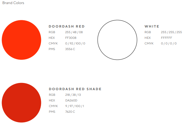
The wings became one singular wing, and the two center lines were removed for one bold D-shaped wing. They also made changes to the iconic red color, making it an electric orange shade (hex #FF3008).
The company maintained the more simple typeface and left the all-uppercase lettering. The new design took all of the core elements of the branding and reworked them to make a new, simplified logo that could more easily be added to the DoorDash branding and marketing materials.
Design Elements of the DoorDash Logo
There are several different key elements of the DoorDash logo that work together to give it its iconic brand image.
The “D” Shape
The iconic “D” we see today first made its appearance in the second DoorDash logo design in 2014. There was a pair of them at the time, for the “D” in “Door” and the “D” in “Dash.”
They looked much more like wings then and had two lines horizontally drawn through the center of each one.
The latest logo simplified this design, removing one of the wings and the lines inside. Still, this symbol is used to reflect a variety of themes, including their speed (as it was designed to look like a Shinkansen Japanese bullet train), futuristic innovation, and community.
Although this part of the logo has become much more simple, it has held onto all of its meaning for the branding.
The Bright Coloring
While there is still some debate about whether the DoorDash logo is bright red or orange, the color also adds a certain visual appeal to the branding as well.
Studies have shown that red is the most appetite-stimulating color, with orange not far behind.
Similar colors can also be found in other popular brands’ logos. Huge food chains like McDonald’s, KFC, and Pizza Hut all use red to stimulate hunger.
Other popular brands like Dunkin’ and Fanta use a bright orange to create these feelings and give viewers a more energetic sensation. The brightness of these colors also helps the brand stand out and quickly capture its audience’s attention.
The Typography
DoorDash never went too overboard with its typeface. It has maintained a clear, simple, minimalist appeal with its lettering from the start.
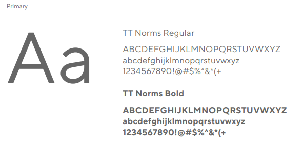
The TT Norms sans-serif font used today helps the brand get the message of its logo across without being distracting or hard to read. It gives the logo a more clean and professional appeal.
These types of logos are becoming increasingly popular in modern times. While the logo still has other unique and creative elements, the brand decided to use a text that is easy to read and incorporate into its branding.
Lessons to Learn from the DoorDash Logo
There is a lot to take away from the evolution of the DoorDash logo.
Even though it has only been changed a few times, each change has a purpose.
A few of the biggest takeaways include the importance of:
- Be Willing to Change
DoorDash’s logo changed as the company grew. Many changes have been made since the original red and grey text logo they started with in 2013. It evolved with them through the years as they transitioned from a campus-based startup to a global leader in food delivery.
Adaptability like this shows that the brand is continuing to improve and keep up with modern times, as well as helping it maintain a higher position in the market.
- Symbolism
The “D”-shaped wing not only represents speed and innovation but also creates a direct connection to the company’s name. Using meaningful symbolism in a logo can help audiences better remember the brand or associate it with other things (like the bullet train or wings).
These symbols are also a great visually appealing way to communicate a brand’s origins and core values.
- Color Psychology in Branding
Bright red-orange hues in the DoorDash logo are used to increase the appetite of viewers and create a sense of energy.
This is a common color used in many popular food chains and services for this reason. No matter what the business is, different colors can trigger different effects.
Businesses can use this to their advantage by incorporating these colors into their logo to evoke desired emotions and make their branding more impactful.
- Staying Consistent
DoorDash has remained consistent with both modern trends and its own branding. It used more modern designs and minimalist typefaces and also made sure to reuse many of its same design elements throughout each change of the logo. This helped make the brand stay recognizable even after each change and maintain a modern appeal.
The DoorDash logo follows the story of how the company grew from a small startup to a leader in food delivery. Starting within the boundaries of the Stanford University campus, DoorDash is now actively being used in the U.S., Canada, Australia, and New Zealand. Each version of the logo was designed to match the company’s progress and reflect its identity.
From a simple design in 2013 to the bold and modern logo we see today, DoorDash shows how important it is to adapt and use thoughtful designs. The logo’s symbols, colors, and simplicity represent the company’s focus on speed, innovation, and staying connected with its customers. This branding is partly responsible for how the brand has become one of the most recognizable brands in the world today.

