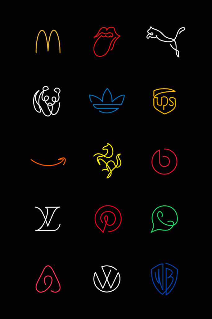
We encounter logos everywhere—on our phones, in our feeds, at the grocery store, and even on our coffee cups. They’re those tiny emblems that, in a split second, tell us what brand we’re dealing with.
But have you ever stopped to think about just how much information a good logo manages to squeeze into a simple shape? Now, imagine taking some of the world’s most recognizable logos and stripping them back to just a single, continuous line. Would they still hold up? Would we still see Apple’s “bite” or Coca-Cola’s flowing script?
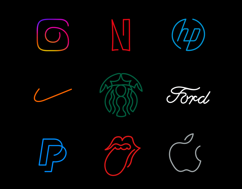
French designer Stephane Leopold, who co-founded the creative studio Loooop, set out to find out. Loooop is well-known for its stunning minimalist line art, and this time around, Leopold chose a unique challenge: reinventing 44 of the world’s most iconic logos with just one continuous line. The results are a mesmerizing study in simplicity—and a testament to the strength of the original designs.
Reimagining Famous Logos with a Single Stroke
Logos are usually the product of countless hours of research, sketching, refining, and testing. They have to instantly capture a brand’s personality and purpose.
Over time, some logos have become so familiar that we’d know them with just a glance, even half-blurred in our peripheral vision. Think of Nike’s swoosh, McDonald’s golden arches, or Apple’s bitten apple.
So what happens when you dial it back and try to draw them using one unbroken line? Leopold’s work shows us that when a design is truly brilliant, it remains recognizable even after stripping away color, complexity, and extra details.
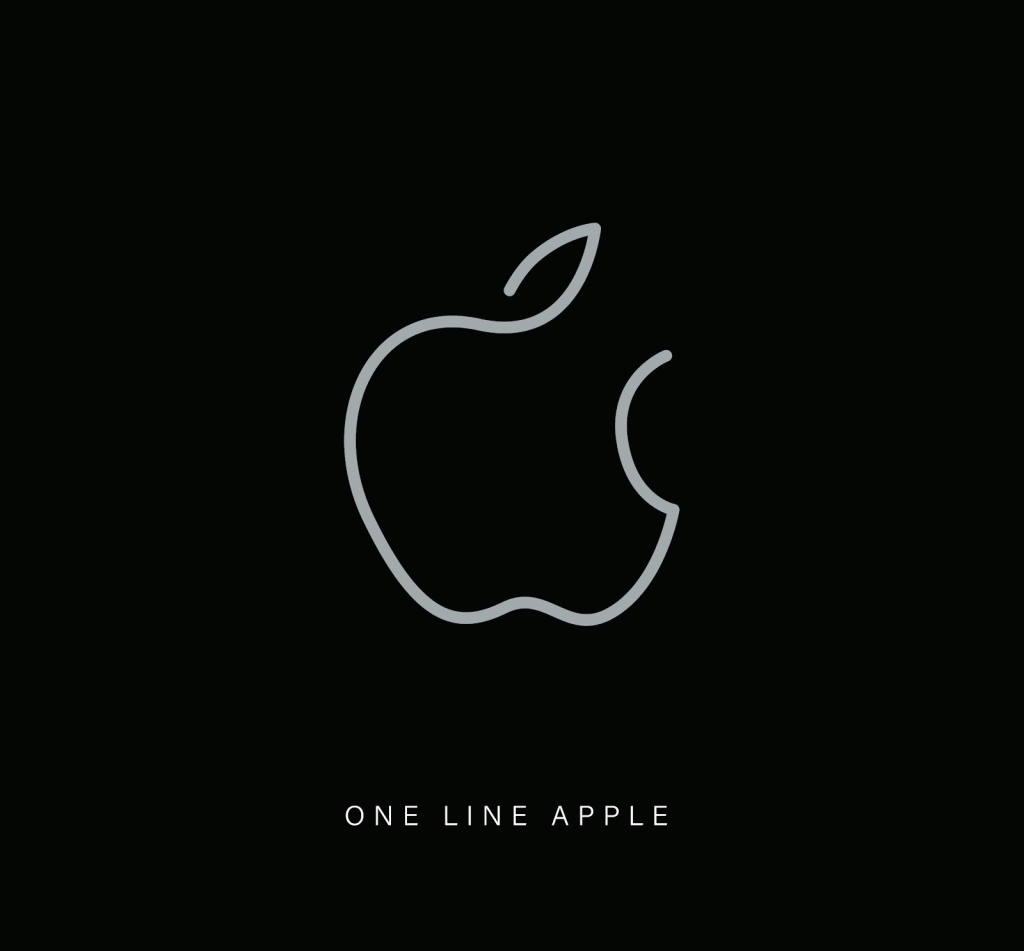
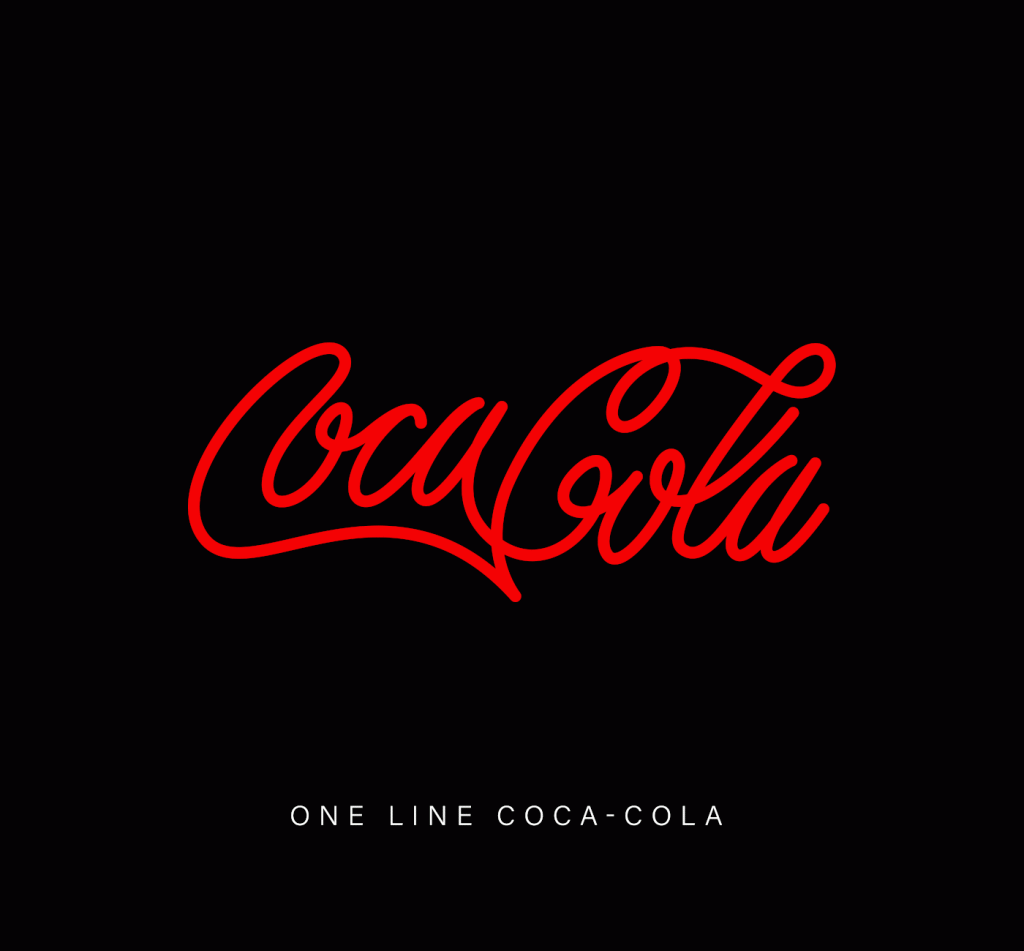
Apple’s famous mark, for instance, becomes a single flowing outline. It’s still unmistakably “Apple” because the silhouette is just that strong. Meanwhile, the Coca-Cola logo, which is already a piece of masterful typography, turns into a graceful, calligraphic loop.
Instagram’s colorful camera icon—normally a layered and lively shape—reappears as a smooth, continuous outline that still manages to feel like a camera.
From First Instincts to Final Refinements
Leopold explains his approach as starting with pure instinct. He’ll pick up a pen and freely sketch out what he feels is the “flow” of a design. It’s less about getting it perfect on the first try and more about capturing the overall shape and movement. He says, “I usually start with instinctive, hand-drawn line directions to capture the general shape and movement of the subject and to identify its key features.”
But the challenge is real. After all, many iconic logos are already quite minimalist. How do you decide what to remove without losing what makes the logo special? That’s where patience comes in. Leopold refines his sketches over time, testing different variations until he hits on something that feels right.
“For this logo project, the symbols are already quite simple, so it’s not easy to decide which elements to remove,” Leopold admits. “However, my process involves time and refinement, which helps me reach the final result. I truly enjoy experimenting with the line until I’m satisfied with the aesthetic of the final creation.”
Why Simplicity Works So Well
One fascinating part of this exercise is how it proves that the best logos aren’t famous because they’re complicated.
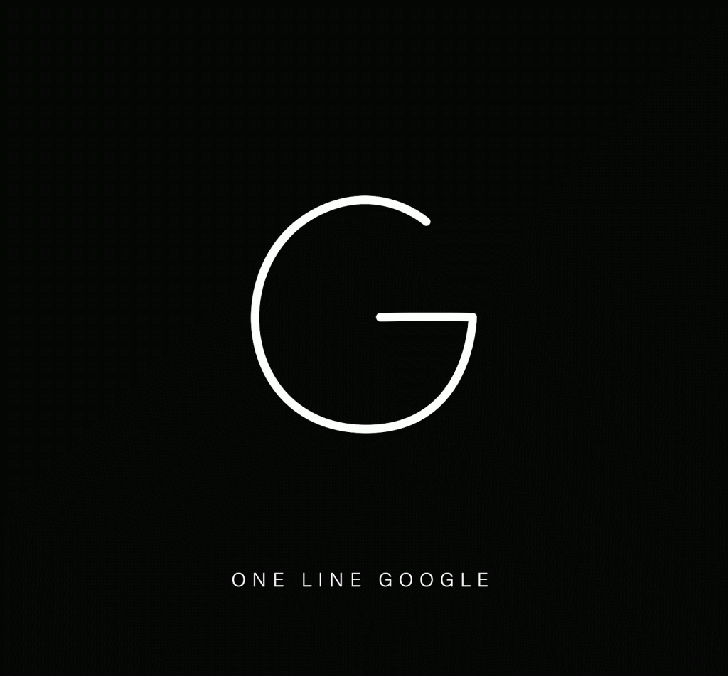
They’re famous because they’re memorable and easy to recognize. Even when you reduce them to a single line, many still have that “click” moment where your brain goes, “Oh, that’s definitely the Nike swoosh” or “Yup, that’s the Google G.”
This speaks volumes about the strength of these designs. They hold up under pressure.
You can peel away colors, gradients, and details, and the essence remains intact.
This is minimalism at its finest: cutting back to the pure form without losing what matters.
Channeling a Childlike Sense of Play
Leopold mentions that part of his inspiration comes from “letting the child within me act freely.” Remember how, as kids, we’d draw shapes before we learned to write? We’d scribble lines and circles to represent people, places, and things. That childlike freedom—tapping into our most basic instincts as humans who draw and understand shapes—is powerful.
By stripping logos down to their rawest form, Leopold recaptures that feeling. Instead of relying on brand guidelines and style sheets, he’s focusing on the fundamentals: line, shape, and flow. The results remind us that, before all the rules and branding regulations, a logo is just a picture telling a story.
Choosing the Right Logos to Transform
For this collection, Leopold chose 44 famous logos that span different industries and styles. Some are simple symbols, while others are wordmarks or more illustrative icons.
By picking a broad range, he shows that the single-line approach can work in many scenarios. Some logos translate easily into a single line (the Ford logo, for example, with its already cursive style), while others require more careful thought.
“I’ve been obsessed with logos since I was very young and could memorize them naturally,” he says. “For this project, I chose some classic logos that are often regarded as among the best ever. I also aimed for a good balance between logo types and industries.” The result is a diverse gallery that feels like a crash course in global brand identity.
What This Means for Designers (and Everyone Else)
For designers, this experiment is more than a neat trick. It’s a reminder of the importance of a strong concept. If your logo works beautifully when stripped down to a single line, that’s a sign you’ve got something special. It means the core idea is there, shining through no matter how much you simplify.
This idea can extend to other design fields, too. Whether you’re creating a user interface, a product, or a building, there’s something to be said for seeing what happens when you peel away all the extras. If the core still holds up, you know you’ve got a design with staying power.
For the rest of us, this project is just plain fun. It’s like seeing a familiar face out of context and still knowing exactly who it is. Plus, it’s a reminder of just how ingrained these logos have become in our daily lives. We see them so often that even when they’re turned into a single stroke, we instantly know what we’re looking at.
A Fresh Appreciation for the Logos We Love
So, the next time you spot a familiar logo, take a second look. Think about the shapes, the structure, and the idea behind it. Consider how it might look if you drew it in one unbroken line. Would it still capture that same brand personality?
Chances are, if it’s a classic, it will. And that’s what makes these single-line logos so captivating. They don’t just simplify; they clarify. They help us appreciate the original designs on a whole new level—reminding us that sometimes, less really can be more.

