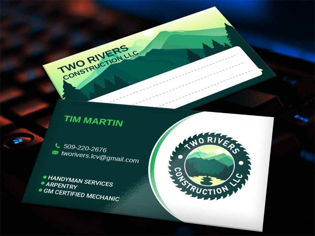
- Business cards are an important part of marketing, even in a world that is filled with social media
- For those who are both new to graphic design and those that are experienced in the industry business card designing can be difficult
- We share all of our top tips for creating a stellar business card design, including keeping it simple, experimenting with different fonts, and choosing the best shape
A business card is one of the most critical pieces of a company’s marketing material that they rely on for getting consumers and displaying their business at its best. Without reliable business cards that they can use to give out contact information or have available for customers to take and contact them if needed. Although they’re the most commonly overlooked piece of marketing material, they’re also one of the most important for a successful business. After all, in a world where we rely on social media for exchanging greetings and interacting with customers, business cards can seem outdated.
But we can promise that business cards are far from outdated and far from unnecessary. However, business cards are only beneficial to a business if they’re designed well. A good design and layout for a business is the most critical part of it. Business cards are mini advertisements for your company, which is why it’s so important that they advertise it at its very best. For graphic designers that are either designing their first or 100th business card, it can still be an overwhelming and difficult task.
Knowing how to design a stellar business card that will represent the company well and look amazing can seem impossible for many graphic designers. If you’re struggling with business card designs, this is our guide on how to create a stellar business card design.
How To Design A Stellar Business Card
Keep It Simple
There’s a reason why business cards are small; they’re not supposed to be an entire website, they’re just a small representation of the company. They’re not supposed to have an FAQ section, Meet The Team, and detail exactly what the company does. That’s not the point of it. The point is a small card with contact information, the company name, and the logo. It’s important that the logo is the largest element on the business card and stands out. Remember, the simpler the better for any business card design.
Experiment With The Font
Almost all of the material on a business card is going to be written, which is why you must choose a font that not only you and the client love but that you feel represents the company and what it stands for. It’s also important that customers will be able to read the font on the card and easily make out what it says. You can create an amazing business card design, but it’s useless if customers aren’t able to reach the company because they can’t make out the contact information.
Only Include Necessary Information
There’s no need for there to be a mile length worth of text on your business card design, there should only be what’s necessary. Make it clear to your client that they should only put what they’re sure they need on their business card. You want the attention to be drawn to the important information, instead of having to weed through all the useless content. It’s okay if you want to include an elaborate design, but make sure that the information itself is little enough that it will all fit well.
Choose The Best Shape
Just because the traditional horizontal card is what’s used for business cards doesn’t mean that yours has to be. You don’t have to stick to any of the typical design methods for your business card design, you can be different and stand out. The more unique the design the more you’ll get to give your print on it. It should be your design with your specific style and look. Choose the shape that you think will complement your design and the font the best.
Include Something Useful On The Back
On the front, you provide information that customers can choose to contact the business with and their business logo. But, for many business cards, the back of the business card is merely a huge waste of space. However, it doesn’t have to be! You can include helpful resources on the back of the business card that will benefit the customer and give them something additional. This will depend on the industry that you’re in, but it can be anything from a helpful chart to an interesting-looking design.
Summing It Up
Overall, designing business cards isn’t easy even for the most experienced and talented graphic designers, let alone those that are new to designing. The process is lengthy and involves getting the perfect result for the client. You want to create a business card that will represent the company and give customers the contact information to reach the company. Above we detailed our top tips for how to design a stellar business card!


