Have you ever had trouble with creating a movie poster? Need some pointers for designing one? We’ve got you covered! In this article, we give our top tips on creating an amazing movie poster that will have everyone impressed! Although the art of designing a movie poster isn’t easy, with these tips you’ll be creating one in no time!
In a world that greatly uses the internet and relies on entertainment, the movie industry profits greatly. With millions going to see each new release in theatres, movies make billions. With an industry that makes so much, movies must be promoted to the public in the best way possible.

If there’s a hype built around a movie, and it’s well promoted, a movie will do much better than with no or minimum promotion before it releases. When it comes to designing a movie poster, you’ll find that it isn’t an easy task. Many designers struggle with designing movie posters, even those who are experienced in other design areas.
Designing a movie poster means that it’s usually necessary for the designer to fully submerge themselves into the project and get to know the movie to be able to display it as well as possible through their design. Following the tips below you can create a movie poster that shows the character of a movie.

Get Their Attention
As with any form of advertisement, your first goal should always be to grab attention before anything else. The movie poster should have everything needed to grab a stranger’s attention and get them to notice it. Grab their attention with graphics and bright colors to leave a positive impression.
Assume that the viewer doesn’t know anything about the movie yet and attempt to tell something about the story of the movie through the poster. However, it’s important that you don’t give everything away. You want to leave something to the imagination while still giving them a little bit of the plot.
Make It A Mystery
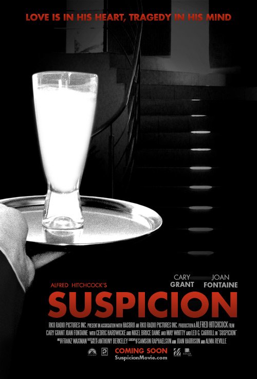
A movie poster should have some of the guessing game included. You want it to have an air of mystery, but they should also have enough knowledge to make them interested. Remember, if you give them the entire plot they’ll have no reason to watch the movie itself. Think of the movie poster similar to a movie trailer; include just enough that it has them on the edge of their seat.
Make it a mystery, but also let them see enough to intrigue their imagination and entice them to see more. The balance can be difficult to find, but it’s what will make movies the most successful.

Keep It Consistent
Everything related to the movie, including the DVD cover, poster, and advertisements, should stay consistent across the board. The biggest mistake that you can make is to have a movie poster that doesn’t look similar to anything else related to it. This usually comes from designers who want to imprint their style onto the poster or make sure it looks like their work.
However, it’s important to keep in mind that a movie poster is very different from other pieces of graphic design. You don’t want to include too much of your own style; instead, choose to incorporate images of the actors from the movie and images of the movie. This way people will be able to relate the poster and movie to each other.
Don’t Go Too Far
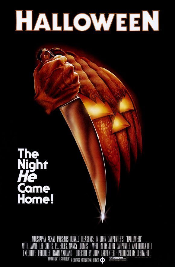
You want your talent to shine and you want creativity included, but there is such a thing as having too much creativity in your movie poster. Sometimes it’s best to go simple and not go overboard with your creativity. Keep in mind that your movie poster may be used for other things such as the DVD cover. This means that it has to be suited for both, as well as possibly other areas of the movie. Don’t let your creativity run wild.
Take A Step Back
Once you’ve completed your movie poster design, you need to see it from a new perspective to be able to see your errors. Literally, take a step back. Walk away from your finished movie poster and take an objective look at it. Think about it as if you weren’t the one to create it and give your honest review.
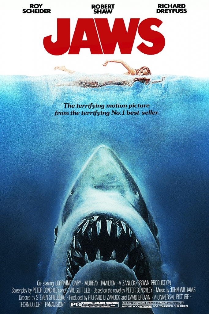
Do all the elements come together well? Do you see any flaws? If the poster grabs your attention and you genuinely think that it’s appealing, then that’s fantastic. However, if you see flaws or aren’t instantly attracted to it, you may want to make changes. Remember, revisions are a crucial part of the designing stage.


