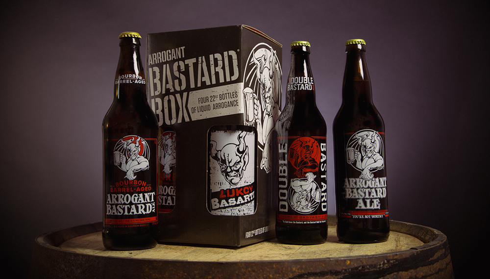
It is the label that says it all.
And more specifically, the design on the label.
I don’t know about you, but it is always the label that catches my eye.
I am not talking about planned purchases here. But about the impulse buys. The I-see-it-and-I-know-I-need-it buys.
And as a marketer, how do you convince people that they need it? I repeat. It is all in the label.
Take for example the label on these bottles of beer.
I don’t know how it tastes. I just know that it looks interesting. And so, I would assume that it would taste good, yes, all because it looks good.
And why does it look good? Yep, all because of the label.
Now, you need to be careful about a few things. Not everything appeals to everyone. You need to find your niche so to speak (just try to make it a broad as possible, so as to get as many clients as possibly).
Also, as a side note to keep in mind if you are revising an old logo. It does not always have to be different, but it does have to be new. As in more color, more style, more appeal. It can be the same logo. It just has to catch the consumer’s eye a bit more than the old one.
Find what people like and stick to it.
Be confident.
Stretch your imagination.
Think big . Plan well.
Think outside the box and inside the label.


