Snakes have a way of capturing our imagination like few other creatures. They can be mysterious, elegant, and occasionally terrifying all at once. Whether we look to ancient mythology, modern pop culture, or corporate branding, serpents keep showing up with a powerful presence.
Over the centuries, snakes have taken on many roles—symbols of healing, protectors, cunning foes, or even harbingers of death.
With so many layers of meaning, it’s no surprise that snakes have also slithered their way into several famous logos. These logos appear across many industries—cars, sports, healthcare, and beyond—using the snake to symbolize everything from heritage and power to healing and transformation.
Today, we’ll explore some of the most iconic snake logos. We’ll look at their stories, their messages, and why this ancient symbol continues to hold such a strong place in modern branding.
Why Snakes Are So Symbolic
Now, let’s start by talking about why snakes are so universally appealing as symbols. In countless cultures around the world, serpents represent a whole spectrum of ideas:
- Wisdom and Knowledge: Ancient Greeks, for example, revered snakes as creatures that bridged the realms of mortals and gods.
- Rebirth and Renewal: A snake shedding its skin has long been seen as a metaphor for transformation and cyclical renewal.
- Healing: Think of the Rod of Asclepius—a staff with a single snake coiled around it—which has been a global symbol of medicine for ages.
- Fertility and Vitality: Snakes that appear close to the earth or water are sometimes connected to agricultural fertility.
- Danger and Death: Venomous snakes are an obvious symbol of peril, deceit, or malevolence in many stories.
From a branding perspective, this wide range of meanings means a snake logo can tap into powerful emotions. Depending on the specific design—coiled or relaxed, fangs or no fangs—companies can emphasize strength, renewal, heritage, or intimidation.
1. Alfa Romeo
Where It Comes From
Alfa Romeo, a renowned Italian automobile manufacturer, has a badge that many enthusiasts refer to as the “Biscione.” This emblem has been around since the company started in 1910, and it’s inspired by the Visconti family’s coat of arms. The Viscontis were an influential family in Milan, and their heraldic serpent has been documented as far back as the 1100s.
What It Looks Like
Alfa Romeo’s logo features a red cross on one side (a nod to the city flag of Milan) and a large snake or serpent on the other, typically depicted with a person in its mouth. Over the years, the company has polished and modernized the look, but the core elements—a cross and a man-eating serpent—remain intact.
Why It Works
The snake immediately ties the brand to the city’s rich history and legendary families, giving Alfa Romeo a sense of heritage and aristocratic flair. At the same time, the serpent suggests a certain vitality and power, resonating with Alfa Romeo’s high-performance vehicles. It’s a unique combination of heritage and dynamism that stands out in the automotive world.
2. American Cancer Society
Symbol of Medicine
You might not think of a snake when you picture the American Cancer Society’s logo, but it’s there. The organization cleverly incorporates the Rod of Asclepius—a staff with a single snake coiled around it. That image goes back to ancient Greece and has long been recognized as a universal symbol of healing and medicine.
Design Elements
The American Cancer Society often features a blue and red layout, with the serpent wrapped around a white staff. The organization’s name appears in clean, modern lettering, striking a balance between approachability and authority.
Deeper Meaning
By using the Rod of Asclepius, the American Cancer Society underlines its commitment to fighting cancer through medical research, awareness, and community support. It’s a direct reflection of hope, healing, and the ongoing quest to conquer one of humanity’s most formidable diseases.
3. Bushmaster
What’s Behind the Name
Bushmaster is a firearms manufacturer known for its array of rifles. The name comes from a type of venomous snake found in the Americas—large, intimidating, and potentially deadly.
Logo Look and Feel
The Bushmaster logo typically shows a bright red silhouette of a snake, usually poised to strike with its mouth open, fangs bared, and tongue out. The brand name appears prominently over or alongside this fierce serpent.
Brand Statement
By featuring such a formidable snake, Bushmaster projects power, danger, and lethal precision. It resonates with firearm enthusiasts looking for reliability and performance, though it may strike some as a bit too aggressive. In any case, it’s a bold, unmistakable identity that clearly conveys the brand’s commitment to robust firepower.
4. Florida A&M Rattlers
College Pride
In the realm of collegiate sports, few mascots evoke as much immediate energy as a rattlesnake. Florida A&M University embraces this theme with the Florida A&M Rattlers. Their logo centers on a striking depiction of a rattlesnake’s head, mouth wide open and ready to bite.
Color Palette
School spirit shines through in bold orange and green. These colors make the snake’s head visually pop, and the rattler’s signature green tongue adds a potent splash of color.
What It Signifies
For a sports team, especially at a university, the rattlesnake imagery speaks volumes: it warns competitors to be cautious, highlights the team’s fierce determination, and rallies supporters to stand behind a powerful symbol. It’s all about showcasing a collective strength and unshakeable team spirit.
5. Hogwarts Crest
Magical Significance
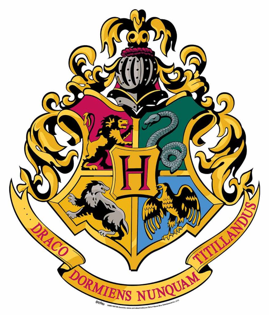
We can’t talk about famous snake logos without tipping our hats to Hogwarts from the Harry Potter series. The school’s crest features four animals, each representing a different house: Gryffindor’s lion, Ravenclaw’s eagle, Hufflepuff’s badger, and Slytherin’s serpent.
Design Details
In the crest, the serpent occupies the top-right section, set against a green field. The design is intricate and has a medieval feel, perfectly matching the whimsical yet historic atmosphere of the wizarding world.
Why a Serpent?
Slytherin House values traits like resourcefulness, ambition, and sometimes cunning—attributes often associated with snakes. While the serpent in Harry Potter can carry a negative connotation (think of the dark arts), it’s more layered than that, reflecting hidden depths and personal complexity.
6. IFR Aspid
Who They Are
IFR Aspid is a European sports car brand offering sleek, high-performance vehicles. The word “Aspid” refers to a genus of venomous snakes related to cobras, so the company’s name and logo are in harmony from the get-go.
Visual Approach
Their logo is more stylized than some of the others. Often, you’ll see a circular orange gradient background with a silver frame and a minimalist black line drawing of a snake’s head or body. It’s not overly detailed, which lends a modern, futuristic vibe suitable for a high-end sports car brand.
Brand Image
By choosing a snake, IFR Aspid conveys stealth, agility, and lethal speed—qualities that sports car enthusiasts value. The minimal design suggests precision engineering and forward-thinking innovation.
7. Odontologia
Medical Roots
In dentistry (a branch often referred to as “Odontologia” in some contexts), you’ll sometimes see the same Rod of Asclepius used to denote a connection to the broader medical field.
What’s the Logo Like?
The typical design might involve a clean staff with a snake coiling around it, possibly complemented by tooth imagery or other dentistry references. The color schemes vary, but medical logos often lean toward blues, whites, or greens to evoke hygiene and trust.
Relevance
Even though dentistry focuses on teeth, it’s still very much part of the medical community. Using the snake-and-staff emblem aligns with the universal symbol of healing, emphasizing professionalism and patient well-being.
8. Philadelphia Union
Soccer Meets History
The Philadelphia Union is a Major League Soccer (MLS) team, and their logo is a fantastic mix of modern sports branding and historical nods. Central to the crest is a golden snake set against a black shield, surrounded by a circular frame.
Throwback Inspiration
The snake references Benjamin Franklin’s famous “Join, or Die” cartoon from the Revolutionary era. It’s a tip of the hat to Philadelphia’s heritage as the birthplace of American democracy.
Team Spirit
By placing the snake front and center, the Union conveys unity, resolve, and a certain rebellious spirit. The gold and black color scheme combined with a sky-blue stripe lends the crest a prestigious yet approachable feel—perfect for rallying fans and symbolizing the city’s enduring passion for its sports teams.
9. Shelby
Automotive Icon
Shelby American—founded by the legendary Carroll Shelby—has given us some of the most memorable performance cars in history, including the Shelby Cobra. That cobra is front and center in the brand’s logo.
Look and Feel
The Shelby logo features a coiled cobra in black and white, meticulously detailed to highlight its scales and hood flares. It’s as if the snake is about to strike, adding a thrilling sense of motion and danger.
Why It’s So Memorable
Car enthusiasts around the globe immediately recognize this cobra as a sign of muscular power, speed, and engineering excellence. Whether it’s on a classic Shelby Cobra roadster or a modern GT500 Mustang, that serpent stands for peak performance, exclusivity, and a touch of rebellious fun.
10. Slytherin
House Identity
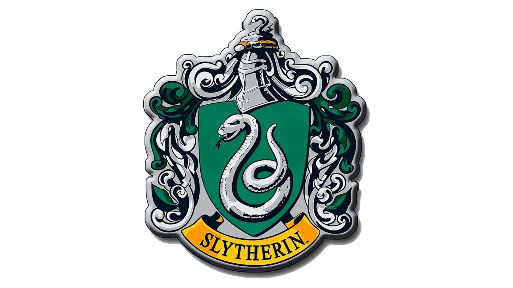
Although we touched on the Hogwarts crest earlier, Slytherin House often gets its own dedicated logo. It typically displays a proud and menacing metallic silver serpent against a green background, with a banner reading “Slytherin.”
Design Aesthetics
This crest looks very medieval, with a dramatic silver outline and bold colors. Even if you’re not a huge Harry Potter fan, it’s hard not to be drawn to the complexity and sheen of this emblem.
Cunning and Ambition
Slytherin House is known for traits like ambition, leadership, and, in some cases, a bit of secrecy. The serpent is perfect here, representing the ability to be clever, watchful, and effective under the surface. It’s a conversation starter for fans and a proud emblem for those who relate to Slytherin’s qualities.
Why Snakes Will Always Slither Around
For thousands of years, snakes have slithered through human culture—as deities, monsters, teachers, or adversaries. Today, these same ancient connotations show up in logos that grace everything from high-end automobiles to sports uniforms, from healthcare nonprofits to fictional wizarding schools. It’s remarkable how one creature can embody so many ideals—wisdom, healing, death, danger, rebirth, and more.
The examples we’ve explored each draw out a unique facet of the serpent’s character. For some, it’s all about tapping into tradition and legacy; for others, it’s about power and rebellion. Sometimes, it’s simply the best way to signify knowledge and healing.
And in today’s crowded marketplace, a snake logo can instantly command attention. It hints at an old-world mystique, tells a story through heraldic imagery, or projects modern aggression and speed. That adaptability is exactly why serpents are likely to remain popular design choices for a long time to come.
So, whether you see them as wise guardians or fearsome predators, snakes have a timeless appeal that crosses cultures and centuries. And for brands on the hunt for a bold and meaningful emblem, the serpent remains an intriguing choice—always poised to strike a lasting impression.


