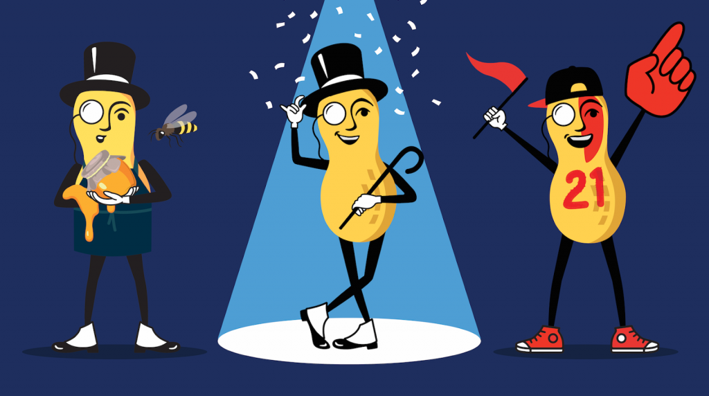
- Planters rebranded their 115-year-old brand, including reviving the iconic mascot, Mr. Peanut, who was killed off last year during the Super Bowl
- The brand also dropped a new campaign, giving their products a fresh and clean new look on store shelves
- Planters gave their logo and Mr. Peanuts a new look, making both more distinguished, classy, and modern
The 115-year-old brand announced that they were giving their brand a lift and presenting a new image for their company. The well-known mascot that’s made itself known on all the brand’s products has been around since 1915, having been around for 105 years. The Planters brand is well known for its peanuts, cashews, almonds, walnuts, and macadamia nuts in a variety of flavors. They’re also famous for their cheese snacks, including curls and balls. This year, Planters have launched a new campaign in an attempt to give their brand a refresh.
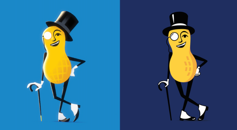
Not only did the brand announce that they would be giving their brand image a refresh but they also announced that they would be dropping a new campaign. Although we’ve seen quite a few changes made to the brand and an entirely new brand image launched, the biggest change that was made to the brand’s iconic Mr. Peanut. Last year during the Super Bowl the company “killed” the iconic mascot character, only to revive him this year.
There have been many changes to the company and brand image, including a new updated logo for the brand. Although the basic concept is still the same, the company name on a solid background, the design itself has changed slightly. While the old logo appeared in a curved form and the letters were in sans serif font, the new logo is impressively stylish and modern.
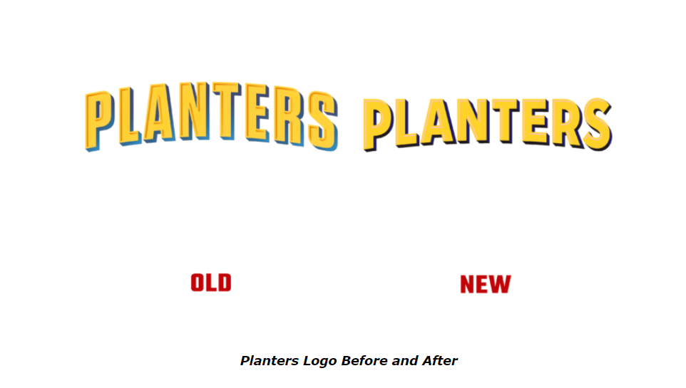
Beautiful lettering appears with a darker yellow shade to create the proper shades for the design. Although the background color was initially a light blue, the new logo appears with a dark blue logo, giving the logo more style and class. It also adds a mysterious touch to the logo, a feature that wasn’t included in the first fun and creative logo for the brand. The letters now appear to have a hollowed-out effect with darker shades of yellow and blue. The new typeface is less flat and more rounded, standing out on shelves with a larger print taking up more space on the packaging.
The executive creative director at VaynerMedia, Mike Pierantozzi said, “When we brought back Mr. Peanut after he sacrificed himself during the 2020 Super Bowl we wanted to make sure he came back both as the Mr. Peanut we all know and loved, but also that he had evolved in his year growing up for the second time. So he’s back, but with a bit more substance, a bit more swagger, a new, more elevated look, and a new message that encourages people to be “a nut above” in how they snack, and in all they do.”
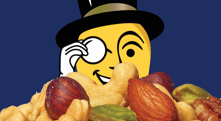
Mr. Peanut was the element of the brand that had the most change made to it, with the character being redrawn just a little and crisp lines being added. The character is now flatter and more relatable, appearing in different roles such as a fan and making the mascot more relatable for events. Although at first glance Mr. Peanut may appear the same as always to customers with his hat, walking stick, and monocle every inch of the mascot has been refined.
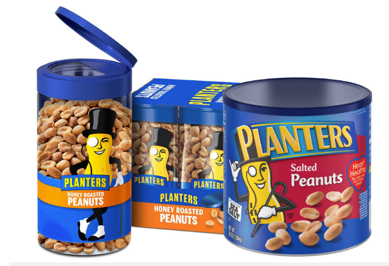
This new brand message has been accompanied by many changes, including new images that display Planter’s products at their best. The new images will photograph the products to show them in their full glory on the new packaging and along with the new marketing material. The photos will show the variety, texture, and quality of Planter’s products on the packaging.

JB Hartford spoke out about the rebranding for Jones Knowles Ritchie, saying, “Planters is a true American icon, connecting generations and providing real food satisfaction with substance. The creative idea behind the new brand identity, Substance with Swagger, is all about celebrating the brand’s straight-to-the-nut sensibility, debonair flare, and crave-worthy irresistibility. We’re thrilled to finally share with the world the many sides of our beloved Mr. Peanut.”

