Temperatures are rising and the economy is improving. Businesses want to move forward with new looks that reflect new values. Three totally different companies – a restaurant, a pest control company, and a tech tool provider – are among the businesses that are embracing new logos this spring.
These new logos leave behind old trends, embrace the sleek lines we’ve seen growing in popularity and make a bold impression. As the weather gets warmer and flowers start to bloom, companies are moving forward with their plans. New business ventures mean it’s time for new logos and branding.
Whether a business is big or small, all companies need logos that reflect their values. This week we’ll take a look at a tech giant, a restaurant, and a pest control company to see how they’re moving forward into 2021.
Springing Into New Logos
Camile
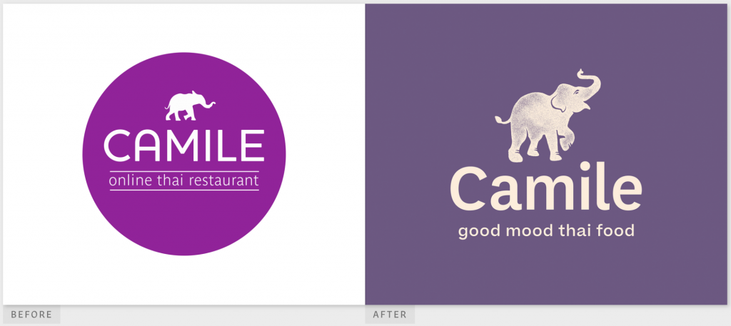
Camile is an Irish Thai restaurant with locations all over Ireland. They prioritize nutrition and health, purpose and intent, and a forward-thinking lens. Camile’s ultra-modern operation even includes delivery drones. To reflect their progressive business model, the restaurant needed a progressive logo.
While the previous logo, which was made up of a bright purple circle and the company’s wordmark, was strong, the new logo is stunningly modern. Bright purple dominates the old logo, but a more muted lavender purple is the background for the new logo.
Camile’s previous logo featured an elephant with its trunk slightly angled. The new logo features a much larger elephant that appears textured and has purple shading. This new elephant’s trunk is raised joyously, which we think is a smart move. This elephant is happy with its Thai food from Camile.
The new Camile logo also features the tagline, “good mood Thai food,” which invites us to test it out. On the other hand, the old logo’s tagline simply stated “online Thai restaurant.” We definitely prefer the new tagline and the new logo (especially the happy elephant). We’ll give it an A+!
Viking Pest Control
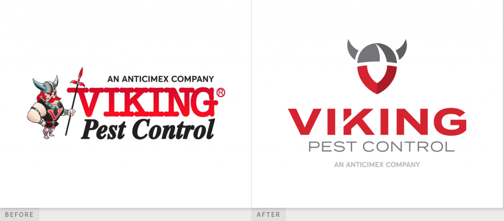
Viking Pest Control offers services for customers in the New Jersey, Pennsylvania, Delaware, and eastern Maryland shore area. With over 40 years of experience, this company knows the importance of tradition, but they’re moving forward. Their website is very user-friendly and modern, and we think their new logo also does a great job of embracing modernity.
The previous Viking Pest Control logo featured three different fonts, which is too many according to most design experts. The bubble-ish style of the font used for “VIKING” looks very dated, and the serif font used for “Pest Control” is also a little behind-the-times. We do love the quirky image of the Viking with his spear, though!
The new logo swaps out the cartoonish Viking figure for a minimalistic Viking symbol that uses two shades of gray and two shades of red. The icon is ultra-modern and sleek. The wordmark uses the same, or a very similar, sans serif font for “VIKING” and “Pest Control,” with negative space in the K that mimics the negative space of the Viking helmet. While we miss the old cartoon Viking, we love the sleek font choices in the new logo. It gets an A in our book!
Trello
Last but not least, let’s take a look at Trello, a product and service from tech giant Atlassian. Trello is a collaborative all-online tool that offers many different customizable options. Because Trello is all about tech, you’d expect it to have a super modern, sleek logo from the get-go, right? Not quite!
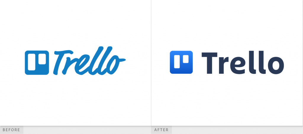
While we like the previous Trello logo, the new logo is a winner. Trello’s previous logo featured an icon, a muted blue square with rounded edges and two white rectangles inside, parallel to each other, the left one longer than the right.
This blue square icon is a representation of the online tool itself, which features boards (the rectangles) of varying lengths. Next to the icon in the previous logo was the word Trello in a cursive-style font, with all letters leaning to the right. The font color was the exact same shade of muted blue as the icon. We like what the old font suggests movement and a forward-thinking company, since Trello is a progressive company that does just that.
The new Trello logo is laid out the same way as the original, but the colors and font have changed. The blue square icon now features a much brighter gradient blue that’s darker at the bottom, but still brighter than the old logo. Trello did away with the cursive-style, leaning to the right font.
They replaced it with a bold black font that’s somewhere between sans serif and serif, and that’s definitely much more modern. We like the font from the old logo, but we love the colors in the new, which gets an A in our books!
From Restaurants to Tech Tools, Sleek Is The Way
Camile, Viking Pest Control, and Trello are three different companies with logos that have recently caught the eye of the design world. Although they offer totally different products, all three companies opted for modernizing their logos by making them simpler and sleeker. Do you like the three new logos we’ve featured this week, or do you prefer the older logos.


