Although BTS is a relatively recent boy band, it has been in the world for a long time.
Successful songwriter and music producer Bang Si-Hyuk had been working on the group together since 2010, and by 2013, it was all pulled together, and the band began releasing records.
Since then, the band has grown significantly. Over the years, they have made several logo changes, each reflecting part of their journey.
The Start Of BTS
In 2005, Bang Si-Hyuk established his own studio called “Big Hit Entertainment.”
Just five years later, he began seeking out talent for a group he decided to call the “Bangtan Sonyeondan” or “Bulletproof Boy Scouts.”
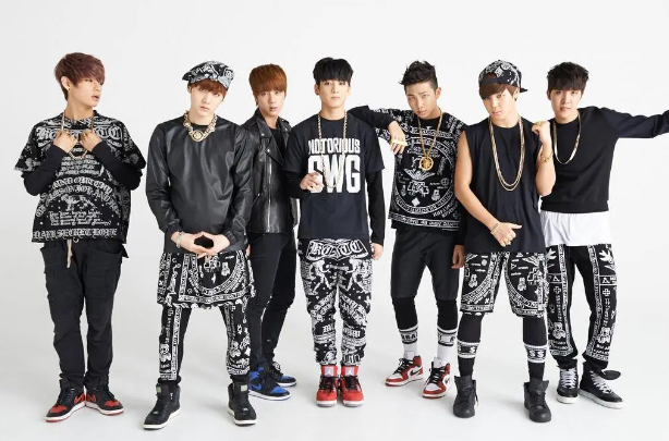
This is the same group that is widely known today as BTS. The group was made up of group made up of Kim Seokjin, Min Yoongi, Jung Hoseok, Kim Namjoon, Park Jimin, Kim Taehyung, and Jeon Jeongguk, better known today as Jin, Suga, J-Hope, RM, Jimin, V, and Jungkook — seven K-pop members who came from all over South Korea.
Forming The Band
RM was the first member to join BTS. RM was already active in the underground rap scene in Seoul under the name Runch Randa. He was invited to audition for Big Hit Entertainment after producer Sleepy connected him with Bang Shi Hyuk, the CEO of Big Hit.
V was the son of framers in Daegu. He dreamed his whole life of being a musician and played the saxophone in his high school years.
Eventually, V’s friend decided to try out for Big Hit Entertainment’s audition, and while the initial intention wasn’t for V to be there for anything other than support, Big Hit Entertainment urged him to audition too. He was the only one that day to make it to the next round, and eventually, he made his way into the band.
Jungkook, the youngest of the band members, was discovered when he auditioned for the third season of “Superstar K” in his hometown of Busan. Although he was eliminated in the audition round, he was scouted by at least seven agencies. Jungkook chose Big Hit Entertainment because he was impressed by RM’s rapping
Jin was the fourth member of BTS. Big Hit Entertainment discovered Jin while he was in college. A scout saw him getting off a bus and persuaded him to audition. Despite being a theatre major with no singing or dancing background, Jin tried out to be an actor. But Big Hit Entertainment had different ideas and persuaded him to train as a BTS member.
Suga began rapping in high school under the name “Gloss,” eventually becoming both a rapper and producer for local artists. He eventually auditioned for Big Hit Entertainment but didn’t win the competition. Although he came in second place, he was still signed as a producer and trainee, eventually becoming a full-fledged member of the band.
J-Hope started as a dance crew member for “Neuron” in his hometown of Gwangju. After being cut from JYP, he eventually auditioned for Big Hit Entertainment. Because of his great rhythm and dance skills, he was immediately signed as a trainee.
He almost didn’t make it into the band fully, until RM eventually convinced both J-Hope and Big Hit Entertainment that he was a good match, and he joined as one of their three rappers.
Jimin became the last member to join BTS. He was a student at Busan High School of Arts, studying dance. One of his dance teachers recognized his talent and urged him to try out for Big Hit Entertainment, where he quickly passed the audition, flew to Seoul, and joined the band.
The Bulletproof Boy Scouts Logo
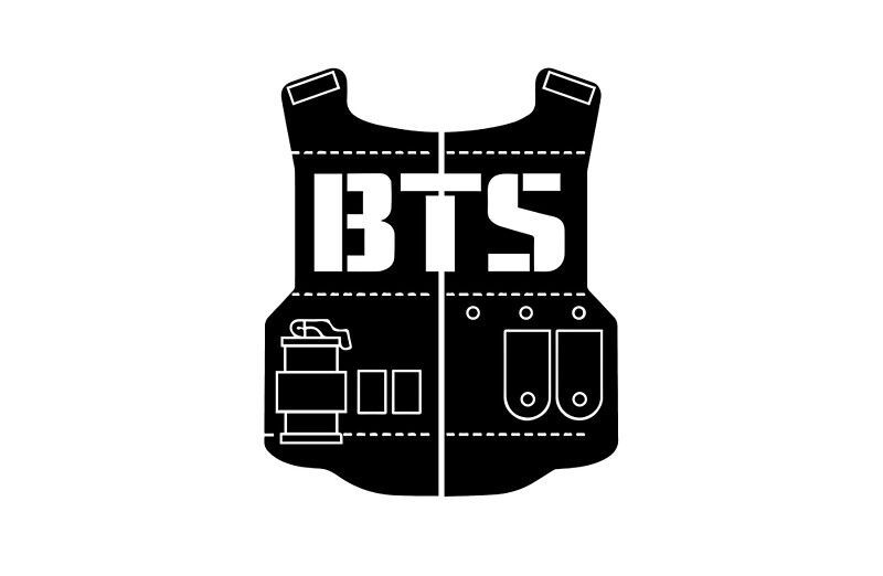
BTS has had four different logos since their debut in 2013. The first one was based on their name, “Bangtan Sonyeondan,” which translates to “Bulletproof Boy Scouts.”
This logo was accompanied by the release of their “2 Kool 4 Skool” album release. This logo was designed to look like a bulletproof vest with the acronym “BTS” displayed in bold across the chest.
On the lower part of the vest, pockets were drawn with a grenade added to the left side.
Around the outside of the vest part of the logo were lightning bolts on either side and spikes forming a full circle around the logo. No other colors were used in making this logo besides black and white. Many consider this version of the logo to be cluttered, but it was a logo they continued to use until 2017.
The First Wings Logo
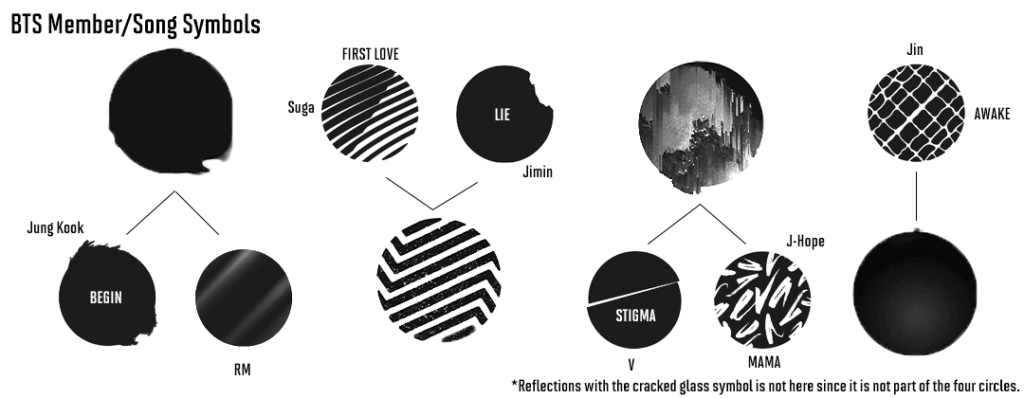
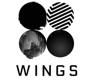
In 2016, BTS added a second logo to the equation. This logo looked drastically different from the original. Instead of a vest design, four circles were used, each displaying different textures.
The word “WINGS” was written below it in thin black capital lettering. Every circle in the logo had a different meaning for the band.
Each circle was meant to represent a more abstract portrayal of each of the BTS members. Each circle also was aligned with the songs on their “Wings” album.
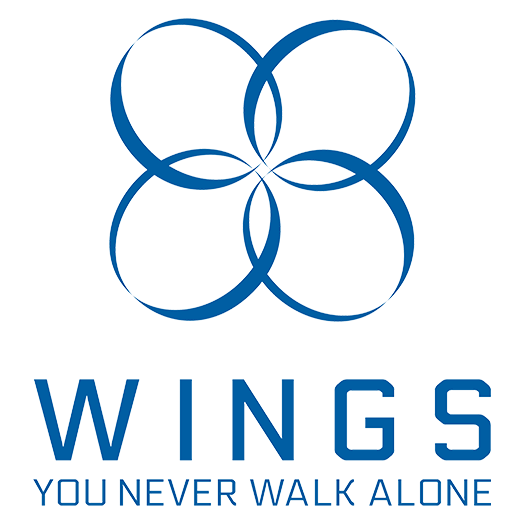
This gave each member a personal connection to the logo. It included pieces of their logos from their songs “First Love, Awake,” “Stigma,” Begin,” Mama,” “Lie,” and Awake.”
The first circle was a representation of Jung Kook and RM, the second was a representation of Suga and Jimin, the third was for V and J-Hope, and finally, the last one was a representation of Jin.
The Second Wings Logo

A second variation of the wings logo was released in 2017. This design took a much more simple approach to their previous Wings logo design.
The design still included four round shapes with the uppercase “WINGS” written beneath.
However, this time the circles were unfilled ellipses. Instead of being side by side, the four calligraphy-style ellipses overlapped with the ellipses directly next to and directly beneath each one.
This logo was also the first to stray away from the black color. Instead, it was entirely navy blue.
Beneath the word “WINGS,” this logo also incorporated the tagline “You Never Walk Alone,” which was also written in all uppercase lettering.
This is a reference to the group’s second studio album, “Wings,” which was re-released as “You Never Walk Alone,” on February 13, 2017.
This variation of the logo was not widely used compared to the others.
The Current BTS Logo
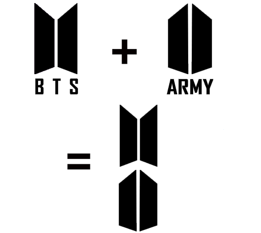
The current BTS logo was also created in 2017. This time, the band decided to keep the logo simpler yet still meaningful, going back to an all-black color scheme.
This version of the logo was simply made of two mirrored trapezoids located side by side with the letters “BTS” written beneath. While at first glance it may not look like much, the logo was actually created to align with the logo for the BTS ARMY — the official fandom name for fans of the K-pop group.
The logo of the BTS ARMY is nearly the same, but the trapezoids are mirrored in the opposite way. Many compare the current BTS logo to looking like a set of open doors, while the BTS ARMY version looks like the shape of a bulletproof shield. Both variations of the logo represent the strong dedication of BTS to their fan base.
Features Of The BTS Logo
BTS’s logos have many prominent features that make them stand out to fans. From the typeface to hidden symbols and colors, the band has made some smart choices for their logo designs over the years.
The BTS Logo Typeface
There are many key elements to the BTS logos over the years. One of these elements is the typeface. The typeface of the original BTS vest logo was a Mossimo font typeface. It is a type of fat slab typeface commonly used for headlines, posters, magazines, corporate branding, logos, titles, and more. This type of bold typeface makes it stand out at the center of the logo, although some considered this variation of the logo to be a little overwhelming.
The next logos — the Wings logos — used a more traditional sans-serif typeface that was cleaner, more modern, and didn’t distract from the logo itself. Finally, the current logo font might appear to be just another classic sans serif typeface, but after closer examination, the “T” is noticeably different. The “B” and “S” feature gentle curves, whereas the “T” has inward slanted edges on the top line, putting its own unique spin on the font.
BTS Logo Shapes Symbolism
The BTS logo has used multiple shapes for their logo over the years. Starting with the more complex vest design, they all chose shapes they felt best aligned with their songs and albums.
The evolution of their logo reflects the group’s artistic growth and changing themes in their music. In 2013, BTS debuted with a logo featuring a bulletproof vest design. This was to symbolize their original name, “Bangtan Sonyeondan,” otherwise known as the “Bulletproof Boy Scouts.” This logo represented their early focus on social commentary and youth-oriented themes.
As BTS’s music and identity evolved, so did their logo. Their second logo featured four circles that also referenced specific albums they had created and their corresponding band members. The following logo was a variation that played directly off of that logo. Finally, in 2017, they introduced a new logo that incorporated two trapezoids forming a door-like shape. This design symbolized their growth and desire to connect with a broader audience.
BTS Logo Color Scheme
The early logo of BTS featured a simple black-and-white color scheme. The bulletproof vest design primarily uses black — a color that can be used to symbolize sophistication and strength. Because of the simplicity of the color choices, it made the logo easier to manipulate for marketing and product use. It also gave a more sophisticated and professional look.

During the band’s Wings era, the color scheme continued to be black and white. The first Wings logo featured four circles representing each member, with a predominantly black color scheme. Later, the logo was modified to include four overlapping blue ellipses, adding a touch of color while maintaining a clean look.
With the current logo, the band has gone back to its simple and sophisticated black-and-white color scheme. Introduced in 2017, the most recent design features two black trapezoids that represent doors opening from the inside.
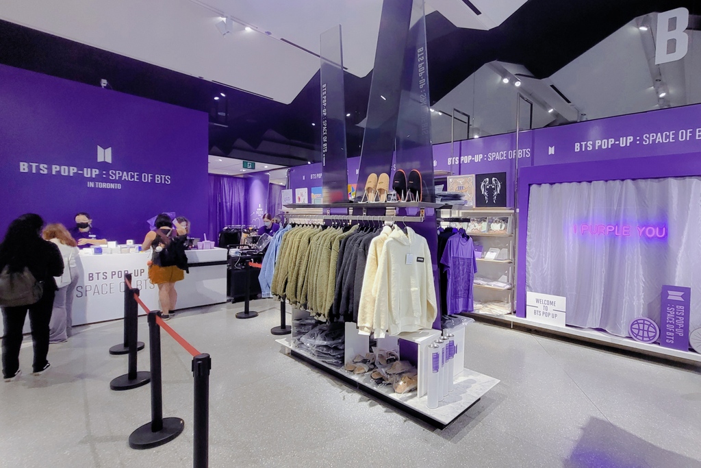
Although the original designs follow a very basic color scheme, these logos do all have colored variations. The most popular color the band has used for the logos beside their initial colors is purple — a reference to the phrase “I purple you” which was said early on during a fan meeting in 2016.
Takeaways From The BTS Logo
The BTS logo is more than just a visual identifier for the band. There is a lot that can be learned from it. The band had an interesting approach that really allowed their logo to reflect who each individual member was and allowed their symbol to grow along with them.
Growing With The Logo
The evolution of the BTS logo from a detailed bulletproof vest to a minimalist door design symbolizes the band’s growth and transformation. Not only did they make less distracting variations that would be easier to reuse later, but they also created each logo in a way that reflected their own personal growth.
Initially, the vest logo represented their rebellious spirit and a determination to protect the dreams of youth. As they matured, so did their logo. Their music and image became more refined, leading to a simpler, more elegant logo that symbolizes openness and new beginnings.
Connecting With Fans
BTS has always had a strong connection with its fans. Their most recent logo is a great example of that. BTS’s most recent logo is a direct reflection of the BTS ARMY logo for its fans.
The complementary designs represent the band’s strong relationship with its fan base and how the band’s success is intertwined with the support of its fanbase. This unique approach creates a sense of community. It reinforces the idea that BTS and their fans are on a journey together.
Not Getting Too Complicated
One of the biggest issues with the original BTS logo was how complicated it was. The logo was creative and represented the band. However, it included a lot of pieces that could be overwhelming and harder to incorporate on merchandise.
The band learned from this, and every following logo was much simpler in design. While every following logo was simpler, including the two wings logos and the most recent logo, they still were able to insert a large portion of themselves into it and maintained strong symbolism.
Adding A Personal Touch
BTS has used strong symbolism since day one. Their first vest logo was filled with symbolism for the band and personality. During the Wings era, BTS took logo design to a whole new level by infusing even more personal elements.
This clever move added a touch of intimacy and authenticity to their brand. By aligning the circles with individual members and their songs, BTS created a logo that not only symbolized the group as a whole but also honored the distinct contributions of each member.
This smart approach humanized the brand, making it relatable and endearing to fans who cherish the personal stories and talents of the members.
The evolution of the BTS logo mirrors the band’s progress, their strong bond with fans, and their dedication to impactful creativity. From the bulletproof vest to the sleek door design, every logo represents a phase in BTS’s story. As BTS keeps motivating and engaging with fans worldwide, its logo remains a powerful image of its history and future ambitions.