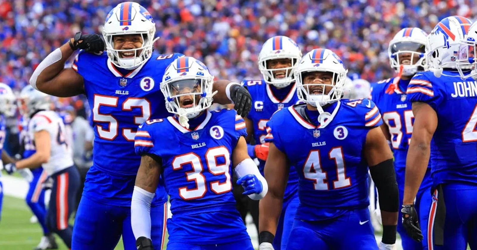
The Buffalo Bills, the seventh team to be admitted to the American Football League, are known for their four consecutive Super Bowls from 1990 to 1993.
However, they’re also known for losing all four games. There’s no denying that the Bills, whether for their wins or losses, are well-known both on and off the field. The Bills are known as one of the most famous and celebrated America Football Clubs, and they are represented by a fantastic logo that stands out.
This logo is most widely referred to as a buffalo or bison, depending on who you ask. Many people believe the two are the same when, in reality, they are not. But regardless of whether buffalo or bison is shown on the team’s logo, there is one thing we know for sure: the Buffalo Bills logo is one of the most classic and timeless logos of all time.
However, the logo hasn’t always been the bright and creative one we see representing the team today. It’s evolved and gone through many changes to reach the design we associate with the franchise today, Let’s take a look at the Bills logo and its history.
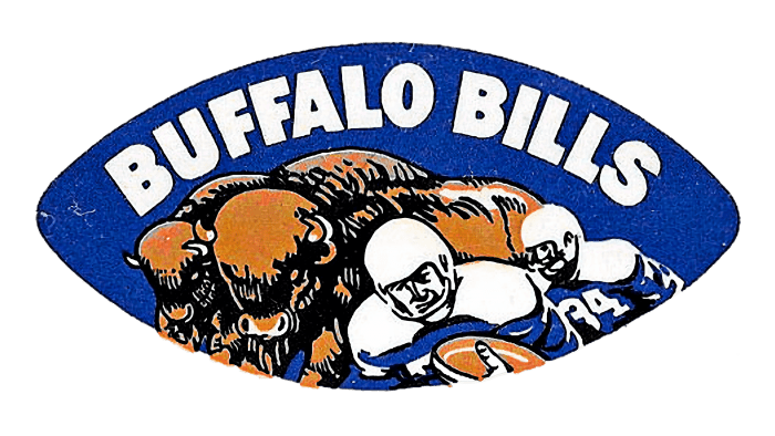
1960––1962: The First Logo
The first logo was created in 1960, featuring the familiar dark blue of the team. The logo shape itself is a blue football with the other elements inside.
We see a herd of buffalos behind two football players, both wearing the Buffalo Bills’ current uniform and one holding a football.
Above the design is a white wordmark that shows the football team’s name in sans-serif font.
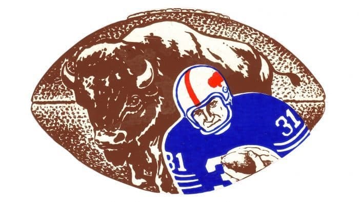
1962––1970: A Slight Change
The previous logo only lasted two years before the brand decided it was time for a change. The team still left all the significant elements of the previous design, changing it to include one buffalo and one football player. They also made both elements larger and closer, removing the blue background from the design entirely. Player number 31 now wore the dark blue colored jersey and a white helmet with a red stripe. The team’s name was entirely removed and the background was changed to be the color of a regular brown football, with the texture changing to that as well.

1970––1974: A Redesign
In 1970, the designers entirely redesigned the logo. This time, they removed all the previous elements, now just introducing one large, red buffalo as their logo.
The design wasn’t detailed, just a simple light red buffalo on a white background. The buffalo was facing toward the right.
1974––Present: The Logo Today
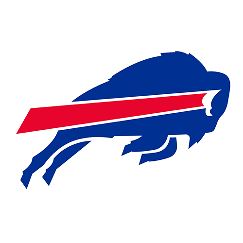
The logo that we see and associate with the football team was introduced in 1974. Jere Wright was a production manager at NFL Properties, and her husband, Stevens Wright, was the designer of this logo. Jere was right for bringing the attention of her husband’s talent to the team’s attention because Stevens created the perfect logo for the football team. The design is simplistic and clean, showing a blue bison charging toward the right with its back legs extended. In the center of the bison is a horizontal red line that has a white outline that creates the buffalo’s eye. The logo is dynamic, with movement and the team’s colors shining through in every element. The logo has stayed with the company to this day, truly a testament to its versatility and creativeness.
The History of the Buffalo Bills
The Buffalo Bills became the seventh team to be admitted to the American Football League and awarded to Ralph C. Wilson on October 28, 1959.
In their fourth season in 1963, the team tied for the AFL Eastern division crown. However, they lost to the Boston Patriots in the playoffs. They won their division a year and defeated the Chargers both in 1964 and 1965. Their head coach, Lou Saban, was named AFL Coach of the Year. Unfortunately, he left the team in 1965.
The team faced another devastating loss in 1966 when they lost to the Chiefs in the AFL title game. After this, the team went on a significant losing streak, losing 55 games, tying two, and only winning 13 games in the next five seasons. It was devastating for the team.
With bad luck, the team’s coach, Saban, returned in 1972. With him utilizing O.J. Simpson, the team’s superstar running back, they managed to make a comeback. However, Saban left the team once again in 1976, and the team began to take a dip down again.
However, coach Chuck Knox joined the team and helped them gain an AFC Eastern division title in 1980. They made the playoffs in 1981 but lost to Cincinnati. They then had another losing streak, with a downturn that lasted six seasons.
But the team got a new coach in 1986 and, under the direction of Marv Levy, quickly turned around again.
The team won five AFC Eastern titles in six years, starting in 1988. They are known as the only team ever to play in four straight Super Bowls.
The Bills have recently found success with their new coach, Sean McDermott.
Conclusion
The Buffalo Bills logo has come a long way since its first design in 1960. What started as a detailed and busy emblem featuring football players and buffaloes has evolved into the clean, powerful, and iconic charging bison we recognize today.
Each change in the logo’s design reflects the team’s own journey—one of perseverance, determination, and a constant drive for improvement.
Just like the Bills have faced ups and downs on the field, their logo has undergone transformations to better represent the team and its identity.
The current design, introduced in 1974, has stood the test of time, proving its versatility and strong connection to the franchise. Whether winning or losing, the Buffalo Bills remain one of the most well-known teams in the NFL, and their logo continues to be a bold and timeless symbol of the team’s spirit and legacy.