We’ve all had the experience of getting behind the wheel of a Chevrolet, or as many call it, a Chevy. Do you remember the feeling of gripping the steering wheel of a Chevy Malibu or the thrill of watching a Corvette zoom by?
When we talk about the best Chevy cars, the Corvette certainly takes the spotlight, but there’s something that shines, like the performance of these vehicles: its logo, a distinctive mark that defines the brand.
The Chevrolet logo, commonly known as the “bowtie,” is one of the most recognizable symbols in the automotive world. This emblem represents more than just a brand; it’s an icon with a rich history. Its simple yet elegant design has left an indelible mark on car culture.
The Evolution and History About Chevrolet Logo
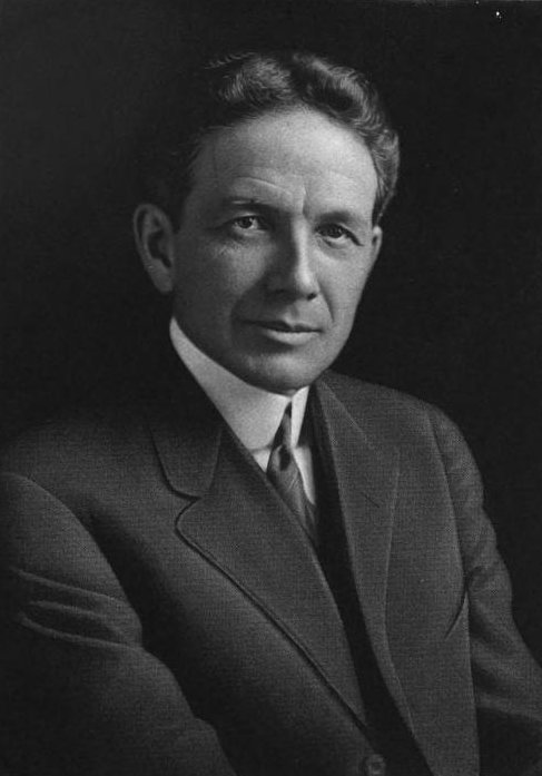
The Chevrolet emblem, first introduced in 1913, carries a captivating history. One famous story suggests that William C. Durant, co-founder of Chevrolet, found inspiration for the now-iconic design in an unlikely place: a wallpaper pattern he noticed at a French hotel. Another version claims Durant saw a similar design in a newspaper advertisement.
Whatever its true origin, the Chevrolet bowtie has become a globally recognized symbol. Early versions of the emblem included the “Chevrolet” word mark, which was eventually phased out; the logo has also fluctuated in size, sometimes encased in other shapes, adapting to the changing eras of automotive design.
From bold redesigns to subtle refinements, the evolution of the Chevy logo reflects the brand’s rich heritage and its pursuit of modernity. Here’s a closer look at how this emblem has transformed since its debut over a century ago.
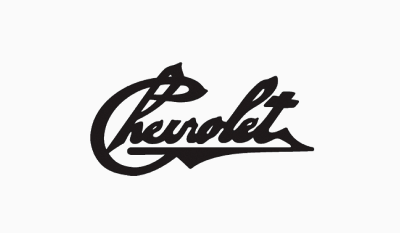
1911: Chevy’s Original Logo
For this year, Chevrolet’s signature inspired the Chevy emblem.
It was created in a bold, handwritten, blacked-out format and was used for a short time between 1911 and 1914. It is believed to be the actual signature of Louis Chevrolet.
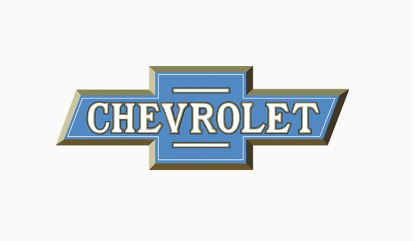
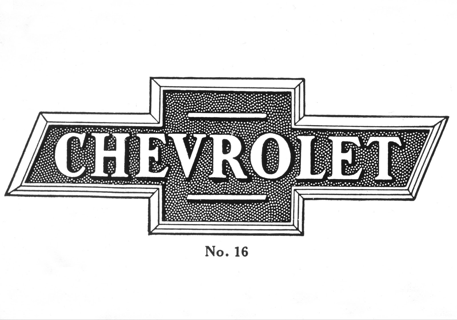
1913: The Original Chevy Bowtie Was Released
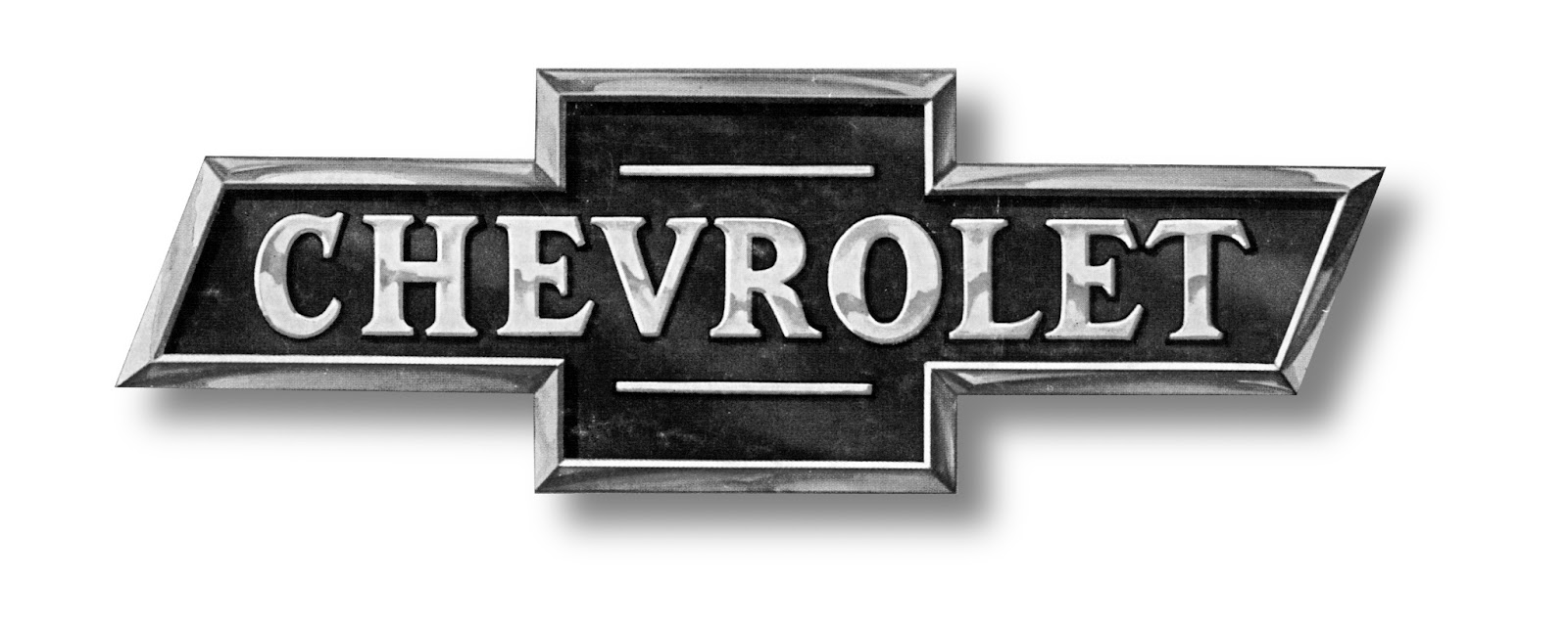
In 1913, it was the beginning of an iconic brand for one of the oldest car manufacturers in the United States. The initial Chevy bowtie logo was understated, featuring soft white and light blue tones with a gold outline. The word “Chevrolet” was prominently displayed across the bowtie until 1934.
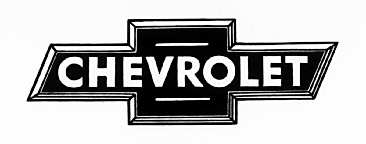
1934: A Monochrome Design
In 1934, Chevrolet made a bold, monochromatic shift in its logo design. The brand moved away from its lighter color scheme, opting for a stark, black-and-white palette. The word “Chevrolet” was reimagined in a thick, extra-bold sans-serif typeface, with more giant and commanding letters that lent the emblem a sense of gravitas previously unseen. This striking version of the logo remained in use until 1940, marking an era of visual refinement and seriousness for the brand.
1940: Chevy Becomes Colorful
This design features a symbolic font dating back to 1913. The bowtie was painted in silver, with a subtle 3D effect adding depth. Chevrolet decided to revive the blue-gold theme but chose a sleeker, flatter design this time. The colors were bolder, exuding a fresh and energetic vibe. The gold outline was now thicker and only framed the outer edges of the cross. This version remained in use until 1957.
1957: Chevy’s Unconventional Design
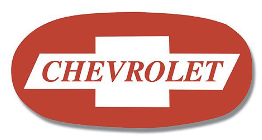
The 1957 Chevy bowtie is one of the most unconventional designs in the brand’s history. Imagine a large, bold red oval with the iconic bowtie nestled inside, also in red.
The interior of the symbol was accented in white, creating a striking contrast that stood out; despite its unique flair, this version didn’t last long and was retired by 1960.
1960 to 1985: Minimalistic and Aesthetic Upgrades
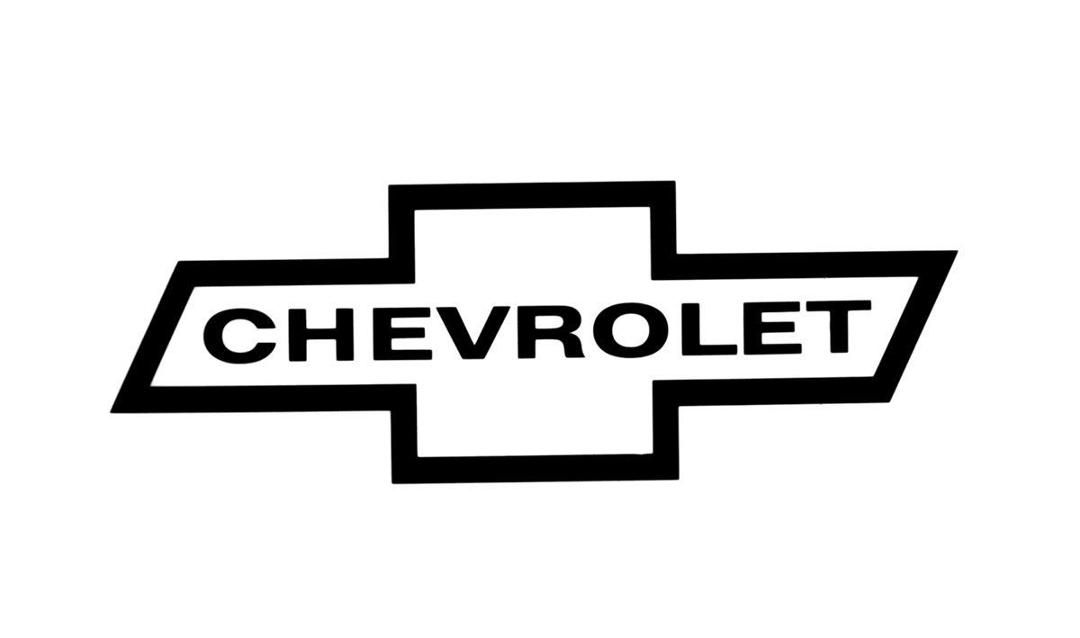
Chevrolet then shifted back to a monochrome aesthetic, introducing what would become the most minimalistic bowtie logo in its history. This version, used between 1960 and 1977, consisted of a slender black outline with the brand name written in italicized black lettering.
During this phase of the emblem’s evolution, the logo featured a white and blue design. In some images, the background even resembled the texture of denim.
The word “Chevrolet” was placed smaller in the center of the emblem.A significant turning point came in 1985 when the bowtie logo transformed into a version closely resembling the one we know today.
This change marked a dramatic departure from earlier designs and helped the logo gain widespread recognition, primarily through its debut in TV advertisements. Chevrolet also removed the “Chevrolet” wordmark from the interior, creating the brand’s first-ever standalone symbol. This iteration remained in use until 2000.
2000 to 2011: The Big Evolution
In 2000, Chevy returned to a bold red, opting for a more understated yet sophisticated 3D design. This version, with its rich, reddish tones, marked a modern, minimalist nod to the monochrome logos of the 1960s.
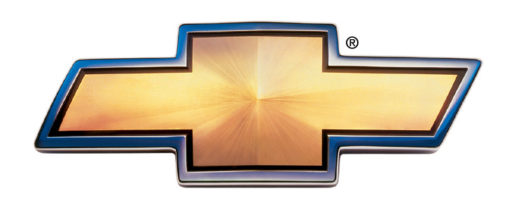
However, in 2011, the gold bowtie was refined again to commemorate Chevrolet’s centennial. This time, it featured a thicker silver outline and a textured, gold-filled center, giving it a more polished and dynamic appearance. This version remains the company’s official logo today.
By 2004, Chevy introduced a gold bowtie, stepping away from the trend of overly complex designs. This new, sleek look elevated the Chevy emblem to one of the most recognizable logos worldwide.
Chevy has made many adjustments to the emblem over the years to complement the design of its vehicles. These tweaks ensure that the logo seamlessly integrates with the front grille or the contoured surfaces of Chevy’s cars, maintaining its iconic status.


The Real Origin Of The Chevrolet Logo Design
Often referred to as a bowtie or cross, the Chevrolet logo is one of the most recognizable symbols worldwide. It features a wide, diagonal cross in a striking gold and black color scheme, first introduced by Chevrolet co-founder William C. Durant in 1913.
While the Chevrolet logo’s debut timeline is clear, its origins remain elusive. One popular theory suggests that Durant drew inspiration from a wallpaper pattern he encountered during a vacation in Paris.
On the other hand, Durant’s daughter Margery has a different perspective. In her biography of her father, she recalls how he frequently sketched name plate designs, implying that the emblem may have been a product of his creativity.
Adding another layer to the mystery, Durant’s wife, Catherine, said that a newspaper advertisement inspired the logo spotted in Virginia. According to her, William was captivated by the ad and thought it would make a perfect fit for the Chevrolet brand.
Among these theories, the one supported by Ken Kaufmann, editor and historian for The Chevrolet Review, appears to hold the most weight. He discovered a version of the logo in a newspaper ad dating back to November 2011, which aligns with Catherine’s version.
Regardless of its origins, the Chevrolet bowtie logo has become one of the most iconic designs in automotive history, solidifying its status in branding.
The History of Chevrolet So Far
Chevrolet’s emblem illustrates how a simple design can significantly influence a brand’s identity. Although the history of the Chevy logo is unclear, the company has successfully crafted a distinctive brand over the years. Each evolution of the Chevy symbol has helped communicate essential information about the vehicles they offer.

Today, the Chevrolet logo showcases a striking golden bowtie framed in sleek chrome. The textured gold finish resembles the gleam of headlights, while the silver outline conveys a sense of elegance and robustness.
While Chevrolet sometimes includes the “Chevrolet” wordmark beneath the bowtie, the emblem has gained such recognition that it stands alone as a powerful brand symbol. The logo is straightforward and easily identifiable, making it a familiar sight worldwide.
Today, the Chevy emblem is an iconic representation of the brand. The combination of gold and silver reflects luxury and sophistication, while the bowtie design pays homage to Chevrolet’s rich heritage. Although the wordmark may sometimes accompany the logo, it is frequently seen on its own, demonstrating how a well-designed logo can eliminate the need for a brand name on products.
The Chevy logo will undoubtedly continue to evolve, yet it will always serve as a reminder of the brand’s legacy and its commitment to delivering quality vehicles. Whether seen on the road or in advertisements, the Chevrolet emblem remains a beacon for car enthusiasts and everyday drivers, symbolizing a shared love for the open road and the journey ahead.