You’ve heard about Amazon, and chances are, you’ve heard about eBay. eBay is a well-known website popular for its digital auctions and the ability to buy vast products from around the globe.
By using the platform, people worldwide can sell products, and others can purchase various items and connect with sellers at any point.
eBay is known for its exceptional growth, skyrocketing just two years after it started. The company has had a strong history of success throughout the years, which can be attributed to its iconic logo, which has boldly stood out and made an impression on customers and sellers on the platform.
But the logo hasn’t always been the colorful and creative symbol we identify with the company today. It’s gone through many changes to become the logo we see today.
Wondering how the eBay logo was so successful and how the company saw such rapid growth? Let’s look at the history of the eBay logo, the history of the company itself, and what we can learn from them both.

1995–1997: The First Logo
The first logo the company created and used was in 1995 introduced for Auction Web. Auction Web is what the company was initially called, and the logo showed a long rectangle with the name inside. Half the rectangle was white with black letters, while the other half was black with white letters. This led to the name being split into two sides of the rectangle, separating them. The typeface for the logo was bold and shown in pixels, creating an exciting yet fun design that stood out. However, the logo only lasted the company two years before they decided they needed a change.
1997––1999: A Big Change
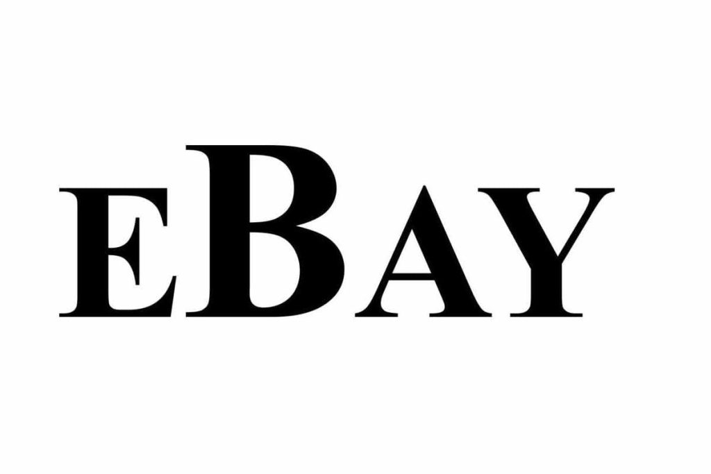
1997 had a few significant changes for the company, and it wasn’t only a new logo. The name was changed to eBay, and that same year the company decided it was time to change its visual identity.
The logo changed to a simpler, more simplistic one that showed the company name on a white background. The letters were black and strong and made a statement with bold letters. The ‘B’ in the title was enlarged, standing out from the other letters and tying the name together.
1999––2012: Color Is Added
Same as the first logo, the second one was only kept for two years before the company once again thought it was time for a change. This time the logo got an iconic redesign that was only one step away from the logo we associate with today’s company.
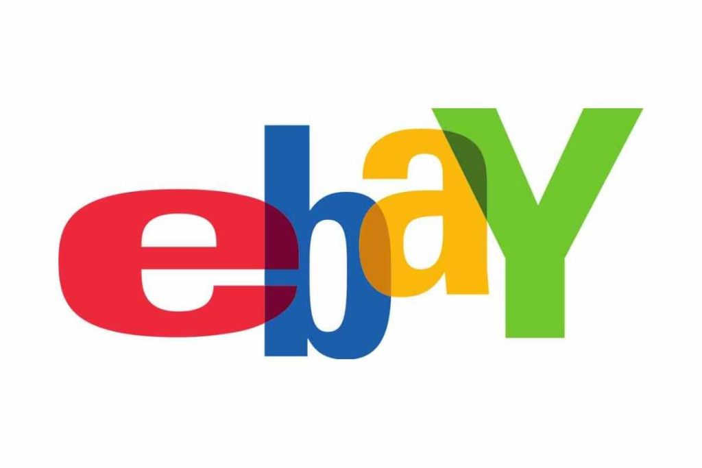
This design brought a colorful change that showed the company name in all lowercase with the letters in red, blue, yellow, and green on a white background.
Each name letter got its color, and they were transparent. This way, the letters were slightly stacked on each other, and you could see through them. The letters appeared to be jumping, placed unevenly and with some bigger than others.
This signified the vastness of what was available on their site and what you could find.
2012––Now: The Logo We See Today
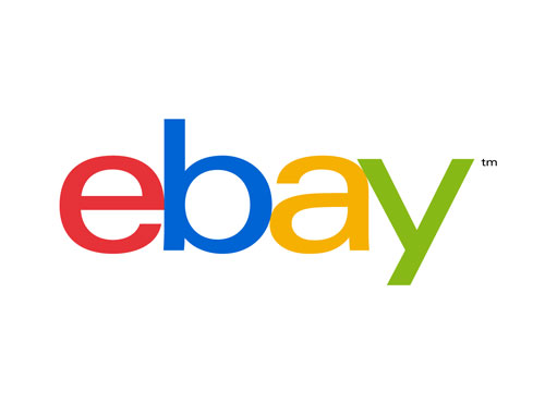
The previous logo stayed with the company for a little over a decade before they decided on a new design, and this time the logo showed the same colors and name, with the letters straighter. Lippincott, a U.S. brand consultant, developed the logo. The goal of this logo was to show how the company and its customers had grown and changed over the years. The emblem was cleaner and more minimalistic, showing what the customer base had also experienced. The company hoped to give its customers a more consistent experience.
The letters no longer overlapped, and the letters were evenly lined up, with none of them bouncing. The design was simple and familiar while still having a fun look with the choice of colors. The logo was still iconic, standing out and making a difference, while it seemed playful to those who saw it.
Overall the logo that we associate with the brand today went through many changes to become the iconic symbol we’re familiar with. Now the logo is associated with quality and the ease of finding anything you need on one website at a cost-effective price.
The Font
The eBay logo has used the Univers typeface for almost all their logos, which surprises many people. After all, when you compare the last two symbols, you’d never imagine they are similar, and it’s hard to imagine using the same font.
However, if you look closer, you’ll see that it’s still the same typeface; it’s just that there’s a bolder version and a thinner one. Also, remember that the logo underwent many changes, including whether it used upper or lowercase letters.
The font was a good choice for the company as it stands out and is easy for customers to identify. The font is iconic and has made a statement on whatever media it is shown on.
The Colors
The color choice is the second part of the design that stands out and makes an impression.
The color palette has always included four primary colors: green, blue, red, and yellow. These colors are bold and make a statement for the company. In some versions of the logo, the colors differ in whether they’re brighter or darker, standing out in some more than others. The colors help to make an impression on those who see the logo and help with positive associations.
The History of The Company
eBay was created and launched by the American entrepreneur Pierre Omidyar in his living room in San Jose. Omidyar founded the company on Labor Day weekend in 1995, and it started when he listed his laser pointe for $1.
This was originally simply meant to be an experiment in how it would affect a marketplace if it were a level playing field. The company was initially called Auction Web, and the laser printer listing was the first auction held on the platform.
At first, the laser printer had no takers, and it sat still for a week. But then there was a change, and bidders began to drive up the price until it reached $14.83. This was the first sign that Omidyar was making something that would change the world.
At first, Omidyar offered the service for free but then started to charge once the internet service costs were too much, so they began to profit. The service was a marketplace for selling goods and services where individuals could buy and sell.
The idea was to be an online trading company, allowing people to trade amongst themselves using the internet. On the web, using the platform, sellers can list items for sale, and then buyers can bid on the things they’re interested in.
Buyers could easily browse through all the items listed to place bids on what interested them.
The website was easy for customers to browse, with the items arranged by topic and the different types of auctions having their categories.
eBay has managed to do what no company before could do by streamlining person-to-person trading where, before this, it had traditionally only been done through garage sales, flea markets, and such.
eBay Throughout Time
From the company’s first inception as AuctionWeb to the vast mass media company now known as eBay, which has revolutionized history with online auctions, the company has come a long way.
We can track the timeline of eBay back to 1995, when it was first founded, a broken laser pointer made history. Canadian Mark Fraser eventually purchased the pointer, and this year marked the company’s first creation and was iconic for the online auction platform.
The following year 1996, the company had grown massively, and it was too much for Pierre to manage without help. This was marked when he hired his first employee; the first employee ever of eBay was Chris Agarpao.
Chris has continued to work with the company for over 25 years. As the company continued to grow, Pierre eventually hired Jeff Skoll to be president. In 1997 another big step was made for the company, with the company name being changed.
The name was officially changed from Auction Web to eBay. This year also marked the millionth item sold on the platform and introduced an addition known as the Feedback Forum, where users could leave valuable feedback.
The following year brought more excitement for the company as it grew to even greater heights. The company launched My eBay, went public, and reached $53.50 per share in one day.
The year after, the company expanded to greater heights, even officially moving out of the United States, including Germany, the U.K., and Australia.
In addition to expanding out of the country, the company began offering new features and acquiring new countries. As we continued into the 2000s, the company continued in the same way, expanding to new locations, including new features, and acquiring more companies.
eBay Changed Online Auctions and eCommerce
eBay has played a significant role in the rise of online auctions and helped to influence e-commerce greatly. The company considerably changed how people acquire and sell items regularly since, before eBay, this was a foreign concept.
Online auctions hadn’t been heard of before, and the idea was utterly new to the public when eBay was first launched and started meeting such rapid success.
The company had a significant focus on making the idea of online auctions both accessible and fun for users. They focused on making the website accessible for people to use by including features such as real-time bidding and auction style format for users.
One of the most significant ways that eBay changed auctions, in general, was that auction houses were affected.
The brick-and-mortar businesses and the auction houses faced competition once eBay emerged and had such a large customer base.
eBay was a platform that allowed buyers and sellers to thrive by offering and buying rare items that couldn’t be found elsewhere. When it came to e-commerce, eBay also made a drastic difference.
The platform showed the ease and viability of e-commerce through online transactions and how regular the entire process was.
In Conclusion
eBay may have had humble beginnings, but there’s no denying that the company has changed the world throughout the years. It has become a hugely prominent player in e-commerce.
The company has been dramatically impacted to become one of the most excellent online websites.
There’s no denying that the company wouldn’t be where it is today without a strong presence, which means iconic branding.
The company has a solid and symbolic brand, including the easily identifiable logo that has stood the test of time. The eBay logo is genuinely iconic, standing out for the colors and font that help to make it as symbolic as we see it today.
As discussed above, the logo has undergone many changes to become what we see today. We can learn much from the company and its iconic logo by looking at the history of the company and the logo above.

