A name and image probably come to mind when you think about sports and the industry. This might be ESPN, the sports broadcasting network that has become symbolic in the sports industry and has made its mark on millions of fans.
Both fans and designers embrace and love this logo, using the platform for various purposes and inspirations. However, it’s not only what ESPN does and its purpose that makes ESPN famous and so well known, but it’s the iconic logo that makes it easily recognizable and has been the symbol that represents the sports industry for centuries.
Whether you’re a fan of sports or merely a designer who takes an interest in some of the world’s finest creations, the history of the ESPN logo and its evolution throughout the years offers something new to everyone. It allows a glimpse of branding and creativity while showing the development of a brand throughout the years.
Despite how the well-polished logo may appear today, it wasn’t always the iconic emblem we’ve grown to associate with the brand.
In this article, we’ll embark on a journey through ESPN’s history, tracing the evolution of its logo to what we see today.
We’ll delve into the significant milestones that the iconic symbol has traversed, from its creation in 1979 to its current status as the emblem of universal sports.
So, without further ado, let’s dive into the captivating history of the ESPN logo.
1979––1985: The First Logo
To look at the history of the ESPN logo, we must journey back to the late ’70s when the first logo first came into existence. This first logo marked a substantial moment in sports history and was pivotal when ESPN first made its design that would help it become famous in the sports and networking industry.
The first ESPN logo first emerged on July 14th, 1978, and it first appeared in a specific promotion as an orange ring. It started out as an orange ring and then quickly expanded to advertise ESPN’s acronym. The font used for the name was a highly modern and signature font that would become symbolic of the platform.
The orange contrasted with the red well, and it stood out to create an appealing and memorable look. The secret to the success of this design was its minimalist appearance. This original version simply featured a simple inscription of the name without making it overly flashy or seeming to try too hard.
The network’s name was four simple, bold letters that stood out and impacted the viewer. This logo lasted the brand six years before they decided to change and redesign the emblem.
1985––Present: The Logo Today
It didn’t take long for ESPN to find a permanent logo representing the network and create a signature brand emblem.
In 1985, the logo changed to a new look that would become globally recognized and associated with the network.
Since it was first developed in the mid-80s the ESPN logo has only won over more hearts and spread further in popularity around the globe. Regarding logos, the signature design and font are important to pay attention to. The right font can make or break an emblem, and ESPN decided that in 1985, it was time for them to focus on the design fully.
This design was entirely different from the network’s original logo, and the font was the central part that was changed. The 1985 version of the emblem shifted significantly from the previous logo, and they chose a statement font that showcased a badge-like logo in big, flashy red letters.
The letters were stylized, and the scarlet red was in a wide futuristic sans-serif font, which made a big impact the second that people saw it.
The font, which is called the Stop font, was originally developed in 1971 by designer Aldo Novarese.
When redesigning the logo, the designers abandoned the previous design entirely and focused on creating a new one.
The main signature look of this design was the white line that slashed through the big red letters, creating a striking appearance. The letters were slightly tilted to the right, adding depth and creativity to the design.
The bright red appeared on a white background, creating a unique and creative look that would become associated with the network and become iconic throughout the years. This design allowed for a completely new design that had been completely redone and created a new look that fans would associate with the brand.
This completely new concept was an instant success for the network and became popular. The significance behind this design was that it showed movement and was energetic looking.
This excitement in the design was the same excitement and speed that sports exhibits, showcasing what the network offers and bringing the same enthusiasm to the design that the network offers its viewers.
The History of ESPN
Now that we’ve looked at the history of the ESPN logo, we can look at the network’s history.
The history of ESPN dates back to when the first logo was created in 1979. Bill Rasmussen, his son Scott Rasmussen, and Aetna insurance agent Ed Eagan founded ESPN that year. Bill Rasmussen and Eagan knew each other from Rasmussen’s time working for the New England Whalers.
Eagen had expressed an interest in a career in television. After Rasmussen was fired from the Whalers, the two began to discuss a cable television network that would focus on covering all the sporting events in Connecticut.
Although Rasmussen knew limited information about cable television during this period, both men were determined to make this dream a reality. In 1978, they made the push to fully make their dream operable, with the two Rasmussens, Eagen and Bob Beyus, who was Eagan’s associate and owned a video production company.
They sought out the support of various cable operators and searched for inventors who might be interested in helping them get their sports boarding casting network started. By now, they had a name chosen for their network: the Entertainment and Sports Programming Network (ESP).
They received five acceptances from local cable operators to hear them pitch their idea; however, when they heard it, the operators were skeptical. This set them back, but they didn’t give up hope.
Despite the setbacks, ESP was incorporated in 1978 at the cost of $91. The trio got started shortly after doing their research to understand how they could begin broadcasting their news sports channel.
After researching and finding the best and most cost-effective option, they decided to use a transponder for their satellite. With the help of family and friends and the few inventors they had, they pooled together $30,000 to get the transponder.
They opted to use the 24-hour satellite feed because it was more cost-effective and would allow them the most productive way to send their signal across Connecticut. Once figuring out the tedious details of how they would effectively broadcast their network, they started to look at the content they would display.
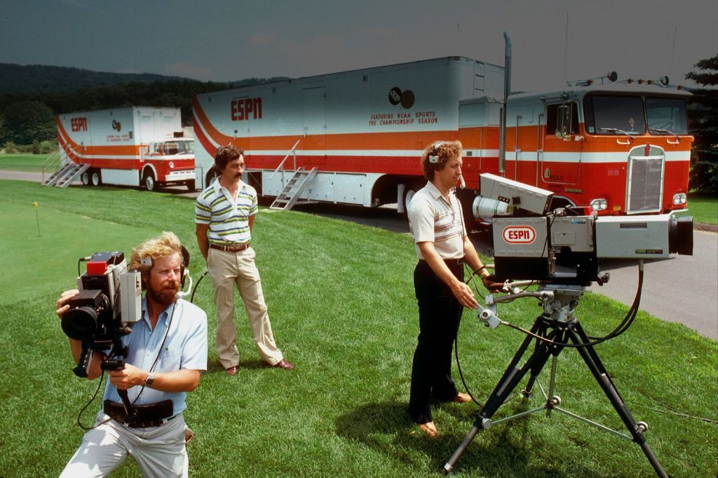
They agreed that they would display various types of sports 24 hours a day and hire sportscasters. They also planned to buy a fleet of trucks nationwide to cover the different sporting events.
Next, they purchased a parcel of land for $18,000 in Bristol, Connecticut, to set up their headquarters.
The founders had their work cut out with figuring out the rights to sports and understanding how they could legally execute their idea, but with research and diligence, they could accomplish the task.
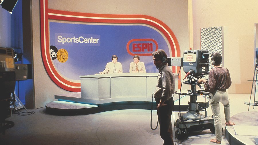
Finally, after a year of putting hard work and effort into getting their dream running, 30,000 viewers tuned in to watch the launch of ESPN. The network debuted its first telecast using anchors George Grande and Lee Leonard, ensuring they made a statement with this launch.
The iconic debut of the network started strong with Leonard saying to viewers, “If you’re a fan, if you’re a fan, what you’ll see in the next minutes, hours, and days to follow may convince you you’ve gone to sports heaven.”
These were the iconic words that would become symbolic of the sports broadcasting network and its initial launch. The network was an instant success and, from then on, has only increased in popularity as it has spread nationwide.
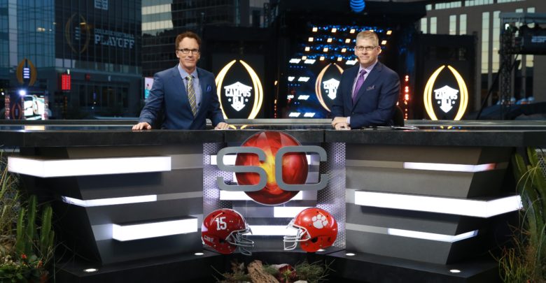
Now, everyone knows the iconic network and tunes in to watch their favorite sports.
ESPN Going Multichannel
So how did a network that was initially headquartered in Bristol, Connecticut, and started with covering Connecticut sports branch out to be known worldwide?
Well, over time the network began to branch out into other countries and began to launch new channels around the globe. In 1988, roughly a decade after the network had launched, the ESPN International wing was officially formed, and the network began to create channels in various different countries.
They started with South America in 1989 and expanded to Asia and Europe. Today, the network is known worldwide and is famous for its broadcasting.
Conclusion
Whether you’re a fan of the sports industry or not, there’s no doubt that you’ve heard of the famous ESPN sports broadcasting network. However, when you think of the network, the image of the scarlet red and white logo may spring to mind.
This logo has an interesting history, with the first logo coming into existence in 1979 and then later redesigned to the iconic emblem that we associate with the brand today. Above, we looked at the history of the legendary ESPN logo and how it got to what we see today.
With the creative use of font and color choices, we can use this logo as an example of what to look for in the future to create modern, sleek designs that will stand out.
After looking at how the logo developed into what we see today, we examined the network’s history and how the founders worked to develop it into the creative broadcasting service that has made its way around the nation.
We can certainly learn a lot by looking at ESPN, both with the network and its visual identity, learning the important aspects of development, and using creativity to create iconic and long-lasting impressions.


