When you think about watching the news, a few different things might spring to mind, one of these being Fox News.
There are many popular news channels worldwide, one being the famous Fox News channel reporting news since it first launched in 1996.
One of the reasons that Fox News stands out is due to its iconic logo that represents the channel. From its early days to its present status, the Fox News symbol has consistently cast the network in a positive manner, enticing viewers to stay loyal.
However, the Fox News channel hasn’t always used the sleek and modern logo we see today. As with any logo, the design has undergone changes that reflect the brand’s growth and changes to what it offers. As one of the largest American media corporations, Fox News has made a name for itself and become one of the most popular channels in the nation.
This write-up explores the origins and progression of the Fox News insignia, detailing its various alterations over the years and the rationale behind them. Furthermore, we will delve into the channel’s background and uncover the factors that have led to its present-day triumph.
1990––1996: The First Logo
The initial Fox News emblem, designed in 1990, was markedly different from the one recognized as the brand’s symbol today.
Although the channel itself didn’t launch until 1996, that didn’t mean that the channel didn’t get started with its emblem even earlier than that.
We can trace the start of the brand back to 1990, when the first logo was created. This first logo featured a black and white design with a splash of red, giving the channel a fun and energetic start. This first logo didn’t only work as the start of the company, but it also became the icon that many associated with the brand, and it started to develop the channel’s personality at an early point.
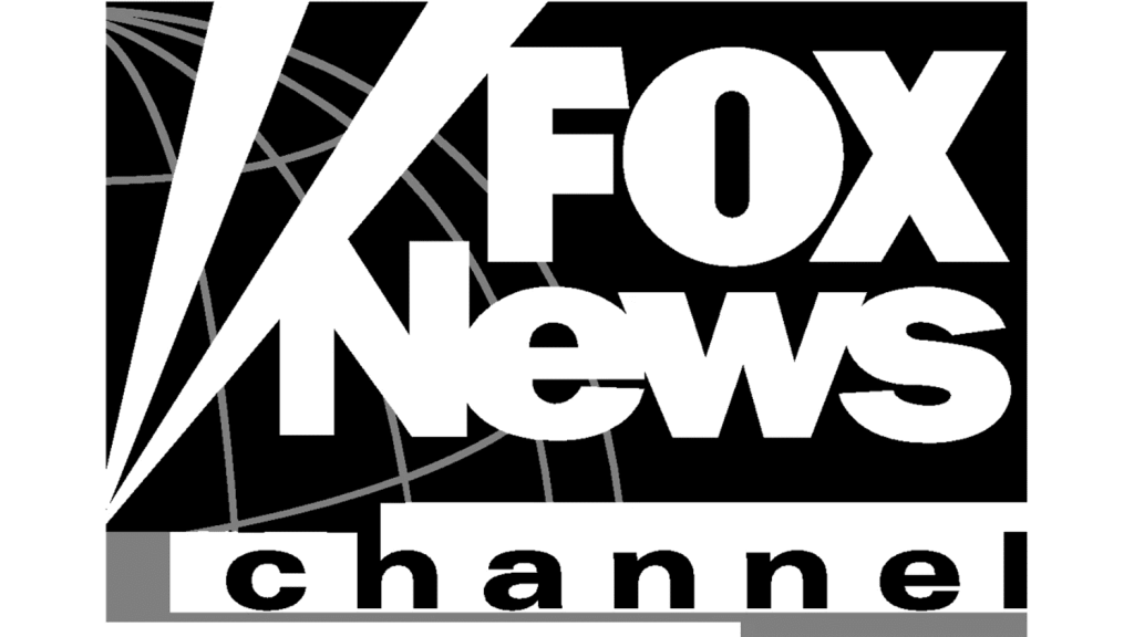
When it came to the design details, this first emblem featured a bold design that showed the word “Fox” in all uppercase letters framed by thick diagonal lines. This first word was shown to the right of the design, almost to the side of the rectangular box that the design was inside.
Below the first word was the second, “News,” also positioned to the shape’s right. The two lines on the left also cut into this letter. The slanted lines, akin to stage lights, carried a deeper meaning beyond enhancing the design’s look.
These lines weren’t just for show; they embodied the channel’s dedication to providing critical news and information to its audience. For those unfamiliar with their channel, it was critical to explain the brand’s purpose and promise to its audience.
The channel took it a step further by using its design to display the purpose of its brand. They did this by using two parallel lines shown beneath the company name. This was meant to mimic a stage, which was meant to show Fox News’s audience its commitment to using an engaging and ever-evolving platform to deliver news.
This logo gave news that the channel had the proper stage and performance means to demonstrate news in the best manner possible. The final part of the name, “channel,’ was shown at the very bottom of the design and enclosed in a stage-like rectangle. This last part of the name was in smaller letters, allowing the first two words to be the show’s star and make an impression.
The design featured a black drawing on a vibrant yellow background. When it comes to logo color choices, brands tend to use colors to display their energy and character. In the case of Fox News, they chose the two colors for their design very carefully. The black demonstrated trustworthiness and solidity, ultimately showing the brand’s reliability. The yellow showed the brand’s liveliness, energy, and expertise.
When you see this logo, it’s clear that it was more than just a design–it was a symbol of their purpose and showed the brand’s essence through the usefulness of shapes and color choices. This first logo really set the stage for the brand’s future and was the base for all the designs that followed.
2002––2017: A Change For The Design
In 2002, the brand decided it was time for a change and embraced a new symbol for their channel. The brand updated its logo to remove the red line they’d used in their previous logo.
This was a big step for the brand, considering the red line had been a vital design part. Instead, Fox News opted to use a dark blue square as the center element of their design. As with every aspect of their design, the blue square was intentional and filled with purpose.
It was a vital element of the new design that the brand felt was necessary as they entered a new era. Blue is a color that represents trust, stability, and wisdom. It was important that, as a news channel, Fox News represented itself as a trustworthy and reliable brand.
That was why the brand chose colors, such as blue, that ignited feelings of trust. It intentionally displayed itself as a reliable and robust brand that always delivered accurate news.
However, this new era wasn’t only centered on the colors used in the symbol. The brand also made a subtle shift in the design’s typography. The difference in typography wasn’t substantial, only slight enough that it could barely be noticed.
However, it did make a difference in the overall cohesiveness and character of the design. This change was capitalizing the letter “C” in the word “channel,” ensuring that the design adhered to spelling rules and had a more sleek look. Although this may seem like a small change that had no meaning to some, it was very intentional on the brand’s part.
They wanted to show their audience their attention to detail and securing perfection. For Fox News, their brand was all about showing their audience that they delivered accuracy and precision with every event they reported on. Demonstrating their diligence in correcting this error in their previous design showed customers they were devoted to ensuring accuracy.
For designers at the time, this was an example of how a company could execute a redesign flawlessly. They ensured the brand didn’t lose the consistent identity they had developed with their first design. It shows how a design can transition throughout the years without losing its core or missing the mark.
The brand intentionally kept the “Fox” inscription the same and used the spotlight lines to keep parts of the design consistent and ensure that the audience saw the same cohesive look. This logo stayed with the channel for fifteen years, representing high-quality journalism and how professionals consistently delivered accurate stories on the channel.
This design was famous for showing designers that simple design changes could be impactful, however slight.
2017––Present: The Logo Today
The Fox News logo didn’t change with the 2002 design. The channel continued striving for perfection, which meant a change for the brand in 2017.
This change to the design wasn’t just a tiny edit made to the design but rather an impactful change that could show how the brand had changed since it was first created and the growth it envisioned in the future.
The most impactful modification to the design was the minor yet purposeful shift in its color palette. The blue that had previously been dark was lightened, now giving it more of a sleek and modern look.
The lighter blue made the design more approachable. The brand also made the red in the design slightly darker, using it to balance out the light blue. This change again showed the channel’s devotion to getting every aspect of the emblem perfect, down to the details of the colors.
With this design, the brand also included a thin curved line behind the company name, shown in white. Many people might even notice the change, but it was an essential aspect of the design of the brand.
It helped with the overall cohesiveness of the design and made it more fluid and sleek. The line helped combine all the design elements and helped them tie together in a more artistic way. In many ways, this line helped the design appear more modern and elegant.
The typography in the design also changed, showcasing a change in the word “channel” so that now it was all lowercase. This made the design more approachable and also helped it appear more modern by using the same type of digital-age design that more brands were beginning to adopt. The channel used the logo’s typography as a powerful tool to create a stylish and sleek design.
This redesign kept enough of the previous designs consistent and recognizable with the earlier designs, but it also helped the design keep up with the times and stay modern. The brand consistently has shown that it strives for perfection and is willing to make as many small changes as necessary to ensure the logo is always as perfect as possible.
That’s why the brand was willing to make slight changes to the color and typography and add a curve for the design to keep it aesthetically pleasing. This version of the logo was created in 2017 and has been with the brand ever since.
In Conclusion
Overall, the Fox News channel is an iconic and reliable news channel that millions of viewers around the globe turn to for their knowledge.
Although the channel has a fascinating history, there’s no denying that the logo is well known for being legendary and having made its mark in the design world.
The brand has had three logo designs since its creation, each purposeful and intentional. Fox News has committed to perfection and has ensured that its brand is consistent and only necessary changes are made to the logo. Today, we see a sleek and stylish logo design that represents the brand and everything it stands for.


