Professional sports logos aren’t just about brand identity—they’re symbols that tell stories, forge deep emotional connections, and bring communities together. If you’re a fan of the Kansas City Chiefs, you already know how special that iconic arrowhead is.
It’s a design that has remained strikingly consistent for decades, proudly representing the team’s roots, its adopted home in Kansas City, and the devoted fan base known as the Chiefs Kingdom.
So, how did we get here? Let’s take a look back at the franchise’s early days as the Dallas Texans, track their big move to Kansas City, and see how Lamar Hunt’s famous napkin sketch gave birth to a logo that’s now one of the most recognized in the National Football League (NFL).
Throughout this journey, we’ll touch on how the Chiefs’ identity evolved, why they’ve stayed true to their brand for so long, and how the arrowhead continues to unite fans in red and gold—from the Midwest to every corner of the globe.
From an Entrepreneur’s Vision to the Dallas Texans (1960–1962)
Before there were the Kansas City Chiefs, there were the Dallas Texans. Back in 1960, entrepreneur Lamar Hunt founded this team as part of the newly established American Football League (AFL). Hunt’s dream was to create a football experience that both rivaled and complemented the NFL.
The Texans had to stand out in a place already buzzing with excitement over the Dallas Cowboys. As you might imagine, a bold identity and distinctive logo were key to putting the Texans on the map.
The Hunt for the Perfect Colors
Lamar Hunt initially experimented with different color combinations, hoping to inject personality and flair into his new franchise. He thought Columbia blue and orange might work, but when he realized Bud Adams had picked Columbia blue for his Houston Oilers, Hunt pivoted toward red and gold.
It might have been a quick decision at the time, but it was a stroke of genius for the team’s long-term look. Today, those two hues still resonate with fans around the world as the essence of the Chiefs brand.
The First Dallas Texans Logo
The Texans’ earliest primary logo was pretty straightforward: a white silhouette of Texas with a bright yellow star showing where Dallas is located.
Placed on a background of red or sometimes gold, it highlighted the team’s name and its tie to the Lone Star State.
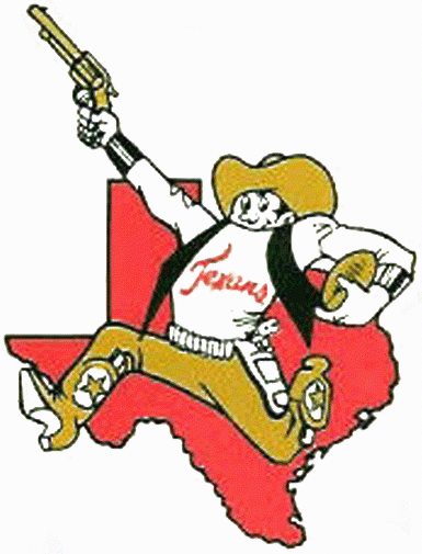
However, there was also a secondary design—created by cartoonist Bob Taylor—that showed a gunslinger in a cowboy hat, sporting spurs, superimposed on the outline of the state.
This gunslinger emblem was a bit more playful and captured the “Wild West” spirit, but it never made it onto the uniforms or helmets.
Instead, it appeared on promotional materials and stationery, giving the Texans a splash of personality in the marketing department.
Growing the Fan Base
Despite its relatively short life, the Dallas Texans franchise carved out a place in the AFL’s history. Between strong on-field performances and memorable brand identity, the team found ways to win over local supporters—even though they shared Dallas with the established Cowboys.
The Texans managed to claim an AFL championship in 1962, but as it turned out, winning wasn’t enough to eclipse the Cowboys’ presence in the same city. This reality pushed Lamar Hunt to look for a fresh start somewhere else, forever changing the Texans—and their logo.
Becoming the Chiefs (1963–1971)
In 1963, the Dallas Texans embarked on a new chapter by packing their bags and relocating to Kansas City, Missouri. While moving a team is never easy, Lamar Hunt saw the potential for building a passionate fan base in a city that wanted a pro football franchise to call its own. But before long, the question loomed: What do we name this new team?
From “Texans” to “Chiefs”
Initially, Hunt considered keeping the “Texans” moniker, reasoning that Dallas fans would still follow the team. However, Kansas City’s local leaders—and even some fans—thought it might be strange to cheer for the “Texans” in Missouri. The city’s mayor, Harold Roe Bartle, played a major part in the team’s rebranding.
Nicknamed “The Chief” for his leadership in local civic programs, Bartle inspired Hunt and General Manager Jack Steadman to adopt a new name that would resonate with the new home crowd. They landed on the “Kansas City Chiefs,” a tribute to the mayor’s nickname and community spirit.
A Logo for the New Era
Once again, Bob Taylor took on the challenge of designing a fresh logo. This time, he replaced the gunslinger with a Native American figure in motion, football tucked under one arm.
Behind that figure was a map that outlined Missouri, Kansas, Nebraska, Oklahoma, Iowa, and Arkansas—underscoring that this team wasn’t just for Kansas City but for a broader region as well.
Like the Gunslinger logo in Dallas, this design was primarily used in advertising and on team facilities, never appearing on helmets. Nevertheless, it helped fans across multiple states connect with the team, providing a unifying symbol for Midwestern supporters.
Establishing a Loyal Fan Base
As the Kansas City Chiefs, the franchise quickly found success. They became one of the strongest teams in the AFL, racking up wins and making history with an appearance in Super Bowl I against the Green Bay Packers in 1967.
After that, they returned to the big stage in Super Bowl IV (1970 season), emerging victorious. The city threw its support behind the Chiefs, and red-and-gold became fixtures on street corners, in local shops, and in the hearts of enthusiastic fans. By the early 1970s, Kansas City was no longer a new home—it was the home.
Yet something was missing from the Chiefs’ look—an emblem that was distinct and timeless, something that would resonate the moment you saw it. That’s exactly what would arrive next, courtesy of Lamar Hunt’s imaginative doodles.
The Birth of the Arrowhead (1972–Present)
The biggest turning point in the Chiefs’ visual identity came in 1972 when the now-famous arrowhead logo debuted. This design was the brainchild of Lamar Hunt, who drew his initial sketch on a napkin, setting off a chain reaction that would shape the team’s brand for decades.
The Napkin Sketch That Changed Everything
While traveling back to Kansas City, Hunt found himself inspired by the classic interlocking “SF” on the San Francisco 49ers’ helmets. He liked the simplicity of those letters sitting within an oval but felt the Chiefs needed something unique—an arrowhead shape to represent “Chiefs” and honor Native American heritage.
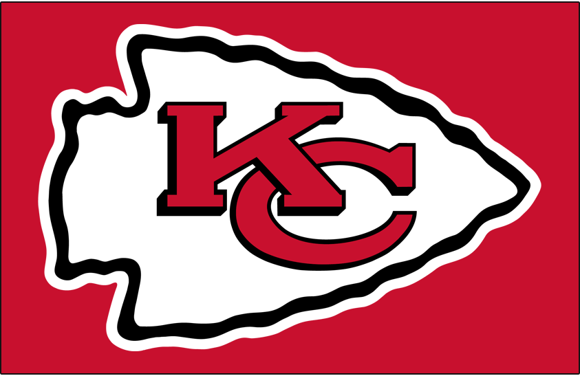
So, he drew a quick concept on a napkin: the letters “KC” inside a stylized arrowhead. When he showed it to the rest of the organization, it immediately clicked. And with just a little polishing, the final version was unveiled: a white arrowhead trimmed in black, with the red letters “KC” nestled inside.
Why the Arrowhead Works
Part of what makes the arrowhead so successful is its simplicity. By focusing on core elements—a distinctive shape (the arrowhead) and initials (KC)—the design is universally recognizable and easy to reproduce, whether on a helmet, billboard, T-shirt, or pin.
Also, the contrast of white on red (with a black outline) ensures it stands out even from a distance. It’s a masterclass in minimalist design, demonstrating that you don’t need elaborate details to communicate a strong identity.
Keeping the Red and Gold Tradition
From the very start, the Chiefs stuck with the red and gold color scheme. Even as other NFL teams cycled through uniform tweaks and logo overhauls, Kansas City held firm.
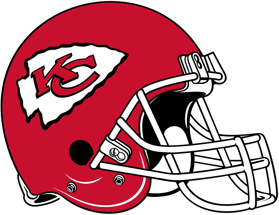
The red helmet, introduced back in the Dallas Texans days, became the perfect backdrop for Hunt’s new arrowhead. Today, when you spot that bright red dome gleaming under stadium lights, you know exactly who’s playing.
The Chiefs’ Uniforms and Merchandise Over the Years
The Chiefs’ arrowhead hasn’t just remained on the helmets—it’s defined nearly every aspect of the team’s merchandise, uniforms, and branding. This approach has reinforced a sense of continuity that stretches all the way back to the early 1970s.
Helmets That Make a Statement
Chiefs helmets are instantly recognizable. Few NFL teams have stuck with one design for so long, especially in an era when marketing experts often suggest “keeping it fresh.”
But for Kansas City, “fresh” has meant consistency and loyalty to a design that works. The red shell, white arrowhead, and black trim haven’t changed in any major way since 1972, and that’s a big part of why they’ve become iconic.
Jerseys and the Red Sea
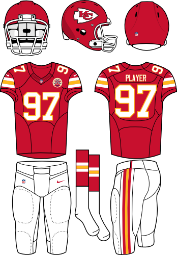
While the details on jerseys have been tweaked occasionally (like number fonts or collar accents), the overall look remains largely the same: red or white jerseys, red or white pants, and the arrowhead front and center on the helmet.
The red jerseys, often paired with white pants, are a staple at home games, creating that “Sea of Red” vibe inside Arrowhead Stadium (named, of course, after the emblem). When the team takes the field, fans instantly feel that connection—old school or new fan, everyone rallies around those colors and that logo.
The Merch That Keeps on Selling
From T-shirts to hoodies, hats, and everything in between, the arrowhead is everywhere. It’s no surprise that it’s one of the top-selling logos in sports merchandise.
Whether people want to rep the Chiefs in Kansas City, across the country, or around the world, the emblem translates seamlessly across different platforms and product lines.
And because it’s so simple and timeless, the arrowhead also avoids looking dated, meaning fans who buy gear don’t have to worry about it being “out of style” in a few years.
Addressing Cultural Sensitivity
No conversation about the Chiefs’ branding is complete without acknowledging the broader debate on sports teams using Native American names and imagery.
Many organizations, from high school teams to major league franchises, have reevaluated how they incorporate Indigenous themes and references in their branding. The Chiefs are, of course, no exception.
The Ongoing Dialogue
In recent years, the team has been under scrutiny for the “tomahawk chop” chant, headdresses worn by fans, and certain game-day traditions. The Chiefs organization has taken steps to address these concerns, including discouraging headdresses and face paint that mimics Native American ceremonial gear.
While the arrowhead logo itself is more subtle than, say, a caricature of a Native American chief, some activists and tribal representatives believe that using any Indigenous imagery or references can still perpetuate stereotypes.
Respecting Culture While Preserving Identity
Balancing cultural respect with fan tradition isn’t easy. The Chiefs have engaged in dialogues with local and national Native American groups to better understand how to show respect. So far, the arrowhead has remained unchanged, and most fans view it as a way to honor and celebrate heritage rather than exploit it.
But the conversation isn’t over; it’s an ongoing process that requires listening, learning, and, perhaps in the future, more changes. For now, the arrowhead endures as the team’s primary symbol, representing not only football but also a commitment to thoughtful discussions about cultural representation.
The Arrowhead’s Enduring Legacy
The Kansas City Chiefs logo has come a long way, from its days as a Dallas Texans silhouette of Texas to Bob Taylor’s running Native American figure, and finally, Lamar Hunt’s napkin-inspired arrowhead. Through relocations, name changes, and league mergers, that arrowhead has remained a constant sign of pride and tradition in Kansas City and beyond.
For over five decades, it’s been a rallying cry for some of the most passionate fans in the NFL, an emblem that has witnessed everything from hard-fought AFL championships to recent Super Bowl triumphs. The arrowhead also weaves through stories of cultural sensitivity, community engagement, and charitable work, reminding us that sports logos can be more than just marketing tools—they can be symbols of unity, respect, and shared history.
As the Chiefs continue to make waves in the NFL, we can expect the arrowhead to remain a beloved and powerful icon. Whether you’re sporting it on your jersey, a baseball cap, or even a car decal, you’re part of a massive community that spans generations. And that’s the beauty of the Kansas City Chiefs logo: its ability to connect us to the past, celebrate the present, and inspire the future—all in one simple, timeless shape.

