The story of the SIG Sauer logo begins with a Swiss wagon factory back in 1853.
Since then, the company has made some major changes, becoming the popular provider and manufacturer of firearms, electro-optics, ammunition, airguns, suppressors, remote-controlled weapons stations, and training that we see today.
While the company itself has gone through some major changes, so has its branding. The SIG Sauer logo reflects the brand’s values and identity as it grew into what it is today.
About SIG
SIG (Schweizerische Industrie-Gesellschaft or Swiss Industrial Company) may now be a well-known manufacturer of firearms, ammunition, optics, airguns, suppressors, and remote-controlled weapons stations. However, it wasn’t always this way.
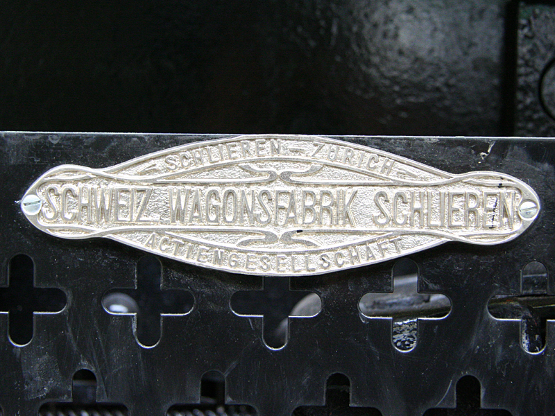
The brand originally started as a manufacturer of railway cars and wagons in 1853 under the name Schweizerische Waggonfabrik (Swiss Wagon Factory). They were located above the Rhine Falls in Switzerland.
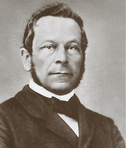
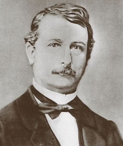
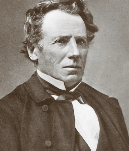
The brand was founded by three entrepreneurs from different backgrounds — Friedrich Peyer im Hof, Swiss Parliament member from the railroad industry; Heinrich Moser, a serial entrepreneur; and Conrad Neher, a prominent iron and steel industrialist.
SIG’s first products were railway cars and wagons for the emerging Swiss railway companies in the mid-19th century. In under a decade, the brand completely transformed. The Swiss Army adopted the 1859 Prélaz-Burnand system and prompted this transformation.
During this transformation, the brand moved from exclusively manufacturing railway cars to manufacturing rifles. Schweizerische Waggonfabrik was contracted by the government to produce 30,000 muzzle-loading Prelaz-Burnand rifles in 1864.
There was one other major change for the company at this time. Instead of continuing to go by “Schweizerische Waggonfabrik,” the company decided to change its name to better reflect the direction the company went.
The name was changed to “Schweizerische Industrie-Gesellschaft” or “Swiss Industrial Company,” today more commonly known as SIG.
SIG in the 20th Century
The 1900s was a big century for SIG. In 1949, the SIG P49 — which later evolved into the SIG P210 — was created for the Swiss Army and went on to achieve legendary status both on the battlefield and in competitive shooting.
That same year saw the introduction of the P220 as the new sidearm for the army, followed shortly by the compact P230 for the Swiss police force. These pistols introduced innovative features and unprecedented levels of reliability to the industry.
The growth did not stop there. By the 1970s, SIG’s small arms division had grown to include Hämmerli Target Arms from Lenzburg, Switzerland. It also included Sauer & Sohn, GmbH, from Eckernförde, West Germany — another long existing companying known for their hunting rifles.
The acquisition of J.P. Sauer & Sohn by SIG in the 1970s resulted in the formation of the combined company SIG Sauer GmbH in 1976, based in Germany.
In the 1980s, SIG turned its attention to the United States market, recognizing it as a crucial component of their business strategy to further expand their market share and establish themselves as a leading player in the global small arms industry.
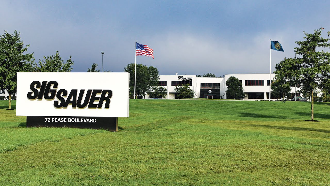
In January of 1985 SIGARMS, Inc. was officially born in Tyson’s Corner, Virginia. It was later moved to Herndon, Virginia, in 1987, before finally being moved to its current location in Exeter, New Hampshire, in 1990.
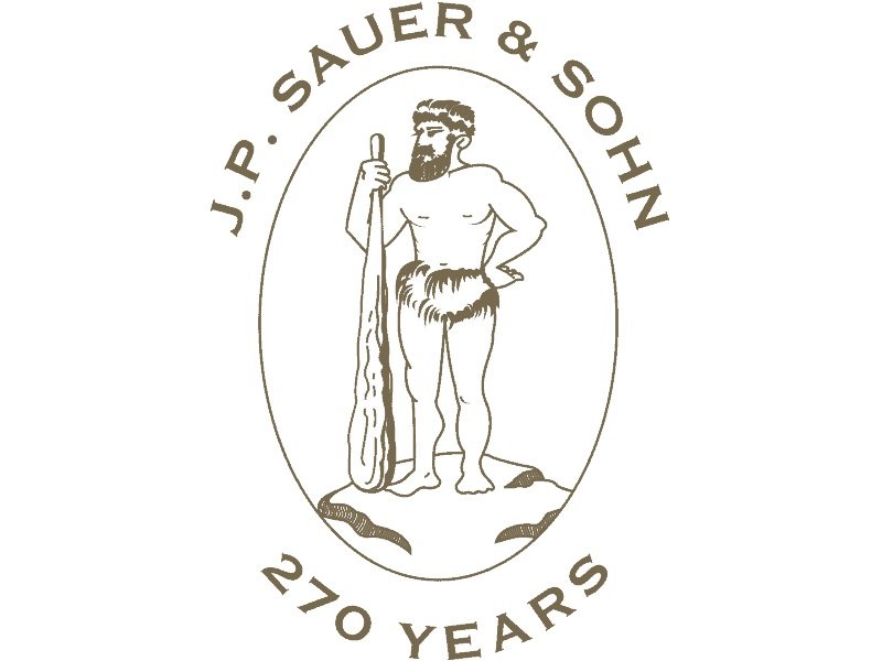
J.P. Sauer & Sohn
J.P. Sauer & Sohn was a company that was no stranger to the making of weapons and firearms. Like SIG, the company has an extensive history.
However, it did not start as a wagon company. J.P. Sauer & Sohn was founded in 1751 in Suhl, Germany by Lorenz Sauer as a gunsmithing company.
It initially focused on producing military rifles but later expanded into hunting and sporting firearms. By the 1800s — under the leadership of Johann Paul Sauer and his sons Rudolf and Franz — J.P. Sauer & Sohn became a well-known manufacturer of high-quality hunting rifles and shotguns.
In the early 1970s, SIG (which was still called “Schweizerische Industrie Gesellschaft”) had already begun its transition into firearms manufacturing, but it was looking for a partner to produce its newly designed P220 and P230 pistols.
That is where J.P. Sauer & Sohn came in. J.P. Sauer & Sohn had the necessary expertise and capacity for the series production of these pistols.
Their partnership helped propel both companies forward. In 1976, SIG acquired J.P. Sauer & Sohn, and the two companies merged to form SIG Sauer GmbH. Prior to World War II, Sauer had primarily manufactured shotguns and hunting rifles, while SIG brought its expertise in pistol design and manufacturing.
This partnership combined SIG’s innovative pistol designs with J.P. Sauer & Sohn’s manufacturing capabilities, leading to the successful production and global distribution of SIG Sauer’s line of handguns, which began with the P220 in 1975.
SIGARMS to SIG Sauer
Although they have been making firearms, ammunition, and other weapons-related items for many years, it wasn’t until 2001 that the rebranding to SIGARMS, Inc. was launched. Some photos can still be found of vintage SIGARMS branded weapons and merchandise featuring a a blue variation of the SIGARMS logo featuring a lowercase “i” with a red dot, although there is not much information about this logo variation.
The brand continued to expand its role in the firearms market. Under SIGARMS, the brand was able to create new contracts in the law enforcement and civilian markets.
The brand continued to grow exponentially. SIGARMS made one last change to its name on October 1, 2007. This was the day “SIGARMS” became “SIG Sauer” as it is known today.
The name change reflected even more exponential growth. In less than three years after the name change, the company made a threefold expansion to its workforce.
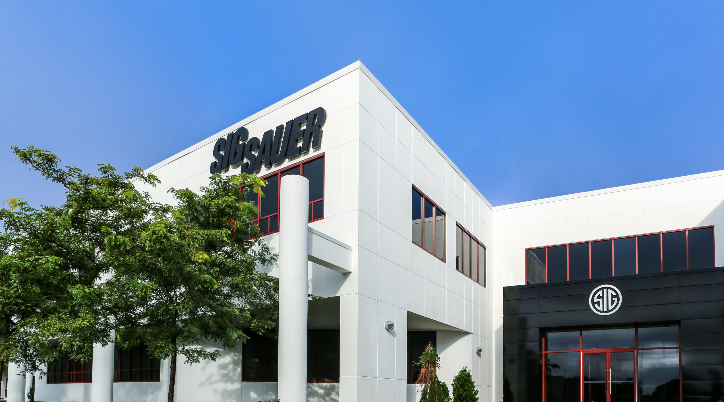
It also invested $18 million into new equipment and manufacturing facilities. The brand also made a huge expansion to its engineering base. The railway car and wagon company that started in the 19th century has now become a widely-known ISO 9001-certified company with a 206, 000-square-foot facility and over 3,400 employees.
The SIG Sauer Logo
Today, the SIG Sauer logo has a very simple design. The logo simply spells out the words “SIG Sauer” and is written in a thick black typeface. The “SIG” is written just slightly above where “Sauer” is written to its right.
This is the main logo featured on their current website and is often accompanied by the slogan “Never Settle” written beneath it.
This same logo is also used with only a slight variation with the addition of the “Academy” written in smaller text below it in place of the slogan for SIG Sauer Academy — an academy that offers firearm training for beginners, as well as military and law enforcement professionals.
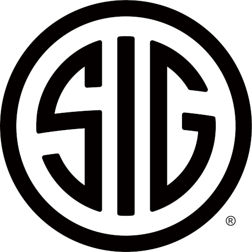
The SIG Sauer Circular Logo
Perhaps the most recognizable version of the SIG Sauer logo is the bold circular logo with the letters “SIG” written inside.
This logo can be found on many of the company’s products today, including firearms, spotting scopes, binoculars, laser rangefinders, riflescopes, telescopic firearm sights, and tactical laser sights. It can also be found on their branded apparel, such as t-shirts, sweatshirts, and hats.
This same logo is used as their favicon — otherwise known as a shortcut or website icon — on their current website and includes a more minimalist design that effectively represents the brand’s essence of authority, reliability, and precision in the firearms industry.
The Wordmark of the Logo
The SIG Sauer logo wordmark features the brand name “SIG SAUER” in bold, italicized capital letters using a simple sans-serif typeface. It is simple but gets the name across.
Unlike many other brands that rely on colors or creative text styles to capture consumer attention, SIG Sauer’s simple approach is straight to the point without any distractions, simply using bold black text. Rather than trying to be overly creative, the brand name stands out clearly and is easily readable.
This minimalistic approach makes the logo both more memorable and more versatile for adding to their various firearms, merchandise apparel, and more.
Color Scheme
Many popular firearm brands, such as Glock, Ruger, Beretta, Smith and Wesson, and Mossberg, incorporate various colors and creative shapes into their logos. However, SIG Sauer took a more simple color approach. The logo primarily uses black and white.
This classic color combination further shows the brand’s sophistication and timelessness. Beyond its simplicity, the black represents strength, power, and authority, which can commonly be associated with high-quality firearms. The white symbolizes purity, simplicity, perfection, and clarity, reflecting the brand’s commitments.
The “Never Settle” Tagline
The SIG Sauer logo often includes the tagline “Never Settle.” This tagline reinforces the brand’s commitment to excellence and continuous improvement in its products and services.
The tagline is typically placed below the main SIG Sauer wordmark in a thinner version of the same sans-serif font used for the rest of the logo, allowing for the tagline to be clearly read while not overpowering the bold wordmark above it.
The phrase “Never Settle” reflects SIG Sauers’s constant innovation and improvements for their products as they provide some of the highest quality equipment to military, law enforcement, and commercial users worldwide.
Lessons To Learn From The SIG Sauer Logo
Although the design is simple and hasn’t seen many changes throughout the years, there is a lot that can be learned from the SIG Sauer logo.
Simplicity and Clarity
The SIG Sauer logo teaches us a valuable lesson about the effectiveness of simplicity. With its bold, italicized capital letters in a sans-serif typeface, the logo’s design is straightforward and easy to understand. This simplicity allows the brand name to be instantly recognizable and easily readable. Minimalist-style logos are timeless.
However, this is a trend that has become more popular in recent years because of its clean look and easier readability. While many of SIG Sauer’s competitors continue to use more colorful and creative style logos, they brand still remains one of the more reputable firebrands with the use of a logo that more simply conveys their message in a more eligible way.
This is a prime example of how brands can benefit from stripping down their logos to the essentials to enhance readability and memorability.
Incorporating a Tagline
The SIG Sauer logo is memorable on its own. However, the company took this a step further by incorporating its tagline “Never Settle.” This tagline shows SIG Sauer’s commitment to excellence, innovation, and reliability.
It reflects the brand’s dedication to producing high-quality firearms and accessories that meet the demands of law enforcement, military personnel, and civilian enthusiasts, and urges buyers to never settle for anything besides the highest quality products.
The tagline “Never Settle” conveys a powerful message of determination and continuous improvement, resonating deeply with SIG Sauer’s audience and reinforcing the brand’s reputation for unmatched performance and dependability.
Adaptability Across Media
Logos like the SIG Sauer Logo are simple. These types of logos have a range of benefits — one of the biggest being that they tend to be more versatile and can be easily scaled or reproduced across different digital platforms without losing clarity or legibility.
Because of the simplicity of their logo, it has been easily incorporated on their website, on their apparel, on their weapons and packaging, and part of the logo has been easily repurposed into other brand logos, such as the SIG Sauer Academy, SIG Tac, and SIG Sauer Experience Center. As the phrase goes, sometimes less is more. This has certainly been the case for SIG Sauer.
Preserving Heritage
Although SIG is far from the wagon company it once was, it has never completely forgotten its roots all those years ago.
While the company has evolved through mergers and expansions, SIG Sauer has preserved its heritage by retaining the “SIG” name.
Staying true to the brand shows a sense of confidence and strong values. By holding on to its roots, the company demonstrates a rare dedication to its heritage, principles, and the people who have supported it along the way.
The SIG SAUER logo is a minimalist yet powerful representation of the company’s brand identity as a leading firearms manufacturer. From a Swiss wagon factory to a leader in all things firearms, the brand has created a big name for itself over the years.
The logo’s design, with its bold typography and minimalistic approach, both reflects the brand’s values and ensures it will continue its timeless relevance across various mediums and applications for the years to come.