Once Twitter was established in 2006, the way we communicated changed. With Twitter’s arrival, keeping our thoughts to 280 characters became the new norm. People rushed to the platform to respond to celebrity tweets, post updates to their friends, and be a part of bigger conversations.
A lot has happened to the company since 2006, and that’s what we’ll explore throughout this article. From platform updates, changes in ownership, and reimagined branding Twitter today looks a little different than it once did. Keep reading below to learn all of that and so much more.
Meet Twitter
Every great company starts with an idea, and the idea for Twitter was first born in 2005. Jack Dorsey was working at a podcasting company, Odeo, at the time.
One day at work, Dorsey had an idea for a service that could send one message to a small group of people. After a coworker had the idea of calling this service “twttr,” Dorsey took that idea and ran with it.
One year later, in 2006, Twitter was officially released to the public, and the first tweet ever was posted. It was what many would refer to as a test tweet, and that tweet was by Dorsey himself writing, “Just setting up my twttr.” From there, Dorsey focused on building a user base, and after two months, Twitter was only up to 5,000 users.
It’s a good thing Dorsey never gave up on his company though. In just a short while longer, Twitter jumped in users, and the public had a strong international presence by 2007. If you fast forward to today, while Dorsey is no longer the owner of Twitter, Twitter has more than 1.3 billion users across the world.
The Evolution of Twitter
Looking at Twitter’s evolution, it’s an evolution that spans nearly 20 years and an evolution we walk you through below.
2005-2007: The early days of Twitter
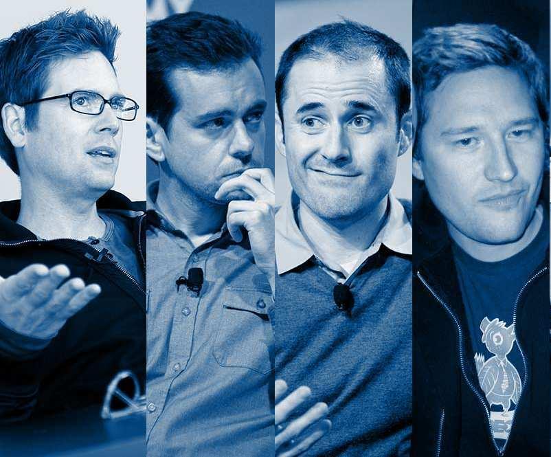
Twitter was founded in 2005 under the name “twttr.” Jack Dorsey, Noah Glass, Even Williams, and Biz Stone were working together at Odeo, a podcast company, and built off each other’s ideas to arrive at Twttr. While the idea came in 2005, it took a year to turn that idea into a concrete application. In 2006, Twitter was released, and Dorsey posted the first-ever tweet. Twitter focused on growing organically until 2007. In 2007, Twitter received $100,000 from a Series A funding round, and following this, its user base grew.
2008-2010: Twitter makes strategic choices for expansion
Once Twitter received its first user boom, Dorsey stepped down as CEO. Williams took over the reins of the business. In the years that followed, Twitter utilized its user base and publicity opportunities to keep the public engaged and expand its reach.
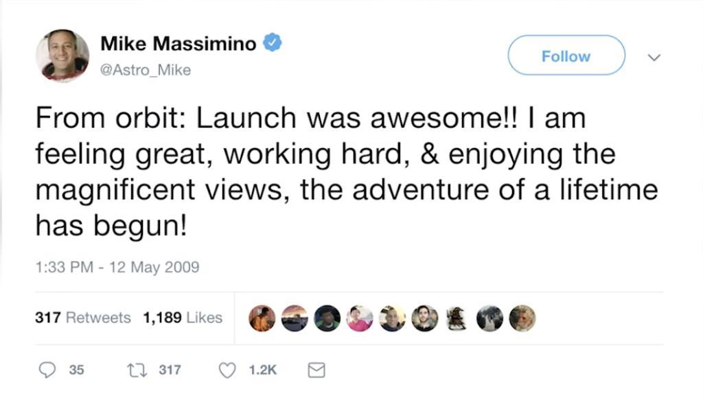
Celebrities used Twitter regularly and even referenced this on talk shows, even Oprah’s show. In 2010, the first tweet from space was sent by a NASA astronaut, which again helped unintentionally promote Twitter positively. That same year though, Twitter went through another change in ownership. Williams was replaced by a non-founder, Dick Costolo.
2011-2012: Twitter turns political
In 2011, Twitter was used as the primary social media platform for antigovernment protests during the Arab Spring overseas. This was one of the first times that Twitter was used for delivering breaking news, uncovering a new use of the platform. Another early breaking news story (unrelated to politics) was the death of Whitney Houston which was announced on Twitter almost an hour before any other news publication. During the 2012 Presidential Election, Barack Obama turned to Twitter to declare his victory. Not only did this solidify Twitter as a source for breaking news, but it solidified Twitter being a large-scale news distribution vehicle.
2013-2016: Twitter battles the stock market
After Twitter maintained an increasing user base, the company went public in 2013. After entering the stock market, Twitter’s user base growth began to slow. While this could have been for a variety of reasons, it still caused the stock price to drop. These years were one of the first times that Twitter had to think strategically about how to get back on track. Its user base lagged behind its social media competitors, and the company struggled to make a profit from its advertising partnerships. To turn the company around, Twitter brought back Dorsey as CEO.
2017-2019: The early stages of Dorsey’s second rein as CEO
With Dorsey back on board as CEO, Twitter turned its numbers around for a little bit. The only constant battle Twitter seemed to be in as it strived to maintain growth was with Donald Trump.
Given the platform was built on freedom of speech, Trump took this verbatim and used Twitter as a campaign tool. With Trump’s presence on the platform, Twitter was back under fire, and Dorsey and Facebook’s CEO at the time, Sheryl Sandberg, were required to testify before the Senate about their platform’s alleged interference in the 2016 election. Beyond that, Twitter was also attacked for alleged political bias during these years. To move forward, Dorsey met with Trump himself.
2020-2022: Twitter’s path forward
When Dorsey took back leadership, he likely wasn’t expecting to have to navigate a presidential election, a Senate hearing, and a global pandemic. As if this wasn’t enough, also in 2020, Twitter was hacked.
In 2021, Twitter permanently banned former President Trump before Dorsey left his role as CEO again. This time Twitter appointed its Chief Technology Officer, Parag Agrawal, as CEO. That wasn’t the last change for the company, though. Today, Twitter is owned by Elon Musk, who spent $44 billion for the platform and took over ownership in 2022. With Musk’s arrival, a large chunk of the workforce was fired, kicking off Musk’s new vision for Twitter.
2023-Today: Elon Musk’s new vision for Twitter
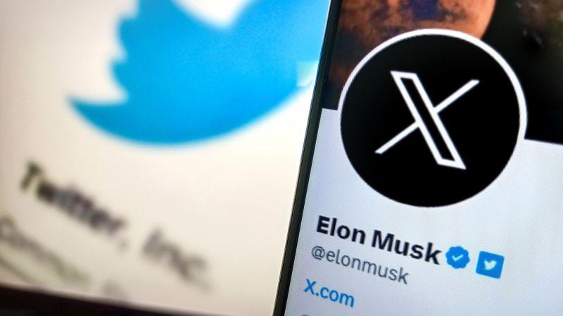
Since taking ownership of Twitter, Musk has had big ideas for the future of the platform. His biggest move came overnight on July 24, 2023, when Twitter suddenly became “X,” with the URL “X.com,” redirecting you to Twitter.
This new name and branding were more aligned with Musk’s other projects outside of Twitter, now falling under his parent company, X Holdings Corp.
Musk teased this new name back in April 2023 and shared that this new name would represent his quest to make Twitter a “super app.”
With the announcement of the new name, Twitter (or X) will no longer feature the iconic blue bird which will be replaced with an “X” style logo. The new logo is yet to be officially announced.
Rather than Twitter only providing an outlet to share tweets, Musk hopes he can grow this app to include so much more, referring to Twitter previously as, “an accelerant to creating X, the everything app.” Musk came up with this all-encompassing idea based on WeChat in China.
WeChat allows its users to tackle anything from direct messaging to taxi-hailing, to submitting payments. This is only the first step in Musk’s move to completely revamp the platform.
Roadblocks Along the Way
With any platform focused on freedom of speech, that freedom of speech can be a roadblock. For Twitter, the biggest public display of this was with former President Donald Trump.
Donald Trump used Twitter as his campaign and personal platform. This eventually led to him being permanently banned from Twitter, and while this did generate buzz around the tool, it still was a roadblock the company had to navigate, being forced to publicly take a side and a stance.
The Meaning of Twitter’s Logo and Twitter’s Logo History
As you go through Twitter’s logo history, you’ll pick up on every decision being an intentional one – especially the current logo version. The current logo version may look simple at first glance, but it is far more complicated than meets the eye, which we outline for you below.
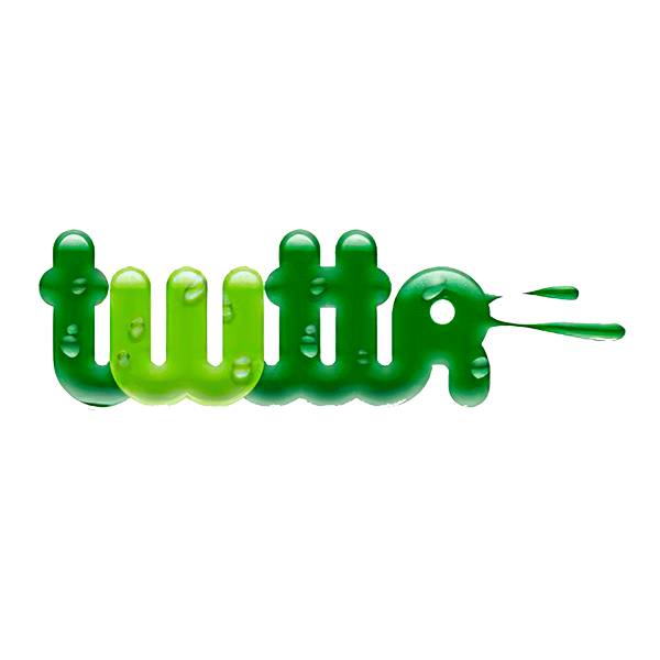
2005-2006: The first version of the Twitter logo
The first iteration of Twitter’s logo went in a drastically different direction than the logo version we know today. The design for this initial logo was designed by Biz Stone. This logo design shortens the brand name we know today to “twttr” and embraces a different color pattern, green. Beyond choosing green, Biz Stone incorporated elements that made the design look like it came out of the film Flubber, with slimy, bubble features. This first design only lasted a year, and after a year, the brand went in a different direction.

2006-2010: The second version of the Twitter logo
This second logo design is the first logo design many of us first saw with the platform. This iteration first introduced us to the Twitter blue hue. The font was updated to become a lowercase font with rounded edges. These softer design elements made the logo feel more welcoming and friendly, which was important as the brand was trying to build its user base.
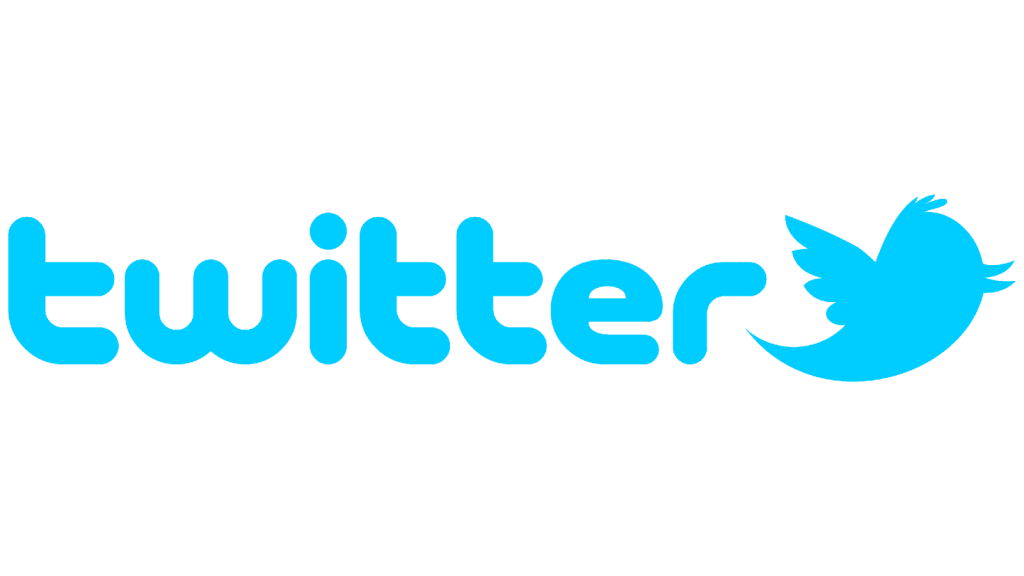
2010-2012: The third version of the Twitter logo
Four years after the second iteration, Twitter decided to make a small update to its design. Twitter kept the same blue wordmark in the same blue font but chose to now include an icon to the right of the wordmark, a small blue bird. It wasn’t long before Twitter decided to give this small bird a name. Twitter went with Larry Bird, an ode to the NBA great who played for the Celtics for a long time. During this logo period, Larry received some updates to the design until Twitter has happy with the bird symbol. The bird icon Twitter eventually went with was a clean and classic shape of the bird without too many added features.
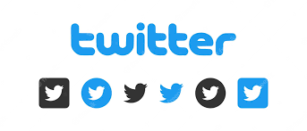
2012-Today: The fourth (and current) version of the Twitter logo
The current Twitter logo you’ll encounter is the same logo the brand has used for more than ten years. When this logo was released, Twitter shared they wouldn’t be updating their logo again for a while, and it looks like they’ve kept that promise. The biggest update to this version is the removal of the Twitter wordmark. Twitter felt they had generated enough brand recognition and that the simple bluebird would be enough to let people know it belonged to the brand. Since Larry Bird was the sole component of the logo now, Twitter made some updates to his design. Larry’s beak was pointed up, the number of feathers Larry had was reduced, and his head (and the top of his head) were updated. The biggest change came behind the scenes, though. While some may still refer to the bird as Larry, with this logo update, Twitter announced that now the bird is referred to simply as the “Twitter bird.”
There was a science behind making this updated bird design, though, and making the Twitter bird was more complicated than you may have initially thought. The bird emblem is made up of 15 perfect circles based on the golden ratio principle. This design was designed by Martin Grasser, who had just graduated from the Art Center College of Design and wanted to put this theory to use again. Previously Martin had used it for other well-known companies like Apple and Pepsi. In constructing Twitter’s logo, Martin layered each circle on top of each other to help give the logo rounded corners and help to ensure it was the most geometric it could be, which as a result, would be pleasing to the viewer.
Twitter’s logo font:
Even though Twitter’s bird is the most prominent component of its logo, the bird was once joined by the Twitter wordmark. The font that was previously used was a lowercase font with rounded edges conveying the friendliness of the brand.
Twitter’s logo color:
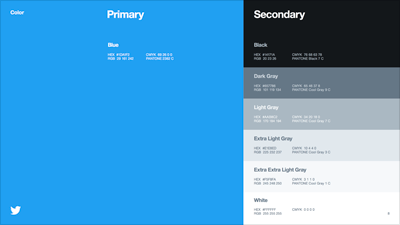
When looking at Twitter’s logo, one color stands out; and that color is blue. Blue has been used by other social media platforms that have proceeded Twitter, like MySpace and Facebook. It’s a common color for these companies because of what the color represents. Blue, and specifically this light turquoise shade of blue, represents unity, joy, and freedom. The secondary color to the logo is white, which is commonly associated with transparency which, coupled with blue, represents what Twitter is – a social media app where users can speak their truth.
Twitter’s logo symbols:
What many people associate with Twitter is its logo’s symbol, the Twitter bird. It is hard to know precisely what specific bird the logo is based on; although it does resemble the mountain bluebird of North America (and this would be fitting given the logo is drawn in blue). Birds are symbols of creativity and freedom as they fly through the sky, which are two feelings the designers were hoping to convey by choosing a bird as its icon.
Beyond the meaning behind what birds represent, the small blue bird is also representative of the Twitter brand name, depicting the “tweet” noise that birds make, which correlates to the tweets that users post. This bird symbol has become such a large part of not only the logo design but also the brand name that the bird was even once called, Larry Bird.
Twitter Today:
Twitter, like other social media applications, has had its share of ups and downs, but somehow the platform has been able to maintain a consistent user base. That may be partly due to being a social media platform the public needs, having a strategic vision that leaders aren’t scared to change, or its iconic logo – or a combination of all three.
Whatever the reason, the Twitter you use today has a new owner from its founder, who is likely a familiar name, Elon Musk. Musk purchased Twitter in October of 2022 for $44 billion. This deal didn’t happen overnight, though; for six months prior, Musk was in talks with Twitter about this acquisition.
With Musk’s ownership came a new evolution of Twitter. Nearly all the prior management team was fired, the board of directors was removed, and Twitter’s staff was reduced by 50%. While it is still early into Musk’s ownership of the company, he has shared some early ideas about what the future of Twitter may entail. These include new products, open algorithms, a commitment to eliminate spam bots, and his hope to make all users authenticated.
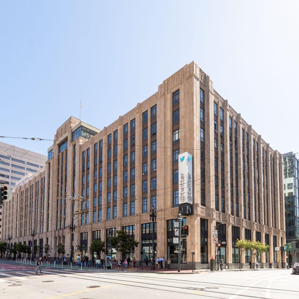
Twitter’s headquarters still resides in San Francisco, California, except now only with about 1,000 employees. In April 2023, Twitter merged with X Corp., Musk’s company.
Lessons Learned from Twitter
The biggest lesson we can learn from Twitter is a rather simple one, let your logo speak for your brand. Twitter started with a wordmark describing the brand name. The brand was conveyed through the font and color choice. The color choice wasn’t original; it was the same color scheme used for similar platforms.
The next version incorporated a friendly bird, further elaborating on the brand. Eventually, as showcased in today’s logo, the wordmark was dropped altogether. Twitter took the time to build up a user base, and its steps toward building brand recognition allowed for the name to be dropped from the logo entirely. Today, the logo features solely the bird icon.
This shows us two things. The first is that it’s okay to look at what the universal colors in your industry are and use the same color scheme. Granted, you might not want the same specific color hue, but if there is a color that is associated with your industry, it’s probably a good idea to incorporate some shade of it. Secondly, it’s okay to drop off your wordmark if the brand recognition is there. Sometimes we get so caught up in thinking we need our brand name in our logo design, but that isn’t always the case. If you have an emblem that you love and people know your emblem well, you can let the emblem be your entire logo.
If you’re looking for more logo design inspiration, check out our variety of other posts on Logo Design Magazine!

