When you spot that distinctive red tab on a pair of jeans, you know instantly it’s Levi’s.
But this iconic symbol wasn’t always part of the brand’s identity.
The story of Levi’s visual branding is as rich and textured as the denim they’re famous for.
Origins and Innovation
The 19th century saw a surge of gold prospecting fever, as people from all over flocked to the possibility of striking it rich. Enterprising individuals sought to capitalize on this craze. One such entrepreneur was Levi Strauss, who recognized an opportunity beyond mining the gold itself.
Rather than join the throngs of prospectors, Strauss devised a novel business idea – providing specialized clothing for the gold diggers. He sourced a durable, sturdy fabric from the French city of Nîmes, which became known as “denim” after its place of origin. Strauss then emblazoned his now-iconic Levi’s logo onto these rugged garments, meeting the needs of the hardworking miners.
The key to the enduring success of Levi’s overalls lay in the quality and craftsmanship of the fabric and construction. Specifically designed to withstand the rigors of demanding manual labor, the sturdy, well-stitched material proved highly durable and practical for the working class.
The red label branding
The popularity and profitability of Levi’s iconic overalls soon attracted imitators, as competitors sought to capitalize on the growing demand. To help customers distinguish the genuine article, the Levi’s owners devised a clever solution – a distinctive red label affixed to the back pocket of their garments.
This simple yet effective branding technique not only served to identify authentic Levi’s products, but also lent an air of exclusivity and prestige to the brand.
As the Levi’s name became synonymous with reliable, hard-wearing workwear, the red pocket label evolved into an instantly recognizable symbol of quality.
The demand for Strauss’ practical workwear proved so overwhelming that legend has it he was forced to repurpose the very sails from his ship to keep up with orders in San Francisco. Strauss’ savvy business instincts and innovative product had struck gold, in a manner of speaking, without ever having to toil in the mines himself.
The invention of blue jeans
The origins of the modern jean can be traced back to 1872, when Levi Strauss and several other tailors patented a design for buttoned, blue cotton pants. This innovative workwear, though initially referred to as “overalls,” is widely considered the precursor to the iconic blue jeans we know today.
Interestingly, the term “jeans” itself did not come into common usage until around 70 years later. Despite this linguistic evolution, Strauss’ patented design had already cemented its place in history and popular culture.
The Iconic Levi’s Logo Speaks for Itself
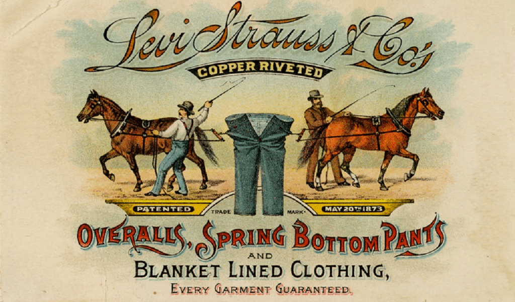
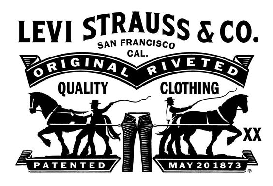
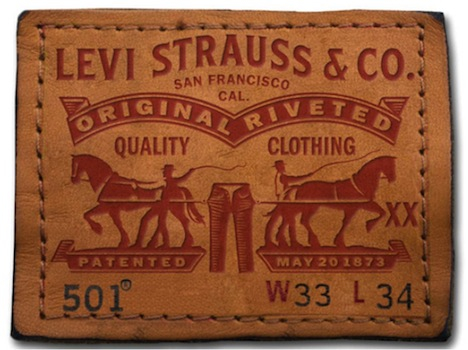
The original Levi’s emblem featured a striking image that spoke volumes without the need for words. At its center was a depiction of two horses, locked in a tug-of-war over a pair of jeans. Yet despite their strength, the denim pants remained resolutely intact.
This visually compelling logo proved to be a masterstroke, particularly given the diverse, multilingual clientele Levi’s was aiming to attract. As gold prospectors flocked to the American West from all corners of the globe, not all of them spoke English.
The Levi’s logo, with its powerful equine imagery and lack of text, transcended linguistic barriers, allowing customers to simply ask for the “pants with two horses” when making their purchases.
The logo was a powerful symbol that captured the essence of the brand—strength, durability, and a promise of top-notch quality that could handle tough situations. It was a design that spoke for itself, cementing its place in the Levi’s story.
A Journey Through Time: The Logo Evolution

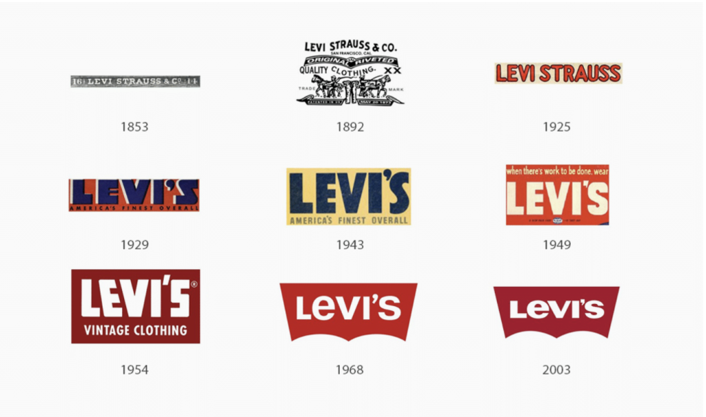
1853: The Humble Beginnings
The original Levi’s logo was remarkably different from today’s design. A simple rectangular badge displayed “Levi Strauss & Co” in serif font, accompanied by the numbers “16” and “14” – a reference to the company’s founding date.
1892: The Two Horses Tale
Perhaps the most dramatic logo in Levi’s history emerged in 1892. The “Two Horse Brand” logo showed two horses attempting to tear apart a pair of Levi’s jeans – a powerful demonstration of the product’s durability.
This iconic symbol still appears on some Levi’s products today, a homage to the brand’s heritage.
This logo, in black and white, appealed to literate, illiterate, and non-native English speakers.
The Early 20th Century Transition
The Modern Era Takes Shape
2003: The current iteration refined the batwing design with bolder lines and a darker red shade
The Psychology Behind the Design
Today’s Levi’s logo is more than just a label – it’s a symbol that communicates the brand’s core values:
– The batwing shape: Suggests how the clothing contours to the body
– The red color (Hex: #C41230): Represents vitality, passion, and strength
– The white lettering: Symbolizes excellence and quality
The typography evolved from formal serif fonts to a distinctive sans-serif style, with custom modifications like the unique “E” character that sets it apart from standard typefaces.
The Distinctive “Bat Wing” Stitch
The iconic “bat” shape featured in the Levi’s logo is not just decorative – it represents the distinctive stitch pattern on the back pockets of Levi’s jeans, reinforcing the seams to provide added durability and support.
Complementing this practical element was the use of all-capital letters for the “LEVI’S” name, save for the lowercase “e” – a stylistic choice that further distinguished the logo and created a memorable visual identity.
This blending of form and function, combined with the distinctive typographic treatment, loaded the Levi’s logo with a sense of timeless authenticity. It was a mark that not only looked the part of a rugged workwear brand, but also delivered on the promise of exceptional, long-lasting performance. The “bat wing” stitch, in particular, became an instantly recognizable hallmark of the Levi’s brand, synonymous with uncompromising quality.
Beyond the Tab
What makes the Levi’s logo particularly successful is its versatility. Whether it’s the tiny red tab on a jean pocket or a large storefront sign, the design maintains its impact and recognizability. It’s minimal enough to work at any scale yet distinctive enough to be instantly identifiable.
The current logo perfectly balances several key elements:
– Historical significance
– Modern aesthetics
– Practical functionality
– Brand recognition
This careful evolution from a simple merchant’s label to a global fashion icon reflects not just changes in design trends, but Levi’s own evolution from a practical workwear manufacturer to a worldwide symbol of style and quality.
Their slogan “Quality never goes out of style” isn’t just clever marketing – it’s reflected in their logo’s resilient design principles, which have managed to stay relevant while maintaining a connection to the brand’s rich heritage.

