Just as many great and successful brands have sustained and evolved over time, so has their identity, audience, products and of course their logos. Not without a fascinating story behind it.
This is what we know today about the logo of the renowned German car brand Audi, born in 1909.
Read on to enjoy the story behind one of the world’s great car brands and its iconic logo.
How The Audi Brand Began
This famous emblem of four interlocking rings was born in 1932 when four independent German car manufacturers merged into a single dream company called Auto-Union.
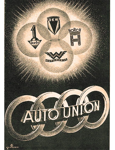
Those manufacturers were Audi, Horch, DKW, and Wanderer, each of these companies represented with a circle of the four.
To complete this union between the companies, it was decided to intertwine the circles representing each brand. Thus, the logo we have reference to today. But what happened to Audi before this union?
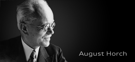
It all began in the late 19th century when a German mechanical engineer named August Horch set himself the challenge of revolutionizing the history of automobile companies.
He began by founding August Horch & Cie in Saxony, and very soon his vision became a cutting-edge automobile company, later to be known as Audi, a name inspired by the Latin translation of his surname ‘Horch’, which means ‘to listen’.
Thus, this name and his vision mark the beginning of Audi’s incredible history, which will continue a legacy of innovation, endurance, and distinction.
Throughout its evolution over time, the Audi brand has had multiple achievements, starting with the launch of its first car, called Puppchen, a small car, to becoming one of the largest motorbike manufacturers of its era.
With this string of successes, Audi made it through the Great Depression and the financial challenges it brought, all with solid determination.
The Audi Logo Through The Years
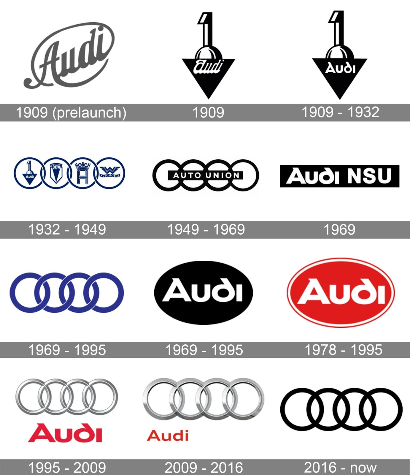
In those early Audi years, in 1909, the company produced its first logo for the pre-launch of its first car.
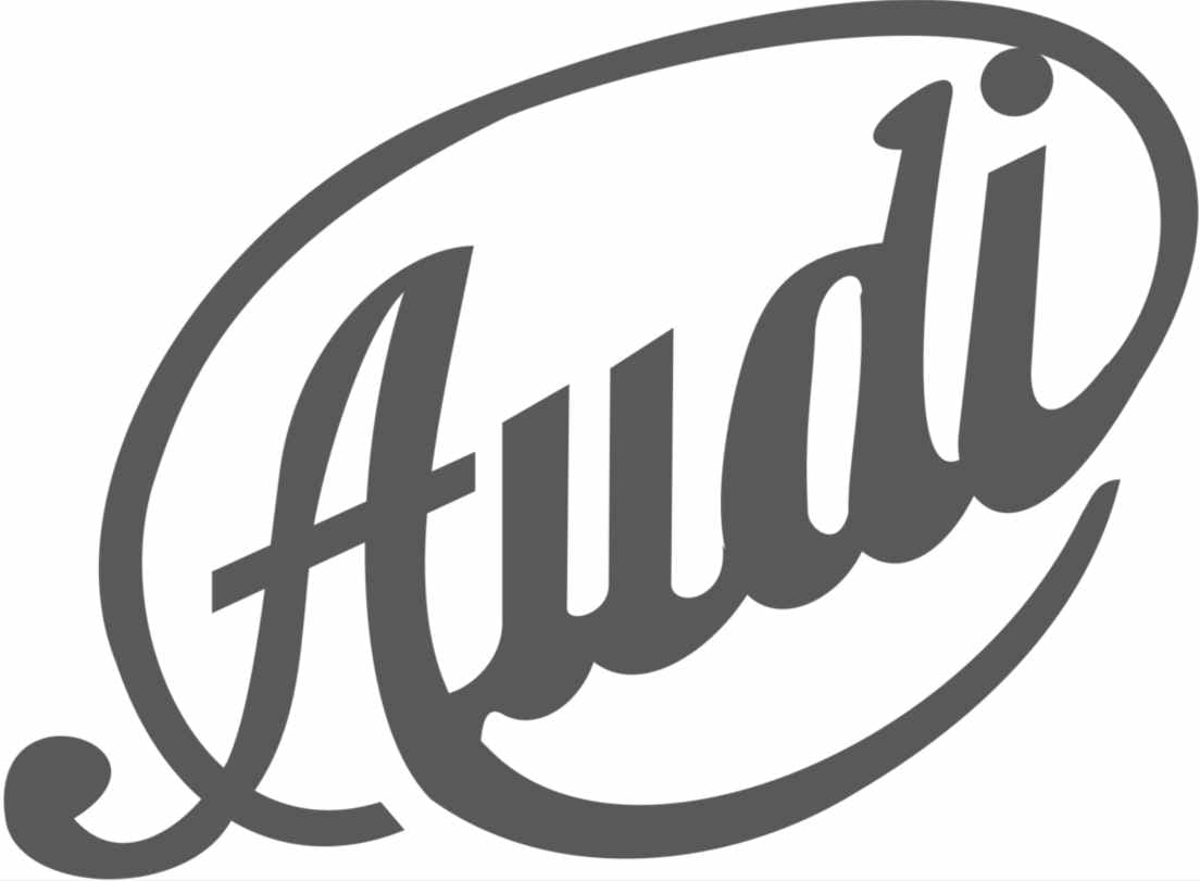
The logo consisted of a cursive typographic inscription set with a diagonal degree, within an oval outline. It was dark gray in tone and projected professionalism and elegance.
Later, in the same year 1909, a less typographic badge, or logo, was created with other interesting elements.
Although this new logo had other graphic elements, it was used for only a few months until its more modernized predecessor was unveiled in the same year.
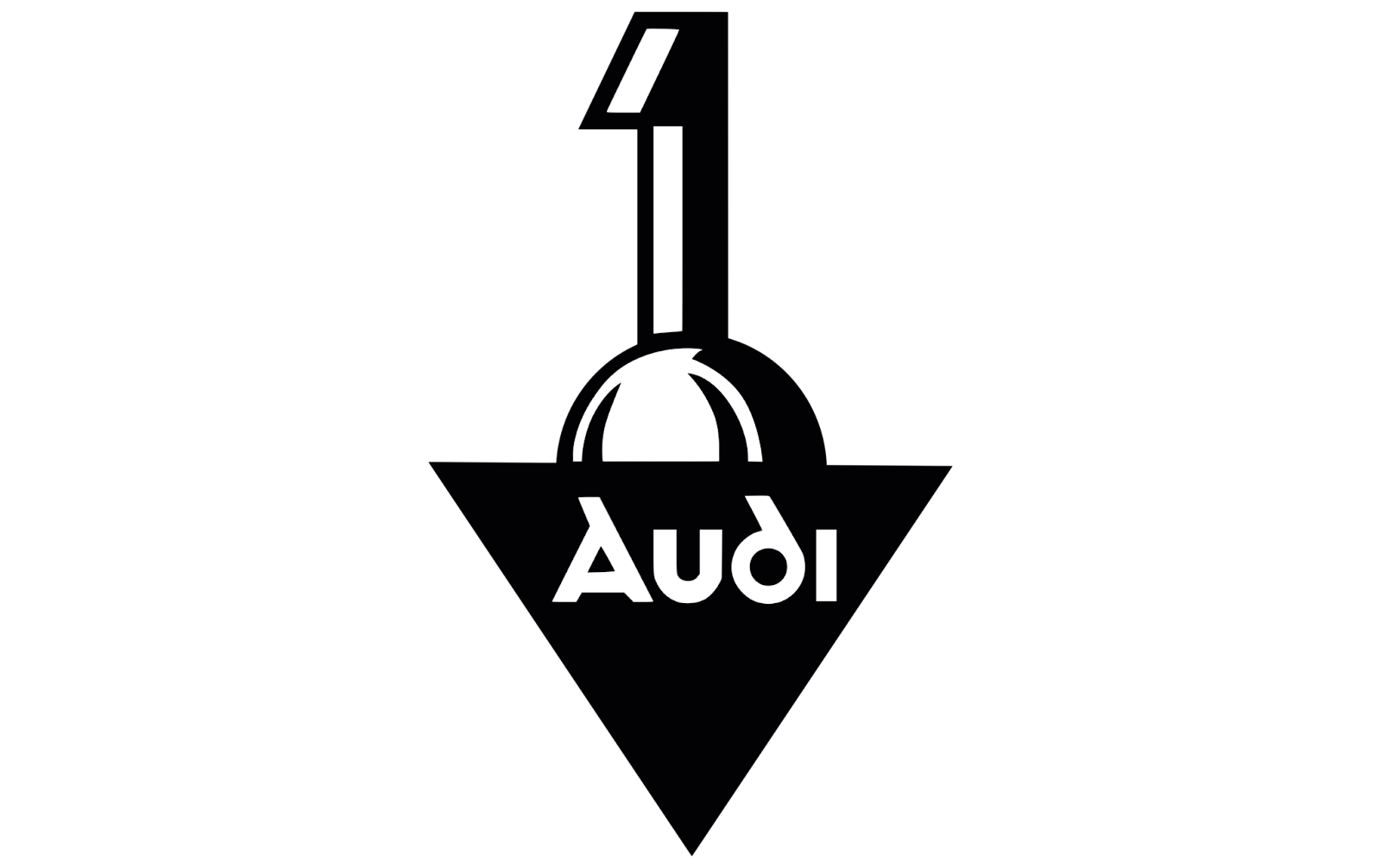
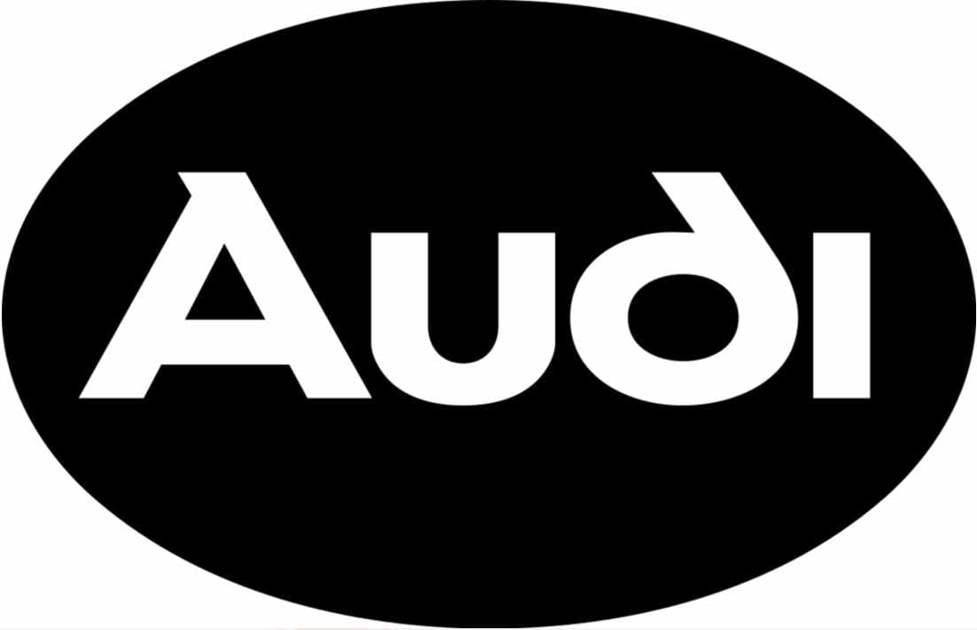
The idea was to represent the number ‘1’ emerging from a sphere, half-hidden behind the black triangle, pointing downwards. With its representative name ‘Audi’ at the bottom and written in italics, as well as in white lettering on a black background.
Soon the same year 1909, until 1932 the modernized logo took place, exchanging the lower typeface where it read Audi, for a thicker, rounder lettering.
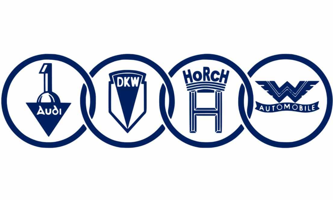
Then Audi merged with Auto Union in the 1930s, and from then on the Audi Olympic rings were presented to the world as a symbol of the union of four large independent car manufacturers, including Audi itself as the fourth company.
The other companies, DKW, Horch and Wanderer Automobile, together with Audi, represent each of the blue rings with their respective brand emblems.
Even within the merger, each company retained its original brand name. However, they divided up the market internally so that one brand would not ‘step on the toes’ of the other, creating uncomfortable internal competition.
Thus, Audi would be responsible for luxury vehicles for the medium segment, Horch for premium cars, DKW for motorbikes and small cars, and Wanderer for medium-sized cars.
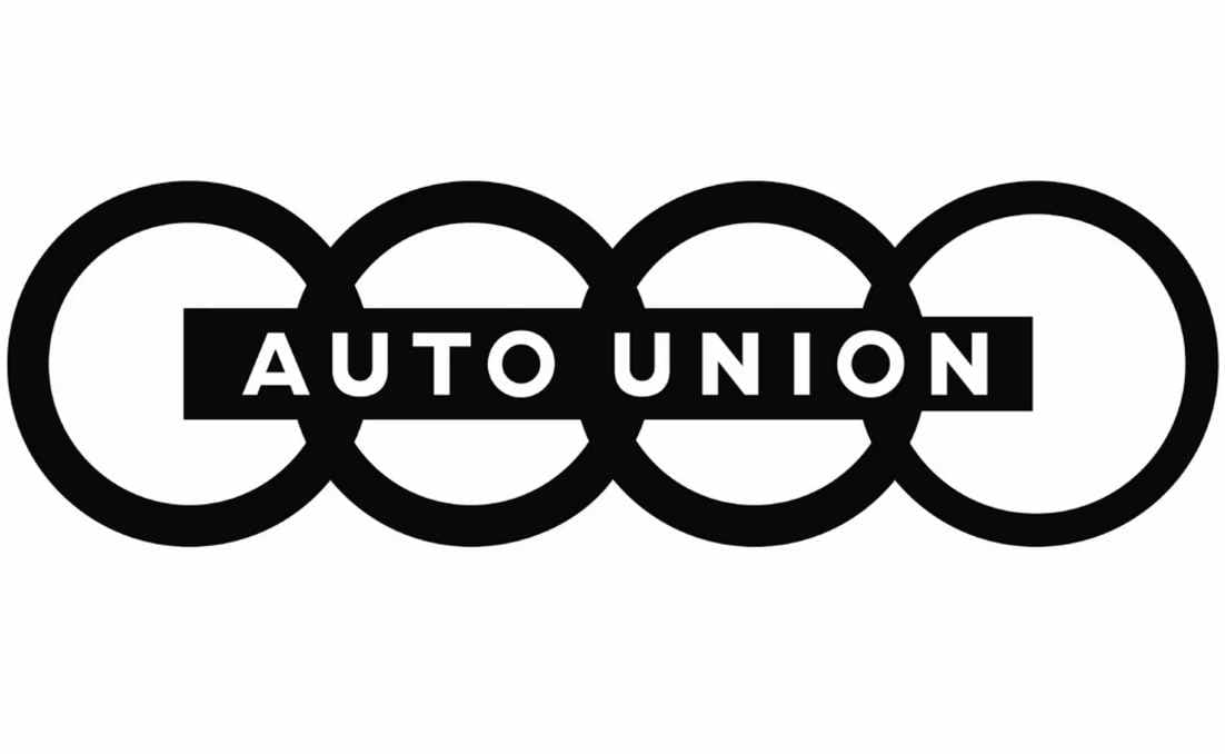
Then in 1949, we see a much more simplified logo of this union, in black, obviating the original emblems of each brand, and replacing it with a thin horizontal rectangle, in which one can read in sans-serif typeface and in capital letters ‘Auto Union’ crossing the rings in the center.
These iconic Audi rings, symbolizing unity and strength, would reflect the heritage and geometric form that famous typographer and graphic designer Kurt Weidemann would later perfect to give them a three-dimensional appearance, enhancing their visual appeal with a non-standard typeface and thick white lettering on a background of chrome and silver rings, updated with black borders to signify elegance and modernity.
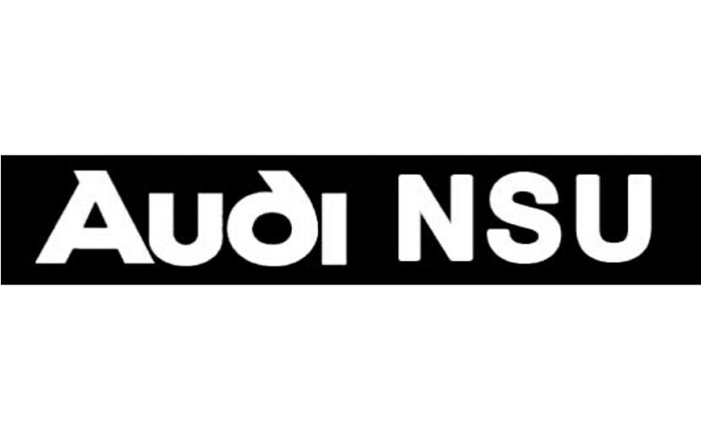
In 1969 Audi wanted to innovate by moving away from such rings, with a simple and strict black rectangle with the words Audi NSU on the inside in white.
However, this logo failed to do the job and was changed back to the famous rings, this time without typography, creating only an emblem or isotype.
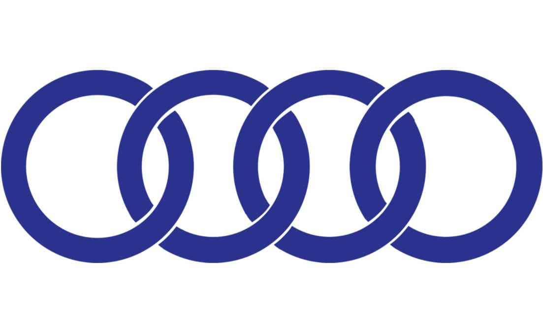
By 1946 Auto Union had become Audi, integrating all the brands into one, leaving only the four thick interlocking rings in dark blue.
However, this logo failed to do the job and was changed back to the famous rings, this time without typography, creating only an emblem or isotype.
They also opted in 1978 for a red and white option, creating an interesting contrast of colors that had not been considered before, since only gray, white, black, and blue had been used.
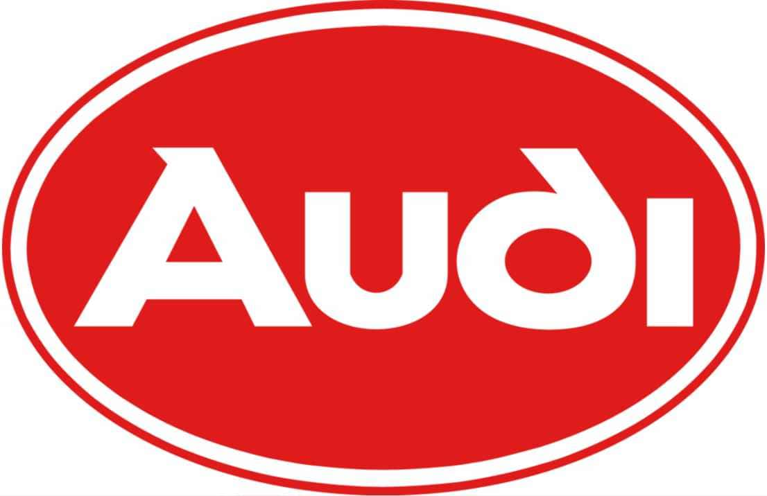
And creating an all-white border to highlight the brand name even more.
We quickly see a leap with the incursion of metallic tones and the idea of 3D logos.
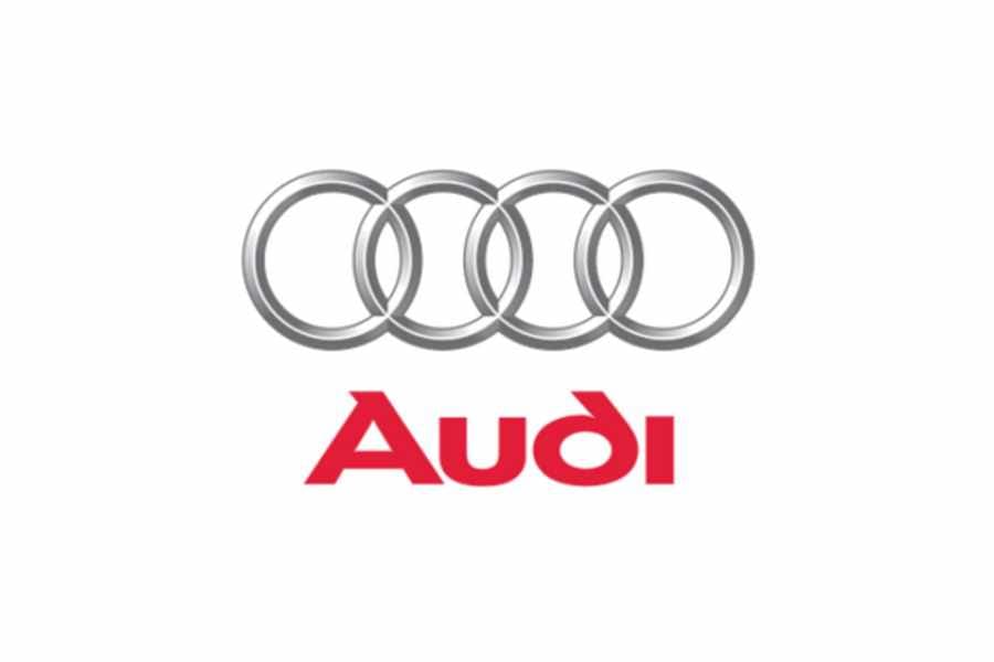
This happened in the years from 1995 to 2009, when two emblems, the typographic logo with the brand name and the isotype of the intertwined rings, were joined together.
This elegant effect of the points of light in silver adds elegance and exclusivity to the whole graphic proposal.
Following the evolution of the years, the logo was further refined between 2009 and 2016, by modifying the rings, making them larger than the typography and brighter and more detailed, with a mirror effect.
While the typeface changes to a more traditional and thinner sans-serif, now placed in the lower left corner of the logo.
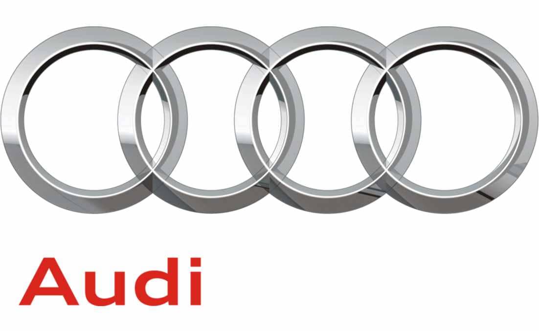
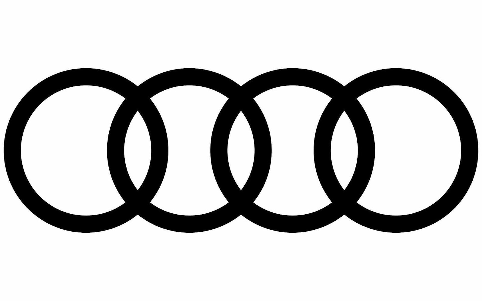
Finally, now that we are in the present day, between 2016 and today, the logo has been simplified to its maximum expression, very similar to the blue of the year 46, with the rings intertwined, thick and black. With a simple, iconic projection.
The Audi Logo Symbol
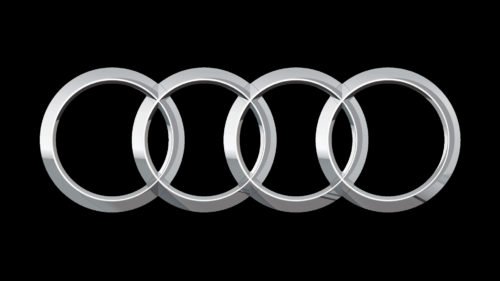
As for the Audi symbol, you will still find, very similar to this last logo, the interlocking rings but with an elegant silver finish.
Without a doubt, we are talking about a long history of more than 100 years of rebranding for the company and its iconic logo to the one we know today.
In Conculsion
Today, the Audi logo represents one of the most memorable and well-known car logos in the industry. With a simple design that is easy to recognize, yet looks powerful, wherever you look.
However, there will be a bit of a twist for some of Audi’s new cars, as the brand will be ditching its iconic four-ring emblem for its new family of electric cars, which will not be coming to Europe.
This decision comes as many European premium brands, such as Audi, look to expand their efforts into territories far from the Old Continent by expanding their business.
And the favorite to make inroads, in general, tends to be China. To the point that some of these companies have entered into a partnership with some of those born in the country itself, as in the case of Audi with the company SAIC, with which it will soon launch a range entirely made up of electric cars for the Asian country.

That is why this range of models will not only bring design, technology, or production focused on the Chinese market.
The most striking feature will come from something we thought was unheard of. Audi will not incorporate the emblem of the four rings in these electric vehicles, however, they say that it has all the DNA of a real Audi. And this will only happen with this particular range of vehicles.
Which also leaves us wondering, what will be the next update to their logo?