We often hear that design is everywhere, but how often do we pause to consider the full meaning of that? Design is easy to spot in branding, from logos to marketing materials. But sometimes, we encounter text, typography, or imagery that doesn’t point to a specific brand at all. Instead, it evokes a TV series or a beloved film.
The typography we see on screen—whether on a network channel, in a film, or during a favorite comfort show—is rarely incidental. It’s carefully selected to support the tone, emotion, and visual storytelling, often making an impression before a single line of dialogue is spoken.
Like all elements of design, typography must be chosen with intention—because when it’s not, it can either weaken or elevate the content. Let’s take a closer look at some of the most iconic and unforgettable typefaces ever used in film and television.
Indiana Jones
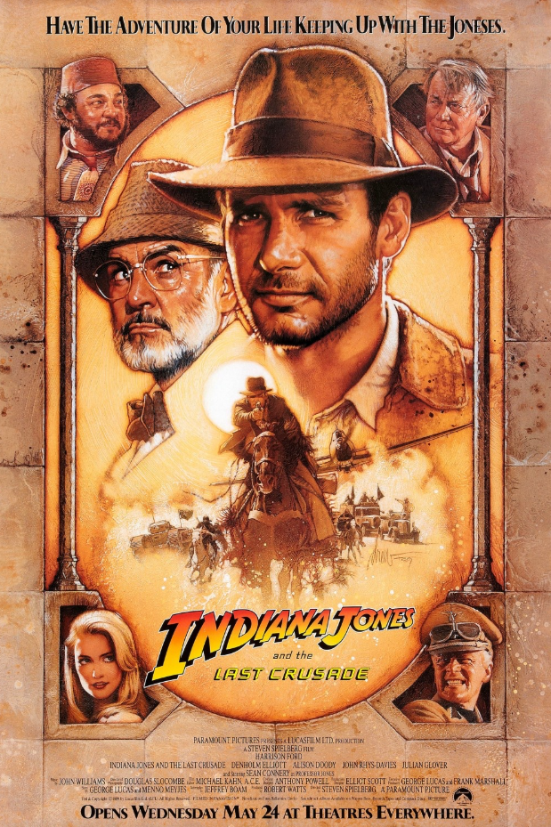
One of the most iconic film series in cinematic history, Indiana Jones, features a custom type design created by art director Mike Salisbury. This bold, adventurous font first appears at the start of each film and is also used prominently in marketing and promotional materials.
The typeface—set in striking shades of yellow and orange against a deep black background—immediately captures the spirit of the story: daring, nostalgic, and full of energy.
Since the franchise’s rise to fame, countless designers have tried to replicate or reinterpret the look. But despite these many imitations, the original design remains unmatched in its ability to evoke the thrill and legacy of Indiana Jones.
Stranger Things
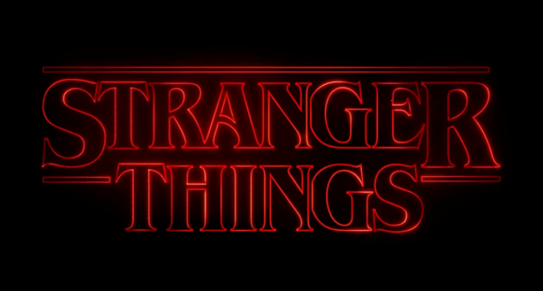
When Netflix released Stranger Things, they didn’t just deliver a hit series—they also introduced one of the most memorable TV show fonts of all time.
The now-iconic title sequence features ITC Benguiat, a serif typeface that instantly sets the tone for the show’s eerie, nostalgic atmosphere.
Paired with the glowing red text and slow zoom of the splash screen, the font became a defining element of the series’ identity. It’s a perfect example of how typography can become just as legendary as the content itself, making a lasting impression before a single line of dialogue is spoken.
Schindler’s List
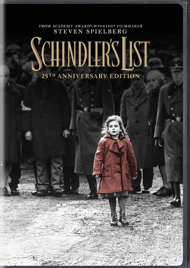
Schindler’s List, the 1993 masterpiece directed by Steven Spielberg, is a powerful and haunting portrayal of the Holocaust.
From the very beginning, the film’s typography plays a vital role in setting the emotional tone.
The title sequence and promotional posters feature a custom serif font that echoes the gravity and elegance of the story.
Refined and understated, the typeface reflects the film’s somber subject matter with dignity and restraint.
It’s a quiet yet impactful design choice—one that mirrors the emotional weight of the narrative without needing to say a word.
The Royal Tenenbaums
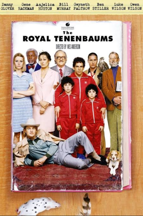
Originally designed by Paul Renner in the 1920s, Futura is a geometric sans serif typeface that has become a timeless design staple.
One of its most memorable appearances is in Wes Anderson’s The Royal Tenenbaums, where the font plays a key role in shaping the film’s distinct visual identity.
Clean, structured, and modern, yet with a subtle playfulness, Futura perfectly complements the film’s quirky, stylized world. Its use throughout the movie underscores Anderson’s meticulous attention to detail—and shows how a typeface can seamlessly blend form and personality on screen.
Apocalypse Now
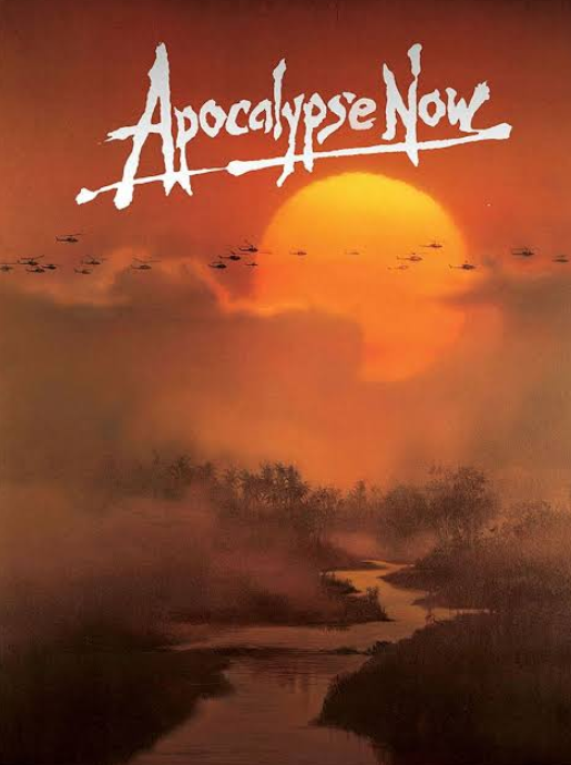
Francis Ford Coppola’s 1979 war epic Apocalypse Now features a striking, hand-drawn title font that immediately conveys the intensity and chaos of the story.
The raw, expressive lettering mirrors the film’s psychological depth and emotional weight, capturing the turmoil at the heart of its Vietnam War setting.
The film follows a captain on a perilous mission into the jungle, and the title design—unpolished, urgent, and unforgettable—sets the mood before the first scene even begins.
It’s a powerful example of how typography can reflect the essence of a story in a single visual gesture.
Psycho
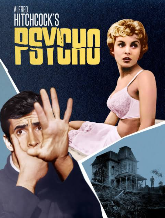
Another iconic entry in film history, Alfred Hitchcock’s Psycho, stands out not just for its groundbreaking storytelling but also for its unforgettable title design.
The film opens with a bold, custom red typeface that appears sliced and fractured, perfectly echoing the psychological tension at the heart of the story.
Designed by Fred Lambert in 1963, the typography sets an unsettling tone from the very beginning, hinting at the fractured minds and suspense that define the narrative.
As the film follows a secretary on the run who checks into a secluded motel run by the mysterious Norman Bates, the title design leaves a lasting impression. It’s widely regarded as one of the most powerful and influential typographic moments in horror—and in cinema as a whole.
Back to the Future
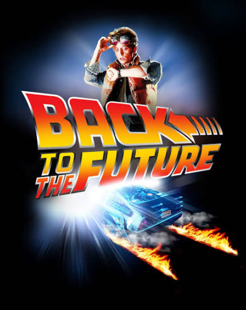
Back to the Future, the beloved sci-fi adventure series following the time-traveling escapades of Marty McFly, is instantly recognizable—thanks in part to its bold, custom title font.
The typography is dynamic and slightly warped, with a sense of motion that perfectly mirrors the film’s fast-paced, time-jumping narrative.
Sleek and futuristic, the design captures the adventurous and imaginative spirit of the story before the action even begins. It’s a font that doesn’t just label the film—it feels like the film, embodying its energy, genre, and unforgettable style in a single visual hit.
Conclusion
From sweeping adventures to eerie thrillers and heartfelt dramas, typography has quietly shaped some of the most unforgettable moments in film and television. These iconic typefaces don’t just introduce a title—they help build entire worlds, convey emotion, and set the tone long before any characters speak.
Whether it’s the nostalgic glow of Stranger Things, the bold flair of Indiana Jones, or the fractured tension of Psycho, each font becomes part of the storytelling itself. As viewers, we may not always consciously notice the typography, but its impact is lasting, and often, it’s the very thing that stays with us, etched in memory as clearly as the scenes they introduced.