What we know as the handicap symbol, but more officially known as the “International Symbol of Accessibility,” is an iconic symbol that has been used internationally for more than 50 years.
The symbol features a royal blue square that shows a white figure in a wheelchair. A few years ago, the logo was modified and now the new version has been widely used.
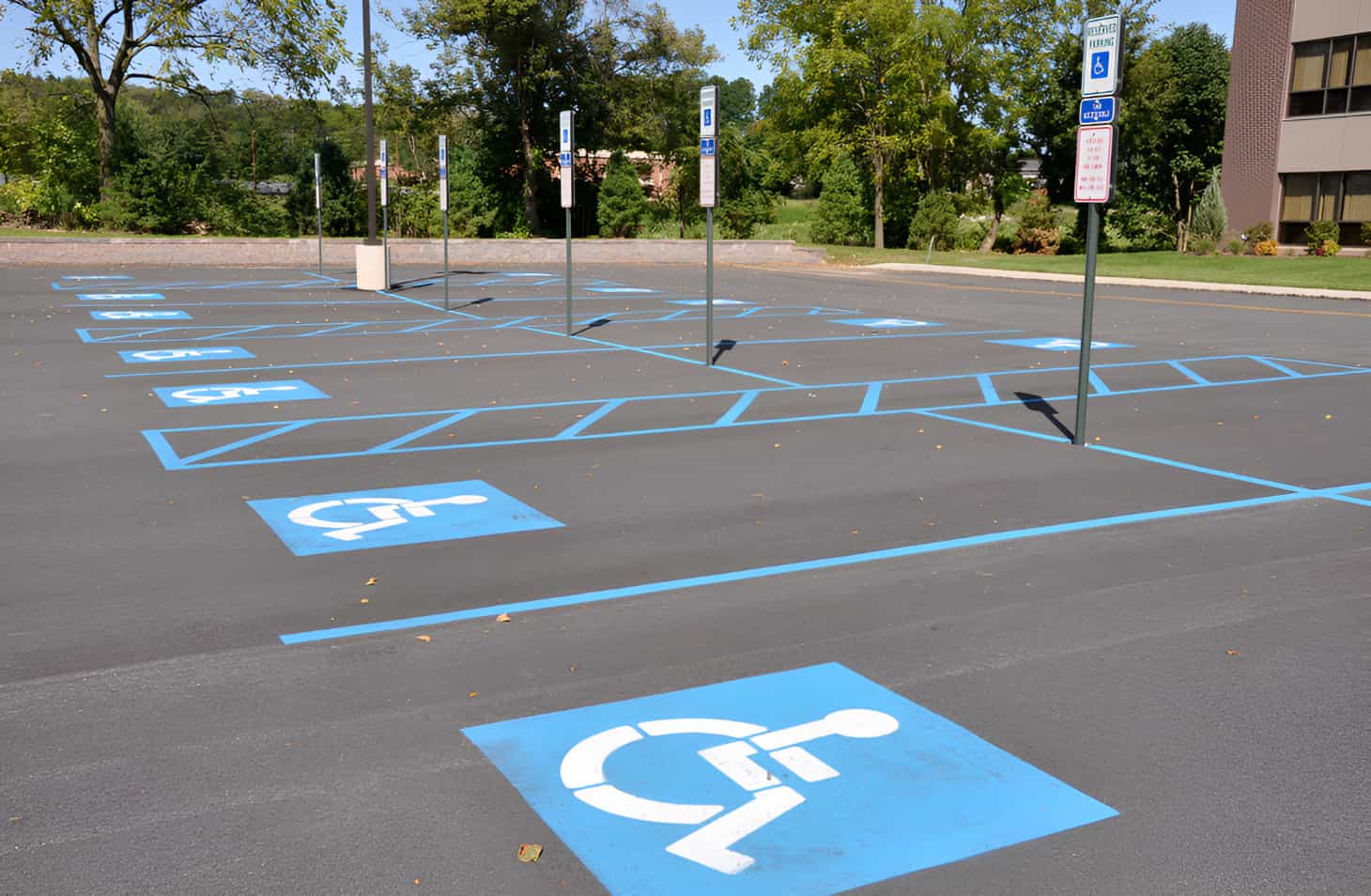
Most people don’t pay much attention to the actual symbol, they just understand that the blue squares designate where the handicapped parking is.
However, the handicap logo isn’t much different from other logos––it has a history and specific design elements that make it into the efficient and effective design we recognize today.
Let’s take a look at the history of the handicapped logo, why it was updated, and why it matters.
The History of the Handicap Logo
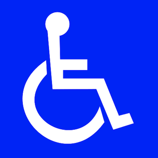
The famous blue and white logo was first launched in 1969. It was created by Danish student Susanne Koefoed. Koefoed submitted her design to Rehabilitation International, which was holding deliberations on what symbol should be used to specify what spaces were handicap-accessible areas.
Besides Koefoed, there were six other potential designs to be judged by an international and independent jury. However, Koefoeds stood out and made an impact, being the chosen design. The design was exactly what the Rehabilitation International was looking for; an International Symbol of Access.
A document was prepared that designated the uses of the International Symbol of Access for the vast circumstances in various countries. The design features a royal blue background with a white image of a figure in a wheelchair.
Koefoed’s design was widely adopted and quickly reached worldwide recognition. It was used to mark a space reserved for cars used by disabled individuals or blue badge holders. It also marked bathrooms with facilities designed for wheelchair users, buttons indicating to activate an automatic door, and various other users. Because of the efficiency and the popularity, there was no reason to change the design.
The Updated Logo

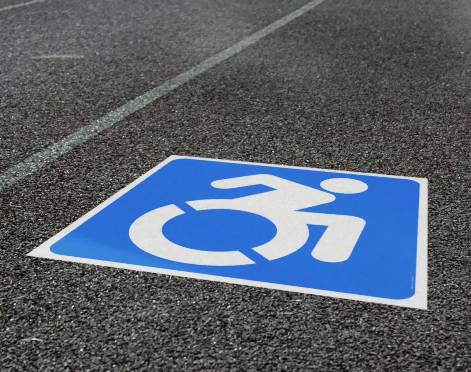
Although the handicap logo hasn’t been officially changed on a global scale, a redesigned version was proposed by artist Sara Hendren and philosophy professor Brian Glenney.
This new version is called the “Accessible Icon” and features minor changes to the logo Koefoed designed in 1969. The proposed design keeps the blue background in a different shade, but changes the handicapped figure in the wheelchair.
They’re now leaning forward, with the head tilted forward and the arm showing mobility and control of where they are going. The new design signifies movement and agency, no longer showing a still figure sitting in a wheelchair. The design change is meant to reassert the sense of independence and continue to push toward a more accepting and accessible community.
Some states, such as New York and Connecticut, have adopted this new symbol but it is not recognized internationally.
Conclusion
The International Symbol of Accessibility has remained a globally recognized emblem for over 50 years, symbolizing accessibility and inclusion.
Designed by Susanne Koefoed in 1969, the original logo effectively communicated the presence of accessible spaces, making it an essential part of public spaces worldwide.
While the design has remained largely unchanged, the Accessible Icon proposed by Sara Hendren and Brian Glenney introduces a more dynamic representation, emphasizing movement and independence.
Though not officially adopted everywhere, this evolution reflects society’s ongoing commitment to inclusivity and changing perceptions of disability.
As conversations around accessibility continue to grow, so too does the significance of the symbols we use to represent it.