Today, we’re going to talk about a rocking logo, not the least, the Hard Rock Cafe logo and its history. So please stick with us to travel to the beginning and see its birth.
It all started with a simple craving for a great burger. When two Americans, Isaac Tigrett and Peter Morton, living in London in the early 1970s, realized they couldn’t find the kind of burger joint they loved back home.
Sure, instead of settling, they decided to take matters into their own hands. So, in 1971, they opened the first Hard Rock Cafe near Hyde Park—a move that would spark a global phenomenon.
By 1978, the brand had expanded across the Atlantic, opening a second location in Toronto, Canada, and the rest is history, but let’s take a close look at its logo.
Behind every legendary brand is undoubtedly a memorable logo and Hard Rock Cafe is no exception.
The first logo was designed by Alan Aldridge, the artist famous for his work with The Beatles and The Who.
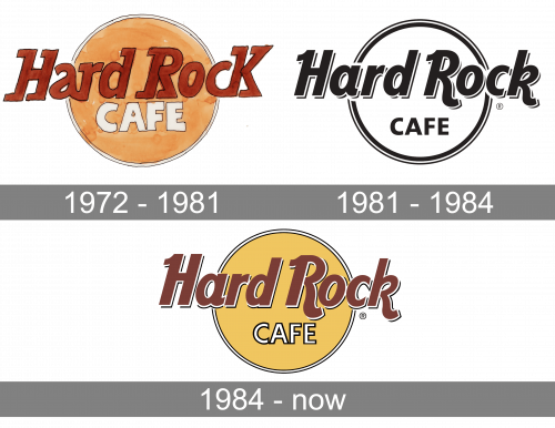
The logo was simple yet bold. The original design drew inspiration from American culture, particularly the Chevrolet emblem, with its circular layout and retro vibe. This happened from 1972 to 1981.
Though the initial idea was to incorporate patriotic red, white, and blue, the final design featured earthy yellows and brownish red.
The logo’s badge-style format, combined with creative lettering and a splash of vintage charm, all centered, made it instantly recognizable.
Over time, refinements gave the logo a sleeker, more modern look while retaining its retro essence, making it versatile across the brand’s restaurants, hotels, and casinos first heading with this elegant black and white version between 1981 and 1984 and creating a more formal wordmark.
Then, as was expected, the Hard Rock logo added the original’s but a bit changed colors, a softer yellow, and going from brownish red to reddish brown.
With this, they honored the initial idea and became present in a modern full of color. And it was keeping the “Cafe” in white with a black outline. This change was welcome in 1984, and it’s so good and strong that it has lasted till today.
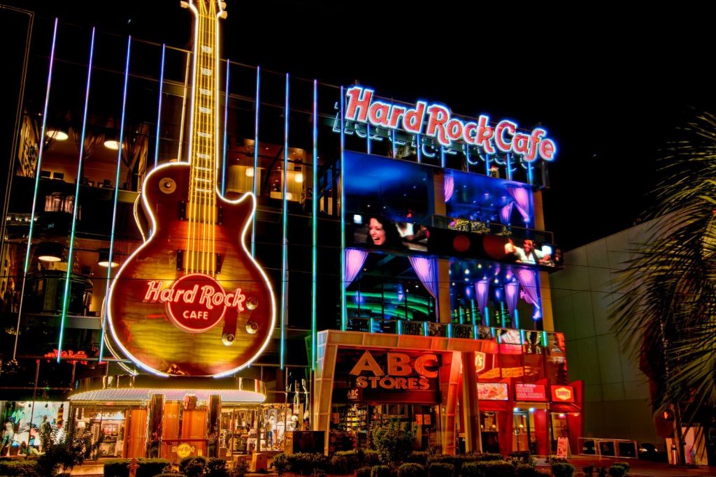
Hard Rock Cafe quickly became more than just a place to grab a bite. It was a whole experience.
The decor, rich with memorabilia from legendary artists like Elvis Presley, Michael Jackson, and The Beatles, transformed the restaurants into music-lover havens.
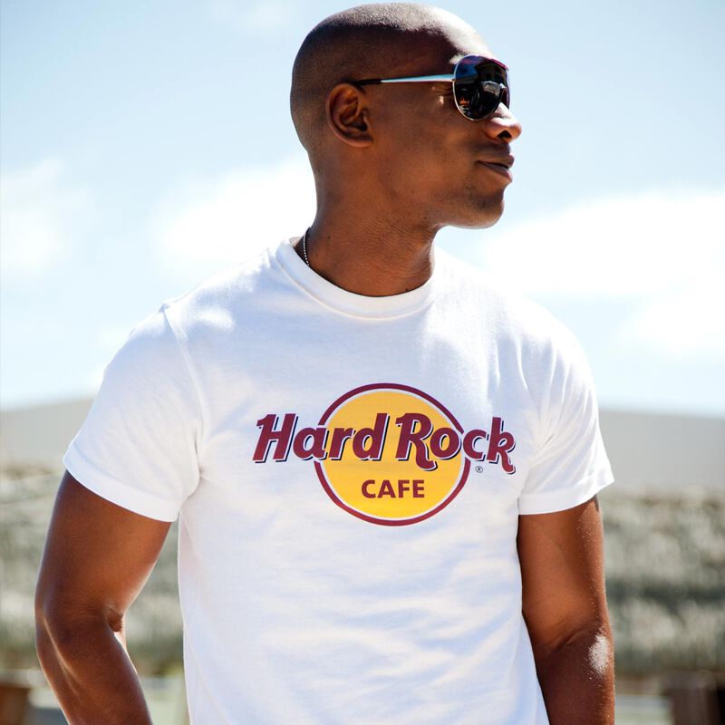
Visitors enjoyed meals and immersed themselves in a visual feast of pop culture history. Soon, a retail component was added, offering branded merchandise that fans could wear as a badge of their Hard Rock devotion.
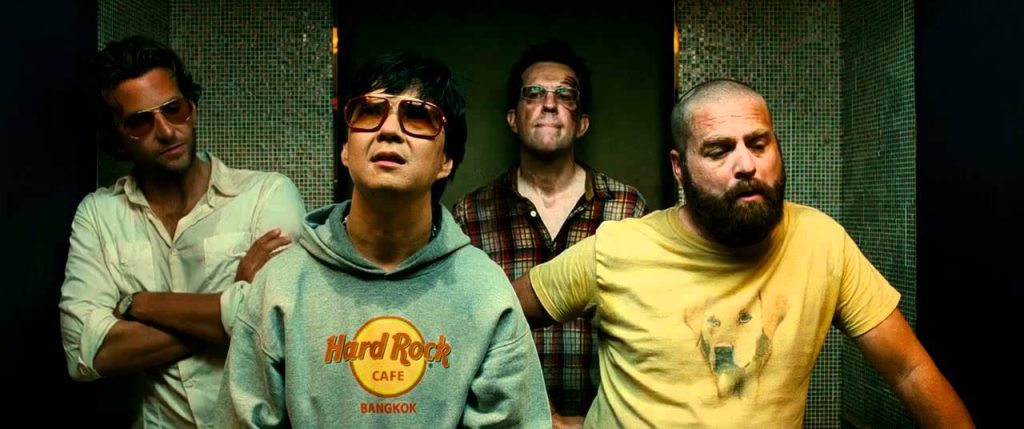
Hard Rock Cafe’s logo has proven its adaptability. City names are often added beneath the word “Cafe,” creating a collectible element for fans visiting different locations.
Whether seen in its original yellow-brown palette or one of its many color variations, the logo remains a consistent symbol of the Hard Rock experience. We even see these widely popular on the big screen (As in the movie The Hangover), a renowned American symbol.
Interestingly, one of Hard Rock Cafe’s biggest branding wins happened accidentally. After over-ordering T-shirts for an event, the company decided to sell the surplus in their restaurants. The result? A merchandising goldmine.
Today, Hard Rock apparel is a must-have for fans, with many travelers collecting shirts from every Hard Rock location they visit.
Simplicity and nostalgia have been at the heart of Hard Rock Cafe’s branding success. The retro-inspired logo captures the brand’s American roots.
It taps into the timeless appeal of vintage design, which still lives in the cultural memory and lives of Americans and the world.
For aspiring businesses, this is a reminder to focus on creating a simple, flexible, and instantly recognizable logo.

