Although it has only been since 1960, the Chick-fil-A logo has evolved several times. This Georgia-based fast-food restaurant is now one of the largest chains in North America, with more than 3,000 restaurants in 48 states.
The business has remained successful throughout all of its logo changes over the years, becoming so well-known today it can be recognized simply by its iconic chicken-shaped letter “C.”
The History Of The Restaurant
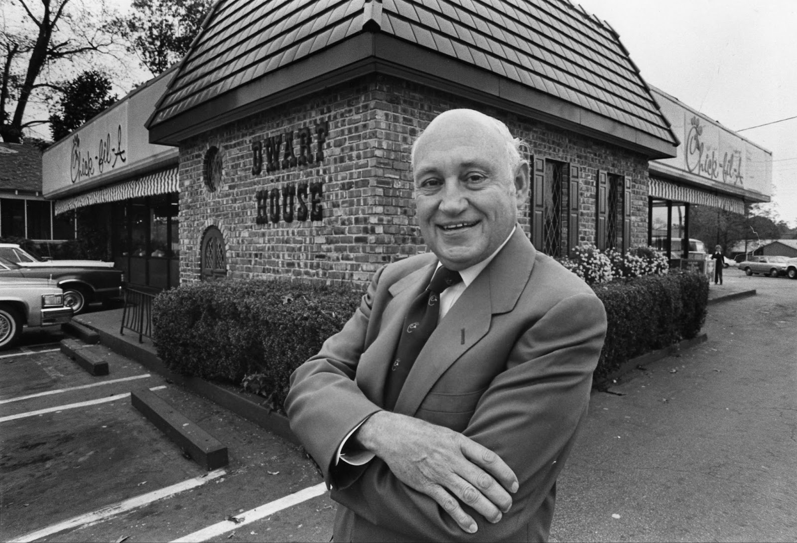
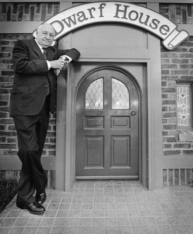
The story all started when Chick-fil-A founder S. Truett Cathy decided to start a small business in 1946. It was also at that time that he decided his business would be closed on Sundays after experiencing the difficulty of working in the fast food industry seven days a week firsthand. He named his restaurant “The Dwarf Grill” (later called “The Dwarf House), which he ran with his brother in Hapeville, Atlanta.
At the time, the focus was more on the operations of the restaurant itself. They had no distinct logo at the time to define their brand.
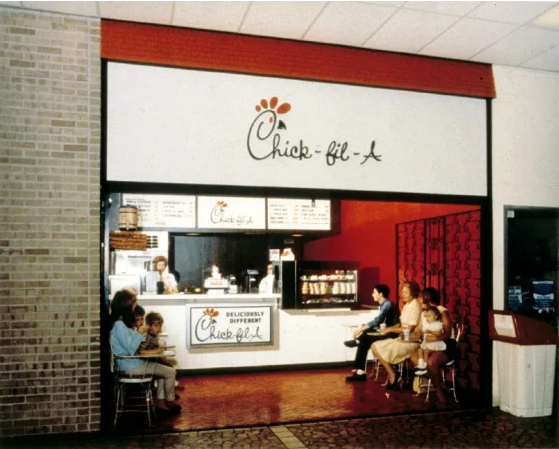
After many years of success, Cathy founded and opened the first Chick-fil-A restaurant in Atlanta’s Greenbriar Shopping Center in 1967. The small space was only 384 square feet. At the time, hamburgers were still dominating the fast-food industry.
This left open an interesting opportunity for Cathy. He didn’t want to be like every other fast-food burger restaurant. Instead, he decided to try a different kind of sandwich to serve – a chicken sandwich.
Today, he is credited with inventing and making the chicken sandwich, which at the time was prepared in a pressure cooker with peanut oil. In fact, today, the company is reportedly the largest buyer of peanut oil.
Cathy’s family has upheld his legacy of leadership over the years. His son, Daniel Truett Cathy, took on the role of CEO in 2013, and his grandson, Andrew Truett Cathy, is now leading as the current CEO of Chick-fil-A.
Creating The First Logo
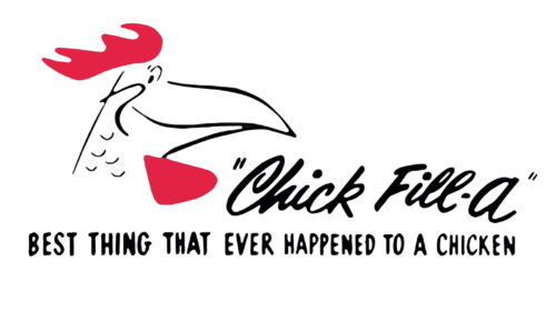
The first Chick-fil-A logo looked very different from the one we see today. In fact, it wasn’t even spelled “Chick-fil-A.” The logo read in black cursive text “Chick-fill-a” followed by text beneath reading “BEST THING THAT EVER HAPPENED TO A CHICKEN.”
There were not only textual differences from the logo we see today, but the chicken at the start of the logo also looked very different. That’s because it was not a chicken at all. Instead, it was the company’s original mascot, “Doodles,” the rooster.
Although there is no clear answer on where the original logo actually came from, many believe that Cathy reportedly commissioned the restaurant chain’s inaugural logo for a mere $50. The logo was said to be designed by two famous American designers – Louie Giglio and Evan Armstrong.
The first sketch of the logo was made on a napkin. Legend has it that the initial design was sketched on a napkin. This particular version remained in use for three years, until 1964.
Chick-Fil-A Rebrands
In 1964, one significant change was made to the logo. Rather than Doodles with his side and smile being illustrated before the words “Chic-fil-A,” the company redesigned, merging his silhouette into the letter “C.” This is how the general layout of the logo has remained ever since.
Most of the changes between 1964 and today have been primarily just color. The chicken silhouette making up the “C” has remained, along with the emphasis of the capital “A” in the logo to represent the brand’s “grade A” quality.
The “Eat Mor Chikin” Campaign
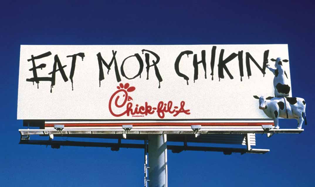
Perhaps even more memorable than their original mascot, Doodles, is the strong association with rebellious cows. In the middle of the 1990s, Chick-fil-A partnered with the Dallas-based Richards Group to launch an ad campaign about how opposites attract. This was a big turning point for the company’s advertising, as it was at this time that they decided to incorporate cows into their marketing.
In 1995, the company first displayed the phrase “Eat Mor Chikin” on a billboard in Atlanta, Georgia. The new marketing was taking a creative approach to inspire customers to set aside their burgers and eat chicken instead. The idea was to portray the cows as rebellious creatures that urge people to eat more chicken so they will, in turn, not be eaten.
As time passed, Doodles, the rooster, was almost entirely dropped from the company’s branding and replaced with the iconic spotted Holstein Friesian cows instead.
The Chick-fil-A Logo Through The Years
The Chick-fil-A Logo From 1960 – 1963
One thing the Chick-fil-A brand has done very well over the years is stay consistent. Even its original logo is very similar to the logo we see today. The original logo – reading “Chick-fill-a” – is a play on words of a Grade A chicken fillet sandwich. This was intentional as the original name of the sandwich was the “chicken steak sandwich,” which did not last long. Cathy released the name was not getting as much traction as he had hoped and changed the name to something more catchy and creative – the “chicken fillet sandwich.” This was a further play on the competition against burgers, as fillets were known as the best cut of meat. Cathy officially registered this name with the Trademark Department in 1963.
The brand has also stayed consistent over the years with its simple color scheme of black, red, and white. The company also chose a font that would stand out but also be easy to read. While it is not as simple as a serif or sans serif font, the bubbly cursive font is still easy for viewers to read and adds a hint of uniqueness that will stand out and stay in their minds for a longer time.
The Chick-fil-A Logo From 1960 – 1963
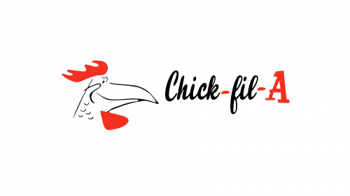
The 1963 logo looked very similar to the logo of the previous of years.
However, this would sadly be the last the caricature-like drawing style of Doodles would be a part of the logo.
The “BEST THING THAT EVER HAPPENED TO A CHICKEN” logo was also removed. Doodle’s head was also not as large and placed lower.
Additionally, a hyphen was placed between the words “Chick” and “Fil” and all hyphens were made red, along with the letter “A,” which was also enlarged and made red.
The brand used many of the iconic elements from its original logo and made slight adjustments to improve and create a well-known image for itself. This is a trend that continued throughout the years.
The Chick-fil-A Logo From 1964 – 1975
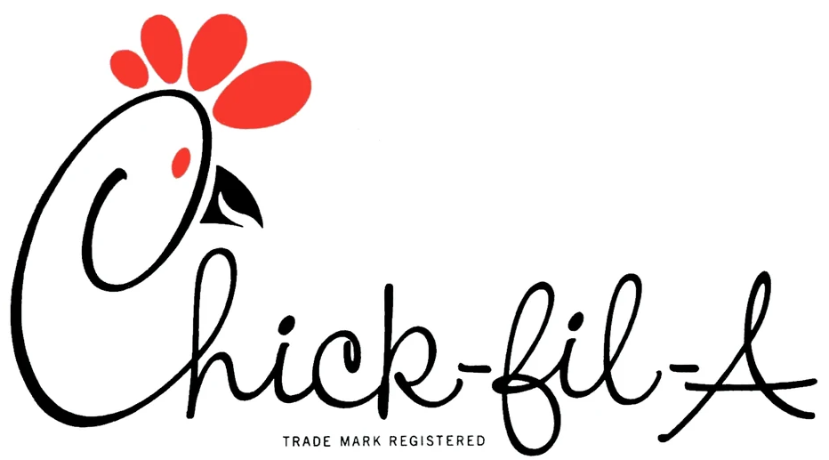
Sadly, the 1963 logo only lasted for one brief year. In just 4 years, the original caricature-like drawing style of Doodles was retired and replaced with a much simpler version that melts into the “C” of the logo. All elements of the logo were brought together for one simple design aside from the “TRADE MARK REGISTERED” text now added beneath. The hyphens were no longer red, but instead, the eye of the chicken and the combs, which were made of simple oval shapes on top of the “C.” Doodles now also exhibited an open beak. This time, the text also resembled more of a thin and open calligraphy type style rather than more compact and bold cursive lettering.

The Chick-fil-A Logo From 1975 – 1985
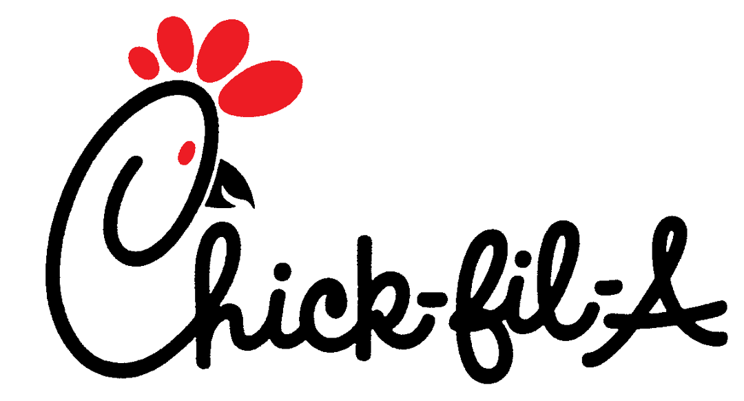
In 1975, another logo was created. This logo looked very similar to the last one, only the lettering was now bold instead of thin calligraphy-like lines. While the letters were now more bold, the typeface itself did not change.
This gave the logo a new and more confident appeal that would make it easier for viewers to read from far away. The 1975 version of the Chick-fil-A symbol kept intact the same sense of warmth, tradition, and distinctiveness that has become synonymous with the brand.
The Chick-fil-A Logo From 1985 – 1998
The Chick-fil-A became increasingly perfected, with fewer changes being made each time. By 1985, the logo changed once again.
This one change was so simple it may otherwise go unnoticed if it wasn’t pointed out.
This year, the color palette of the logo was slightly changed colors by making the shade of red darker in an attempt to make it more professional and visually appealing.
No other significant changes were made and this is the way the iconic logo remained until 1998.
The Chick-fil-A Logo From 1998 – 2012
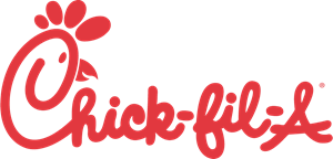
The 1998 Chick-fil-A logo looks very similar to the one we see today. This is the year they eliminated the use of black altogether. Over the years, the Chick-fil-A logo has been made up of primarily black writing and features, using red to make certain aspects of the logo stand out. In 1998, every aspect of the logo, from text to additional features, was made entirely in bold red. The bold red color is a trend in fast-food chain logos that has existed for a long time, including the logos for other popular fast restaurants such as McDonald’s, Wendy’s, Arby’s, In’N’Out Burger, and Jack In The Box. Research has shown that the color red creates a sense of urgency and induces appetite, making the perfect recipe for a fast food logo color choice.
The Chick-fil-A Logo From 2012 – Today
The Chick-fil-A logo only went through one more change to become what it is today. For this final change, the company decided to leave the logo all red but make a slight color change, making it a little less bright and more modern.
Additionally, the registered trademark symbol can be found near the top right side of the “A.” The biggest change, however, would be one final change to Doodles. After decades of an open beak, designers finally drew it closed for a more modern and sleek look.

What We Can Learn From The Logo
Through all of its changes, the Chick-fil-A logo offers many valuable lessons. This is what has kept the brand so recognizable throughout the years.
Adapting To Modern Times
The evolution of the Chick-fil-A logo over the years showcases the brand’s ability to adapt to changing times while maintaining its core identity. While the logo has remained the same in many ways, the colors, design, and artwork all eventually were changed to keep up with the times and give the brand a new and fresh look. Each minor tweak reflected a balance between honoring tradition and embracing modern trends.
Consistency In Branding
While many brands have logos that look completely different from what they started with, this is not the case for Chick-fil-A. Despite multiple logo changes, Chick-fil-A has maintained consistency in its branding elements, including color scheme, font choice, and even its mascot. Even the original logo from the 1960s resembles the one used today. This consistency creates brand recognition and shows their loyalty to their core values and history.
Effective Marketing Campaigns
The iconic “Eat Mor Chikin” campaign, featuring rebellious cows advocating for chicken consumption, shows the power of creative and memorable marketing strategies. When Doodles seemed to be no longer getting the traction they had hoped for the brand, they tried something creative and new. By tapping into humor and storytelling, Chick-fil-A effectively engages with its audience and reinforces its brand message.
Attention To Detail
Although many of the changes to the Chick-fil-A logo over the years have been very subtle, it has proven that they do prioritize one thing – attention to detail. They continued to make changes no matter how small. The meticulous attention to detail in refining the logo, from subtle color adjustments to the closing of Doodles’ beak, highlights Chick-fil-A’s commitment to excellence and creating the perfect image for themselves. This dedication to craftsmanship goes beyond the logo to all aspects of the brand experience, building trust and ensuring the logo remains as iconic as it always has as times change.
The Chick-fil-A logo’s history provides important lessons on branding, innovation, and customer engagement. By learning from these lessons, businesses can find their own way to success while remaining authentic to their identity and values.