Doritos is a famous brand that’s well known for its delicious tortilla chips that work as a fantastic snack or something to munch on during those long car rides. We’re pretty sure that most of our readers are already familiar with the tasty chips that are manufactured by Frito Lay, which is a subsidiary of PepsiCo. The mouthwatering Doritos chips are packed full of flavor and have been around for decades. They first came around in 1960 and have been widely popular since then.
Although many people are already familiar with the tasty chips and packaging, how these chips first came around is less well-known to the public. The brand’s iconic packaging is what makes it so widely recognizable and is a huge part of its advertising and branding. The brand first came alive at Disneyland and their branding was quick to follow once the company was on its feet.
What we do know is that the brand wouldn’t be nearly as iconic as it is today without the famous logo, one that is so familiar it doesn’t even need to show the name with the logo for customers to instantly recognize it.
Let’s take a look at the history of this famous and iconic logo and how it all began at Disneyland.
1964 – 1973: The First Logo
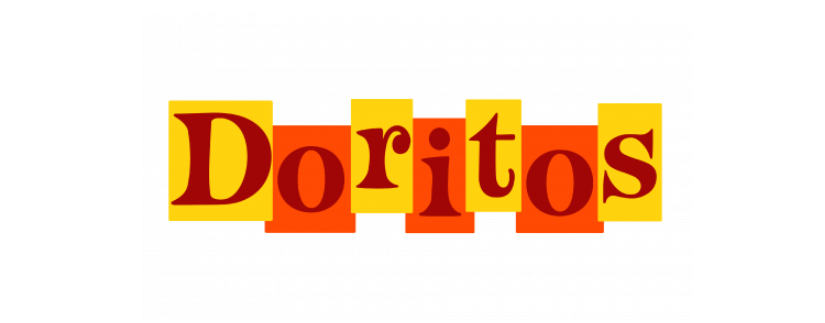
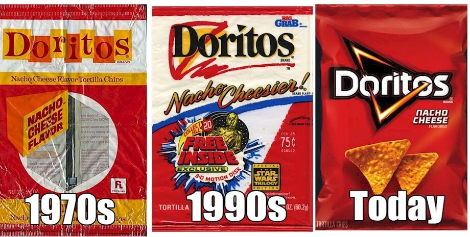
The very first Doritos logo was created in 1964 and although different than the logo we know now, it still carried some elements to today’s logo. This logo was fun and creative, using a geometric banner with rectangles that were appearing to jump. The font was a fancy serif typeface. The logo was colorful, using yellow and red for the banner and letters. The main focus was on the company name while the logo was still creative and fun.
1973 – 1979: A Change
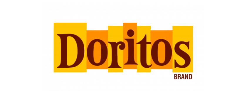
As the business started to pick up more traction in the 70s they decided to create better contrast. They thought that changing up the color was a much-needed redesign element that would give the logo a new look while still keeping the same idea as the first. The text was still very similar to the first logo, but the colors were now changed to brown, yellow, and orange. The letters, although the same in font and style, were now a dark brown.
1979 – 1985: A Color Change
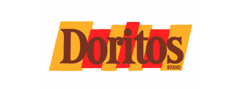
A few years later and the brand thought it was time for another redesign. Both the first and last rectangles con the logo got inclined and the color on the logo changed a little as well. The lettering got a little bolder while the yellow was darkened and the orange was replaced by a cream color. The shade of the brow changed a little as well, and the tagline “Tortilla Chips” was shown in capitals under the name.
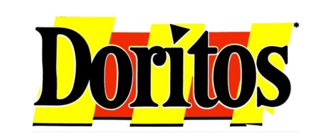
1985 – 1994: Another Redesign
The triangle that Dorito lovers are now familiar with first made its appearance in 1985. But it wasn’t the main star of the brand yet, it was merely used to dot the ‘I’ in the company name. The wordmark got another color change in this redesign, now the letters were black and the rectangles were in a lighter yellow and red. The logo still used a serif inscription and the rectangles still accompanied the wordmark. Some black accents were now included in the logo and the letters now stood out broadly different than they had before.
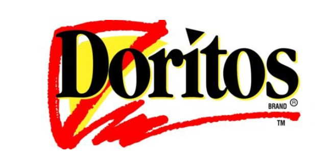
1994 – 1999: The Rectangles Are Removed
In 1994 the brand opted to make the biggest change to the logo that they had since it was first created. The redesign now opted to remove the rectangles that had been with them from the start and instead they included a triangular image that would quickly become an iconic part of the brand. Although the letters stayed in the black and the triangle still dotted the ‘I’, it now included a triangle image that was in red and yellow. It repeated the shape of the legendary chips that the brand presented. A red line underlined the whole wordmark at the bottom and added something new to the logo.
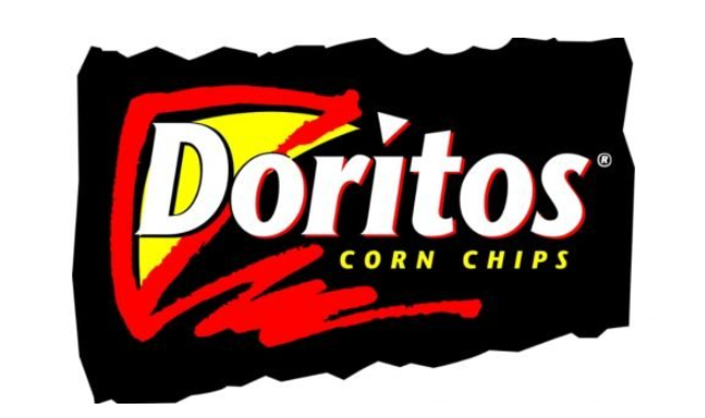
1999 – 2000: A New Color Palette
1999 marked a time when the brand opted to choose a new color palette for the design. Now the entire image was put on a black background, although the design itself stayed the same. The wordmark was now in white with red accents, but the triangle was still the same behind it with the underlining beneath it. The underline became just slightly shorter than it had been previously. This update didn’t last long, but it made an impact when it first was shown.
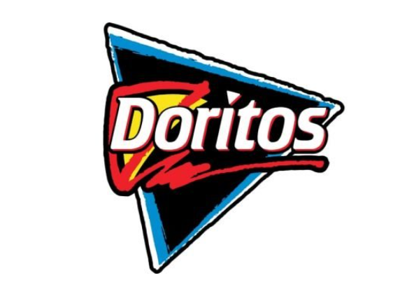
2000 – 2005: Blue Is Added
Another update came in 2000 shortly after the one before it. This one opted to include a new color to the palette; a light blue. Now the background was a triangle in black with a thin blue outline and a black outer edge. The logo looked cooler than it had before and it still kept the wordmark and triangle aspects. This logo is very familiar to the logo that we see used today for the brand and shows what the brand offers by advertising their signature tortilla chips.
2005 – 2013: Another Change
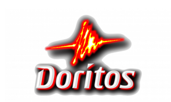
In 2005 the brand decided to drastically simplify the logo while also giving it a cooler touch. They added a 3D effect to the typeface and added drop shadows in the back behind the original text. A flame was shown above the white text that was in the shape of a triangle and added a new and fiery look to the logo. The white letters now also had red accents and the letter ‘I’ was still dotted with a triangle.
2013 – Present: Today’s Logo
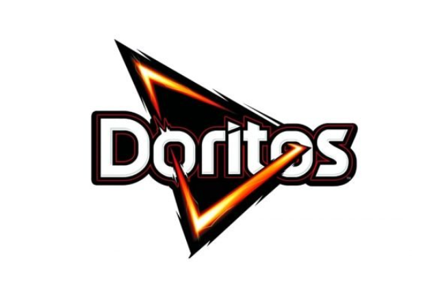
The logo that we’re all familiar with today and is shown on the bags of chips that carry tasty snacks includes elements from the previous logo. It was designed in 2013 and now includes a white sans serif inscription that has double black with a red outline. The letters are enclosed in a fiery triangle that cuts through the two ‘O’s and the triangle is surrounded by a fiery flame. This logo is a strong and iconic element that displays how far the company has come and where it is today compared to where it first started.
Meet The Design Firm

Who was the graphic design firm responsible for creating one of the most legendary logos of all time? That would be Hornall Anderson Design Works LLC, now known as Sid Lee. The firm created the most current Doritos logo and worked in partnership with Frito Lay to create it. The creative design firm specializes in many areas of design and helped the global market out with getting their new logo. The Doritos logo hasn’t changed since and, although it’s likely that it may change, we don’t see any total redesigns coming in the future.
What Makes The Logo Different?
The Doritos logo is a widely successful one, so it’s only natural to be curious why this logo works so well for the brand and what makes it so different from all the other logos that we see daily. The simplest answer is that the logo is unique. These days it’s difficult to find a logo that sticks out, but Doritos has managed to do it. The logo tells their story and tells it proudly. It gives the brand a personality and makes it into a strong, powerful, and iconic logo that won’t soon be forgotten. The Doritos logo is included as one of the most legendary logos of all time due to being such a unique, original, and truly powerful logo that leaves a lasting impression.
The History Of Doritos
Back when Disneyland wasn’t the massive and famous theme park that we know it as today and when it was still in the early days, Casa de Fritos invented Doritos. Although we now know Doritos as delicious and flavor-packed tortilla chips that make us eager for a second bite, that wasn’t what they always were. Doritos started as merely plain and simple tortilla chips when they first began selling in 1964.
Casa de Fritos was a restaurant that was popular at Disneyland and operated there from the time between 1955 and 1999. This restaurant was popular, especially with those who enjoyed Mexican food and the younger children that visited the park. Some of the food that was delivered to the restaurant included tortillas. Although they were enjoyed by customers, the restaurant still ended up with a lot of c tortillas.
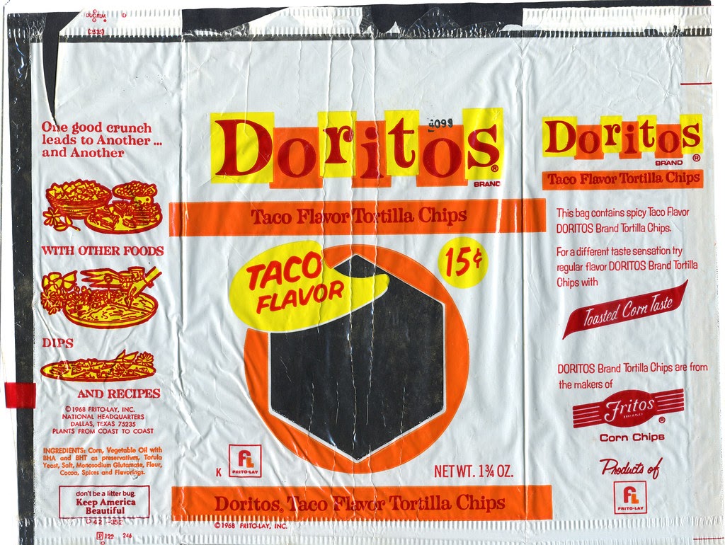
Instead of tossing out the stale tortillas that the restaurant could no lingerie use, a salesman asked one of the cooks at the restaurant to fry up the tortillas. He wanted the cook to make chips out of the stale tortillas. These soon were being enjoyed by customers but the merged Frito Lay didn’t know that they were being enjoyed by customers. When Mr. West visited the restaurant and saw that guests were enjoying the chips they saw that they weren’t just a way to use up the waste.
They could potentially be an amazing snack that could be pure gold for the company. From that point, Alex Foods was hired to manufacture the chips with the intention of national sale in mind. From the beginning, the name Doritos stuck with the chips, which translates to “little golden things” in Spanish. Later Frito Lay decided to produce Doritos on their plants.
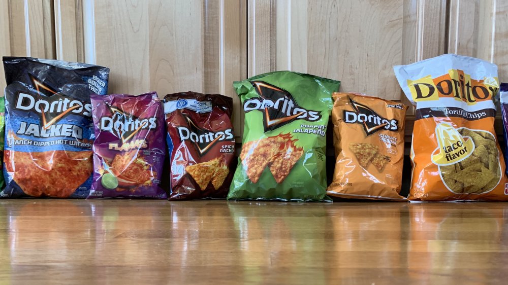
If you were to taste one of the very first Doritos, they would taste very different from the Doritos that you enjoy today. The first Doritos were very plain and didn’t have much flavor to them. To make them more flavorful, the company included a Mexican flavoring seasoning that was called “Taco”. The nacho cheese flavor that we associate with the chips didn’t come to Doritos until 1974. There have been 100 different Dorito varieties in the last 50 years and now there’s a variety of flavors that you can choose from when you purchase your favorite bag of Doritos.
Summing Up The History Of The Doritos Logo
Doritos is a strong and familiar brand that has come a long way since it was first created in the 1900s. The brand has become one of the most famous tortilla chip brands to exist and that has a great deal to do with their aggressive marketing and their attractive branding. The brand has gone through quite a few logos changes in its time, but what’s most surprising to customers is that they boast over a hundred flavors. Many customers are surprised to learn that the very first Dorito was created at Disneyland and has come a long way to being bought in stores!
The Doritos is truly an iconic visual identity, being one that proudly shows the brand off while also keeping its personality. The logo has been around as long as the brand itself, although it’s gone through a variety of changes that have gotten it to the point logo that we’re familiar with today. The attractive logo that we see today is used not only in advertising and every product, but it also stands for the delicious chips that the brand produces.

