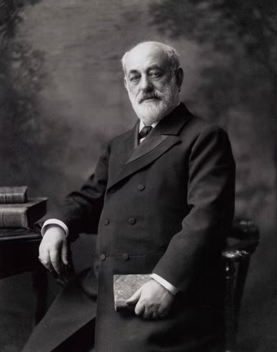
Goldman Sachs was established in 1869 by German immigrant Marcus Goldman.
Goldman moved to New York City with his family and started with just a one-room basement office next to a coal chute. From there, the business flourished.
It now ranks eighth largest bank in the United States, with assets of $521.1 billion.
However, in those more than 150 years, it is not only the business itself that has changed. The brand’s logo has also seen some changes.
About Goldman Sachs

When Goldman started in 1869, bank loans were tight and pricey. He decided to offer merchants a different option — buying their promissory notes and selling them to commercial banks in New York. This is what became known as the “commercial paper business.”
It wasn’t long before other family members began becoming involved in the business. In 1882, Goldman was joined by his son-in-law, Samuel Sachs, and then by his own son, Henry Goldman, in 1885.
With the new additions to the team, the business rebranded, calling themselves “Goldman, Sachs & Co.”
By 1896, the firm was a leader in commercial paper sales and had expanded nationally. In the early 1900s, Goldman Sachs began establishing its investment banking business, pioneering the valuation of securities based on a company’s earning power rather than just physical assets.
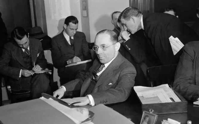
The firm handled significant public offerings. This included those for General Cigar and Sears Roebuck. In 1930, Sidney J. Weinberg — who is often considered the “father” of the modern-day version of the company — was named senior partner of Goldman Sachs.
He continued to serve as senior partner for nearly 40 years and became one of the most powerful men on Wall Street.
Goldman Sachs After World War II
Weinberg did not have an easy time guiding the company when he first began. The first few years were especially difficult.
Weidberg had to guide the company through the Great Depression and the aftermath of the collapse of the Goldman Sachs Trading Corporation. However, by the end of World War II, things started to look up.
After the war, Weinberg earned the name “Mr. Wall Street” as he turned Goldman Sachs into a leading full-service investment bank.
Through his leadership, the firm managed major stock and bond issues, created the New Business Department, and set industry standards in underwriting and sales. The firm expanded internationally, opening offices in Europe and Asia.
After Weinberg’s unfortunate death in 1969 — 100 years after the company began — leadership changes continued, with Hank Paulson, Lloyd Blankfein, and later David Solomon guiding the firm. By the 1980s and 1990s, Goldman Sachs solidified its global presence.
The company developed innovative financial products and was able to expand into new markets. A historic vote in 1998 prompted the firm to go public in 1999, further increasing its capital and flexibility.
Fast forward to today, Goldman Sachs has focused on technology, consumer banking, and sustainability. Goldman Sachs remains a global financial leader, guided by its core values of client service, partnership, excellence, and integrity.
Goldman Sachs Branding
Although the firm itself has undergone many changes throughout the years, its logo has remained primarily the same.
In fact, only two variations of the logo were ever used. Today, Goldman Sachs can be quickly recognized by its logo featuring a sky-blue colored square with white flush left serif font letters reading “Goldman Sachs.”
While this logo has technically been the same since 2020, it is not that different from the original logo, which was created in 1970.
The Creation Of The Goldman Sachs Logo
The original Goldman Sachs logo was created in 1907 by Lippincott & Margulies, Inc. — now just “Lippincott” — a firm that went on to design some of the most iconic brands of the 20th and early 21st centuries, including the 1967 Coca-Cola ribbon, the 1963 Campbell’s Soup can labels, the Betty Crocker spoon, and the American Express blue box.
The firm also helped many others reimagine their brand logos, such as Starbucks, Walmart, Taco Bell, and Delta.
The original design took a minimalist approach. It featured a bright sky-blue square with the company’s names spelled out in white flush left serif font letters in the top corner. The color choices were used to display a sense of confidence, trustworthiness, and clarity.
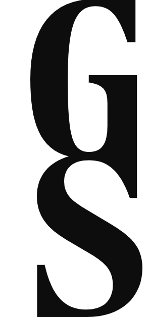
The typeface itself was inspired by the Bodini typeface that was created by Italian typographer Giambattista Bodoni in the eighteenth century. Perhaps the most memorable feature of the Goldman Sach’s logo, however, is the distinctive ligature of the letters “G” and “S” and “c” and “h .”
This variation of the logo was said to be inspired by Tiffany & Co.’s logo. This is the same logo that remained until 2020.
The 2020 Version Of The Goldman Sachs Logo
The Goldman Sachs logo was quietly changed in 2020. This version of the logo was created by Dalton Maag, a typeface design studio founded in 1991. The change came after the original logo was considered to be “not legible enough at small sizes.”
During the redesign, many of the original features stayed the same. However, there were two key differences. First, the bright blue color of the square background was made slightly duller. Second, the letters “G” and “S” and “c” and “h” were no longer fused together, making the logo easier to read in smaller sizes.


The Current Version Of The Goldman Sachs Logo
Goldman Sachs made one more change to their logo in August 2024. This time, the company reverted back to its original style where the “G” and “S” and the “c” and “h” in its logo are connected. Some of the 2020 style was also kept, however.
For example, the more pointed serif styles on the top of the “A” and the “C” were used instead of the original, more rounded style.
The change came after the company decided it wanted to preserve more of its heritage in the logo and also found a solution to its issue in 2020, where it believed the old text style was hard to read in smaller sizes.
Additionally, the company redesigned its monogram, this time connecting the “G” and “S” side by side and giving a white or blue background.
This has been most used for its social media platforms. There is also one final monogram variation used on its website where the “G” and “S” are connected vertically.
The Safe Deposit Box
At first glance, you may not realize that the square background that has remained the background of the Goldman Sachs logo throughout the years is more than just a square.
It was actually designed to be a safe deposit box.
Even though it has existed for many years, this reflects the firm’s promise of security and use of modern technology.
It also subtly reflects the firm’s incorporation of modern technology and innovative approaches.
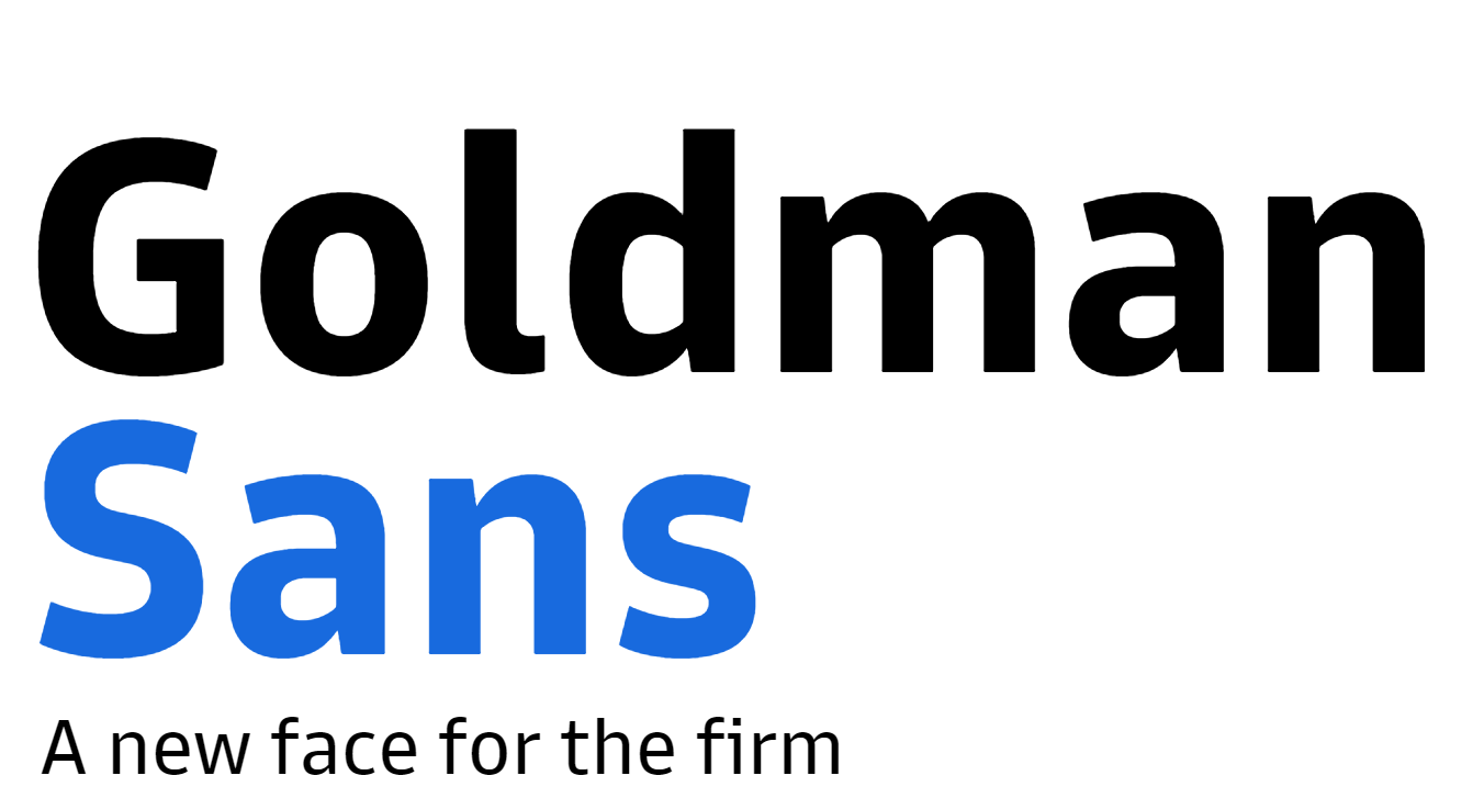
The Introduction Of Goldman Sans
The change in 2020 to the Goldman Sachs logo didn’t just spell out the company’s name differently — it used a “new” font altogether.
In fact, the font they used in the redesign was created just for them. In early June 2020, Goldman Sachs released their own custom typeface, “Goldman Sans.”
The firm said the font needed to “draw from the firm’s 150-year heritage while looking ahead to what Goldman Sachs wanted to be in the future.” Goldman Sachs described this new typeface as “neutral, with a wink.”
During this time, Bespoke typefaces were becoming increasingly popular amongst corporations. Toyota, Duolingo, Southwest Airlines, and CNN are just a few of the other large companies that hopped on this trend.
Even YouTube upgraded from its original “Open Sans” font to “ YouTube Sans” and finally “Scope One.”
Goldman Sachs had the logo created for more than just their new logo, however. They also wanted it to be used for their marketing, website, app, and YouTube video content.
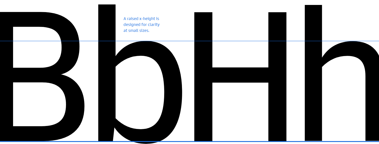
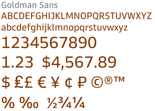
Its identifiable features include a small extension on certain characters, such as the tops of “p”, “q,” “n,” and “g,” to create what is referred to as “slight chamfered spurs.”

The idea behind it is to enhance the visual appeal by creating more white space. They also gave “i” and “j” unique crowns to make them easier to differentiate.
They also made some height adjustments to some letters, such as “x,” and made specific interior shapes that looked different from the exterior of the letter for “o,” “b,” and “d.”
Finally, the numbers in this font were specifically designed so that they would line up perfectly in a financial table.
The Color System
The typeface is not the only thing Goldman Sachs reworked in their rebranding.
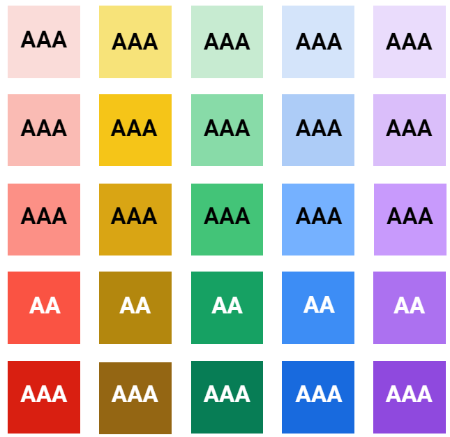
They also made brand-wide adjustments to their colors. This enabled them to gain a Web Content Accessibility Guidelines (WCAG) Compliant AA rating for their contrast levels.
It also allowed them to create greater consistency across their products and platforms and make them more scalable to extend to existing brand implementations.
The new color system was designed to support data visualization, accent colors, UI components, and more.
Goldman Sachs’ rebranding efforts in 2020 aimed to create a cleaner, more modern, and credible look through typography, color, and design updates while maintaining the iconic elements of its historic brand identity
What We Can Learn From The Logo
Although the Goldman Sachs logo has not undergone many changes, there is still a lot that can be learned from it. Its distinct design offers key insights into effective branding and design strategy.
- Brand Consistency
With only two designs, the Goldman Sachs logo has been very consistent over the years.
Despite over 150 years of operation and numerous changes in the financial landscape, the firm has maintained a logo that has remained recognizable and stable.
This not only made sure that the brand stayed easily recognizable but also helped to build and maintain trust with clients and stakeholders and reinforced the brand’s reputation for reliability and continuity.
- Minimalistic Approach
The original design’s minimalist approach has remained timeless. The firm never chose complex or ornate elements. Instead, they prioritized clarity and readability.
They also made adjustments that best reflected a company dealing with complex financial services. The recent update in 2020 focused on enhancing legibility at smaller sizes and reflected that Goldman Sachs realized the importance of clarity in design.
They prioritized simplification and focused on core elements that can make a logo more versatile and effective across various mediums.
- Symbolism
Although the Goldman Sachs logo is simple, it incorporates some symbolism. The subtle design of the square background as a safe deposit box adds a layer of meaning to the logo.
This reflects Goldman Sachs’ commitment to security and modern technology. Even simple symbolism like this can enhance brand identity and create a deeper connection with the audience.
The Goldman Sachs logo communicates its core values and promises subtly while still effectively strengthening the overall brand message.
- Staying Relevant To Current Trends
Even with little changes to the logo, Goldman Sachs managed to keep up with current trends. Perhaps the biggest example of this is Goldman Sachs’ adoption of its own unique bespoke typeface.
This was part of a broader corporate trend and reflected a savvy understanding of market dynamics and branding trends. By developing a custom typeface, Goldman Sachs aligned its visual identity with its brand values and functional needs, ensuring coherence across all digital and physical platforms.
Custom typefaces can offer unique branding opportunities, providing a distinctive look that sets a company apart from its competitors.
- Accessible Visual Identity
Goldman Sachs prioritized having an accessible visual identity throughout their logo improvements. They updated the color system to create a more modern and accessible visual identity.
These changes aimed to make the design more inclusive and readable, achieving a Web Content Accessibility Guidelines (WCAG) Compliant AA rating for contrast levels. This created easier accessibility for all users.
By slightly dulling the iconic sky-blue background of its logo and adjusting other colors throughout its website and other materials, Goldman Sachs created a cleaner and more credible look.
The history of the Goldman Sachs logo highlights the power of consistency, simplicity, and strategic adaptation in branding. By maintaining a minimalist design with subtle symbolic elements, Goldman Sachs has created a timeless and recognizable logo that communicates its core values of security and innovation.