
Good Morning America has been providing morning entertainment and news for nearly 50 years now.
They might not have been the first national morning show, but they quickly became one of the most popular.
Today around 5.5 million tune in! Over the years their logo has changed fourteen times.
Looking at the logo’s history we will see both major and minor changes that lead up to the one we use today.
The Logo From 1975 – 1987
Before we talk about the first logo design, it is worth mentioning the interesting story behind the name. ABC got the title from the song City of New Orleans by Steve Goodman, but they weren’t the first trying to wish viewers a “good morning.”
Boston ABC affiliate WCVB-TV had a show simply called Good Morning! The station manager for WCVB even accused them of stealing the title.

As you can probably guess, Good Morning America won the battle, and Good Morning! later became Good Day!.
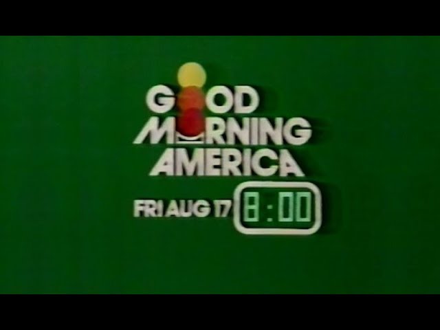
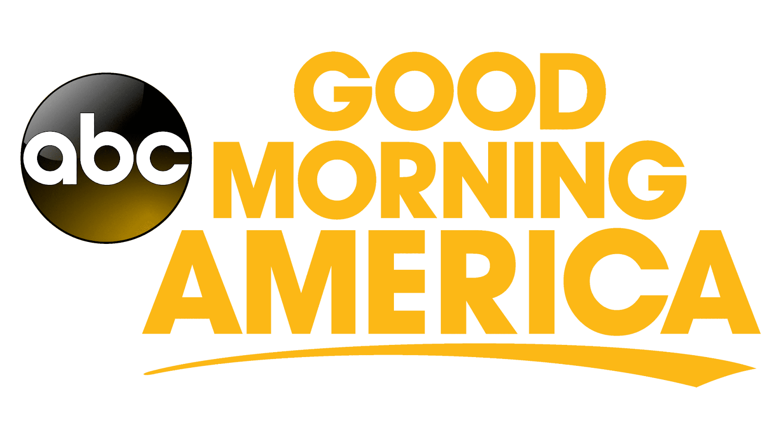
Now let’s look at the logo! The first logo staked the words on top of each other. With a bold black sans-serif typeface and a pop of colors in the O’s (more on that in a second), this logo is definitely inspired design.
The O’s in “Good” and “Morning” make up two-thirds of a rising sun. Going from red to orange to yellow just like you’d see in the morning.
But why add a third sun at all you may ask? To symbolize the hours 7 am to 9 am, which is when the show aired.
1987 – 1989
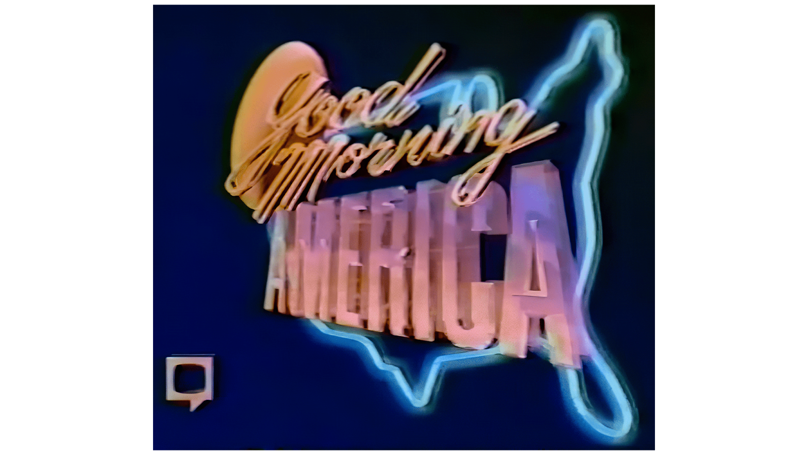
Watch out, because this next iteration of their logo is about as opposite as you can get. 3D where the other one was flat, with multiple colors and fonts, and a large outline of America in the background.
This change in logo came thanks to the retirement of David Hartman, the original host of Good Morning America.
Gone are the rising suns and instead is one yellow sun peaking over the top left corner of the logo. The words “Good Morning” changed to a cursive font and “America” became larger and all upper case. In case you thought they couldn’t put anything more into this font, they added a gradient of pink to purple to America.
All of the elements have a 3D effect, combined with a tilt as if the image is about to rotate around to face the viewer. This tilt was meant to convey the idea of waking up and starting a new day. A bit busy by modern design standards, but definitely the 80’s vibe.
1989 – 1994
After just two years of the previous design, we see another logo take its place.
No more America outline, no more sun.
Change the cursive font back to bold uppercase and make the logo forward-facing.
Some elements of the previous logo were kept. We still have a gradient, light orange to a darker orange on “Good Morning” and light purple to a darker purple on “America.”
America is also still bigger than the first part, perhaps emphasizing the program’s national reach.
The dark shadow behind the words retains that three-dimensional feel as well.
1994 -1996
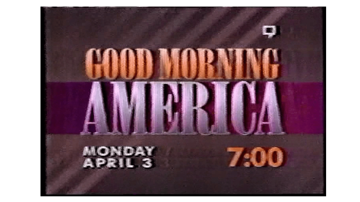
In 1994 it was time for another logo switchup. The 90s were full of bright colors, bold fonts, and geometric shapes in infographic design. We can’t say for sure if that was the reason behind the logo change, but this change certainly reflected the new style of the times.
The ombre is gone and the colors have changed, now “Good Morning” is all white, and “America” is a dark blue.
The typeface and differences in size remain, along with the bold line behind America (though it is now fashionably chopped off before the A).
In the background we see color blocking with various lines and rectangles, and an off-center red square helping the new logo stand out.
While those last few designs have been bold and fun, it’s time to enter the 21st century with some cleaner designs.

1996 – 1999
Yes, this isn’t technically the 21st century yet, but it is when we first see our first simplified version of the Good Morning America logo. Between 1995 and 1998 Good Morning America was having a tumultuous time on TV. First, it lost its top spot to Today. Joan Lunden who had been co-anchor for over 10 years stepped down in 1997, and then one year later ratings declined again when Charles Gibson left. Perhaps this is why we see 3 logos in less than 3 years.
By now Y2K was all anyone talked about. Graphic design was stuck between two worlds, bright colors and futuristic styles or almost brutalistic, flat design that represented everything the 90’s didn’t. You can see that Good Morning America took the latter.
No more background images at all, one color (a nice lilac), and a nice thin line separating the words. Good Morning retained its capitalized font while America changed to be all lowercase and more rounded – it did stand out in terms of size still.

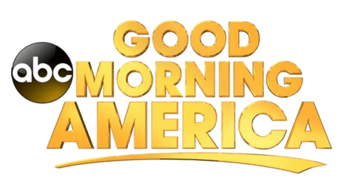
1999 – 2002
Good morning America and goodbye color! Let’s take a look at these new changes to their logo. “Good Morning” becomes smaller, more modern, and bolded with small caps. “America” remains lowercase and larger but thins out its font. The network’s insignia is now before the logo, a simple black circle with white “abc” inside.
Around the end of 1998 and beginning of 1999 Good Morning America had a major overhaul. They fell to third place in the country and in response added a new producer who promptly brought back Charles Gibson and paired him with a new face, Diane Sawyer. Their new logo reflected their new image, professional, modern, and ready to take back their top spot in the new century.
2002 – 2006
The early 2000s were good for Good Morning America. Ratings skyrocketed once again and it shifted to become a more serious news source, even taking the reporting to unique places like an aircraft carrier and the Vatican! At the time they were the first to do live shows from somewhere besides a set newsroom.
The ABC logo stays the same, but the rest gets a fresh coat of yellow paint. “America” is back to its capitalized self and bold font, the A is now made even bigger, taking up both the top and bottom space. The line between “Good Morning” and “America” is removed as well.
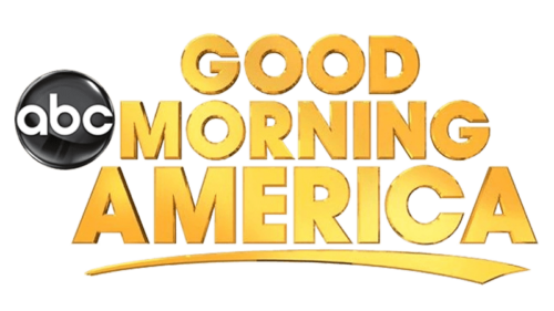
2006 – 2010
We’re back to three levels, a logo choice not made since 1989! As they say, the best things come in threes; Good Morning America also added a third host at this time and planned to add a third hour to their weekday shows.
The changes include the removal of the ABC circle, a three-tiered logo, and a weighted line across the bottom of the logo.
We keep the yellow, the bold font, and “America” is slightly bigger than the rest of the words.
The line across the bottom is used to add emphasis, similar to underlying an important part of your reading, and may even double as a horizon line as “Good Morning America” rises over it to symbolize a new day.
The Logo From 2010 – 2019
There are actually three new logos in these nine years, however they are so similar we are going to group them together and explain them all in one go. In 2010 Good Morning America attempted a small rebrand, going back to two hosts and moving the news desk back to the large windows overlooking Times Square. We will also see hints of this nostalgia in the new logos.
Here is what’s the same about each one. The circular ABC logo is brought back, and we keep the font and underline we see in the 2006/2010 logo. Now for what is different:
2010 – 2013
We get our ombre, shiny, 3D letters back and this time even the ABC emblem joins in on the fun with a nice glossy look. It’s almost retro, giving us flashbacks of the 3D logo of 1987/1989.
2013 – 2015
The main logo stays the same, but ABC loses the shine and gets a pop of yellow gradient in the lower part of its circle.
2015 – 2019
No more gradient and now a larger ABC circle logo to better balance out the whole logo in general.
2019 – Present Day
Once again we go through a series of ever-so-slight logo changes. We do see a major change up from the 2010 to 2019 logos, however.
2019 – 2021
“Good Morning America” now becomes blue and is completely enclosed in a yellow circle. The ABC logo is back with its button-like shine and moved to the bottom. The sizing and typeface of the logo remain, with America being slightly larger than the rest.
2021-2022
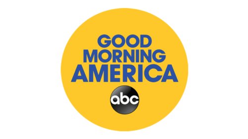
Everything remains the same, but the ABC logo becomes a flat black.
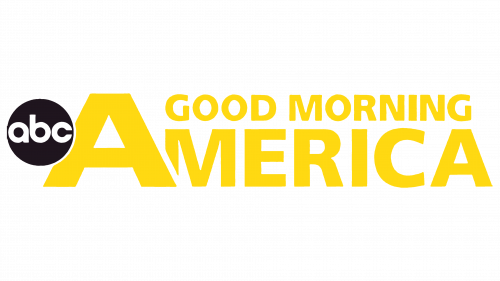
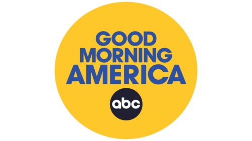
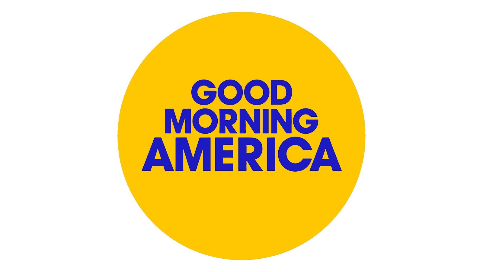
2022 – Present
In this last iteration (for now) we see the ABC logo disappear while the rest remains the same.
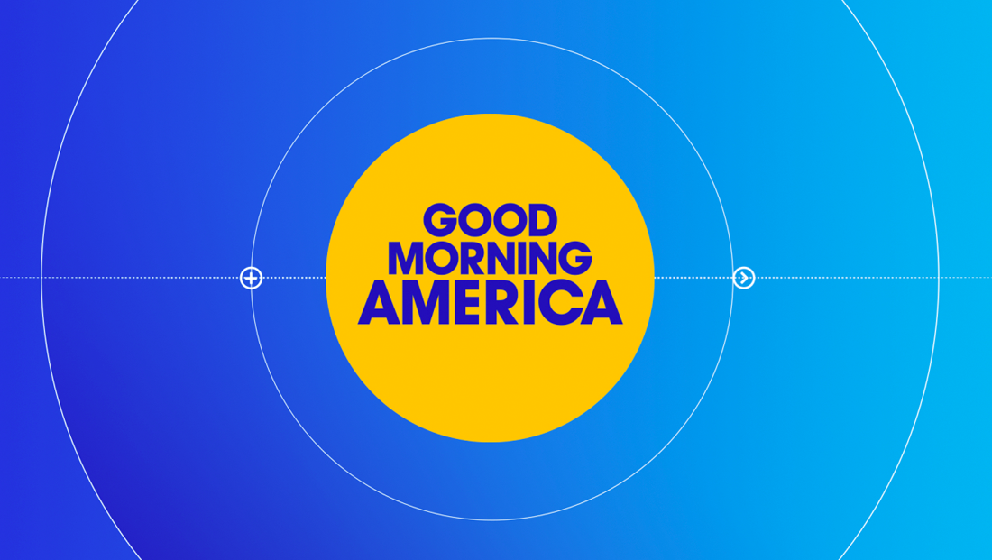
Our current times are all about nice, clean graphic designs.
We see this logo now as a standalone or on a nice gradient blue background with thin white stylized lines.
The Reason Behind The Modern Logo
The history of the Good Morning America logo is just as unique as the history of the show.
Over the years its change in appearance has reflected what it wants the viewers to feel as they tune in to one of the longest and most successful morning news and entertainment shows out there.
The yellow and blue we see now are not only eye-catching, it reflect positivity and hope.
The design is clean enough to convey the professionalism of a station that has broken some major world events, while also remaining fun as it spreads feel-good stories as well.


