Want a fresh drink of water, save the planet, and look hip doing it? Well, Liquid Death has branded itself as the company you’re looking for. The company is on a mission to spread cans, not water bottles, worldwide.
And they’re giving back in the process, with 10% of company profits going to combat plastic pollution and offer clean drinking water to those who need it.
Get to know the Liquid Death brand, and how their bold, monochromatic logo is becoming an iconic design, much like their mission of saving the planet. So, it’s not just about the product but the movement.
Liquid Death has tapped into a cultural zeitgeist, positioning itself as more than just a beverage brand but a lifestyle choice. By aligning itself with sustainability and counter-culture aesthetics, the brand resonates with a generation that values both social impact and style.
With a sharp sense of humor and a rebellious spirit, Liquid Death quenches thirst and challenges the status quo, one can at a time.
About Liquid Death
The Liquid Death brand is more of a way of life than a bottled water company. Founded in 2019 by Mike Cesario, the company leaned heavily on creative marketing to get a foothold and has quickly disrupted the beverage industry. They focused on creating a healthy brand with a twist—with an edge and a lot of merch, like branded tees.
Their brand identity is rooted in a combination of punk rock aesthetics and environmental consciousness, resonating with a younger audience looking for more than hydration. Their name was created to stand out in the crowded beverage market.
The founders wanted an edgy, provocative, and unexpected name for a water brand. The idea was to create something that felt more like a heavy metal band than a typical water company. The name “Liquid Death” was chosen to emphasize the idea of “murdering your thirst” and to create a brand that would be memorable and generate buzz.
The stark contrast between the name and the product—essentially just water—helped it quickly gain attention and set it apart from other brands.
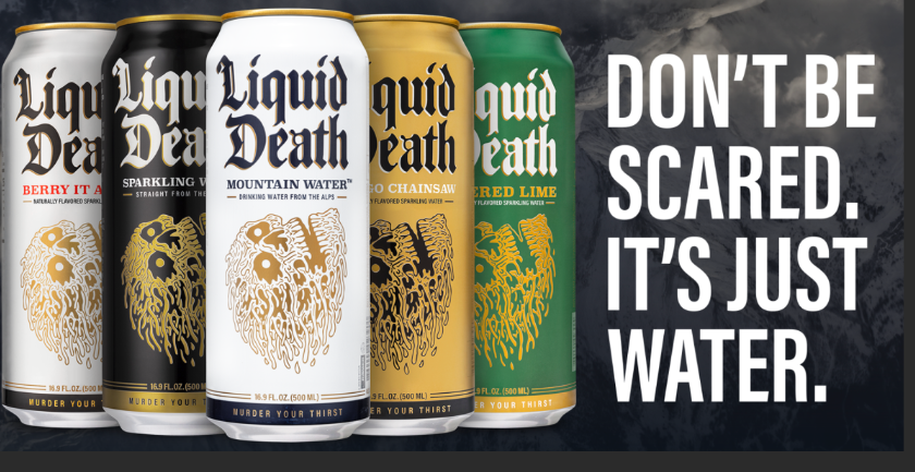
They aimed to shock and amuse their audience with advertising, boosting their products and merchandise at music festivals and concerts. They have also taken social media by storm with viral videos and memes. But it isn’t just their approach and products; it’s their mission—to improve the world.
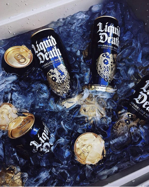
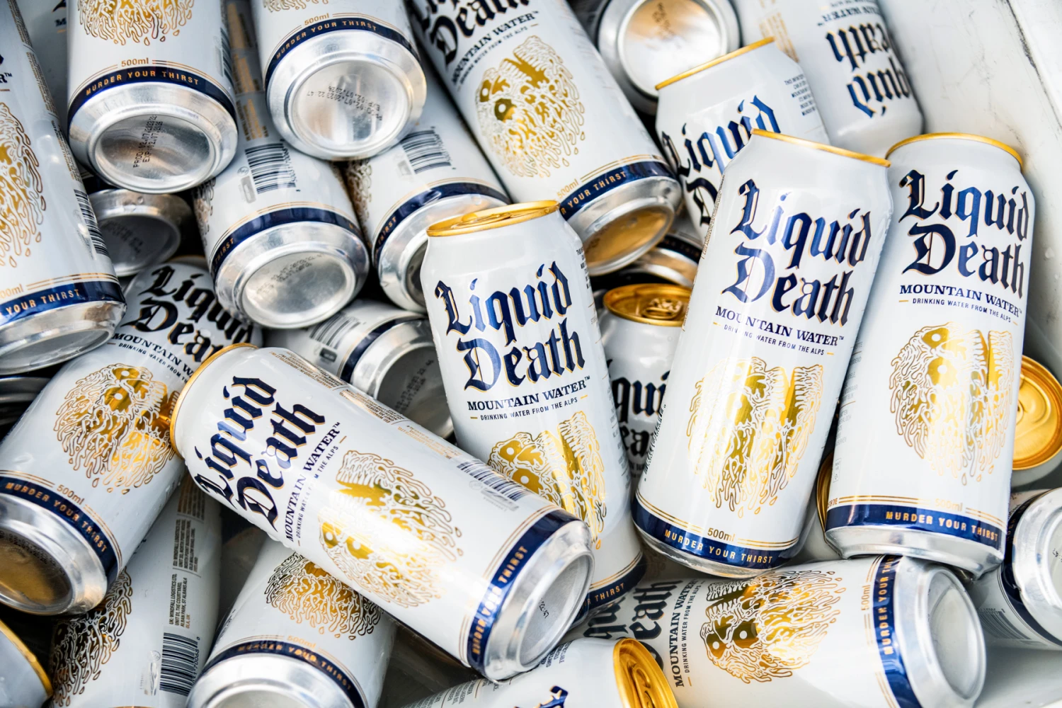
The fight begins against plastic bottles and supporting sustainability. The brand is committed to environmental sustainability, using cans as a deliberate choice to combat plastic pollution. Their main product is carbonated or still water in an aluminum can bearing a skull and inviting buyers to “Kill Your Thirst.”
Liquid Death Brand Competitors
Liquid Death has its edgy, rebellious branding and unique positioning. But its competitors are formidable.
Evian
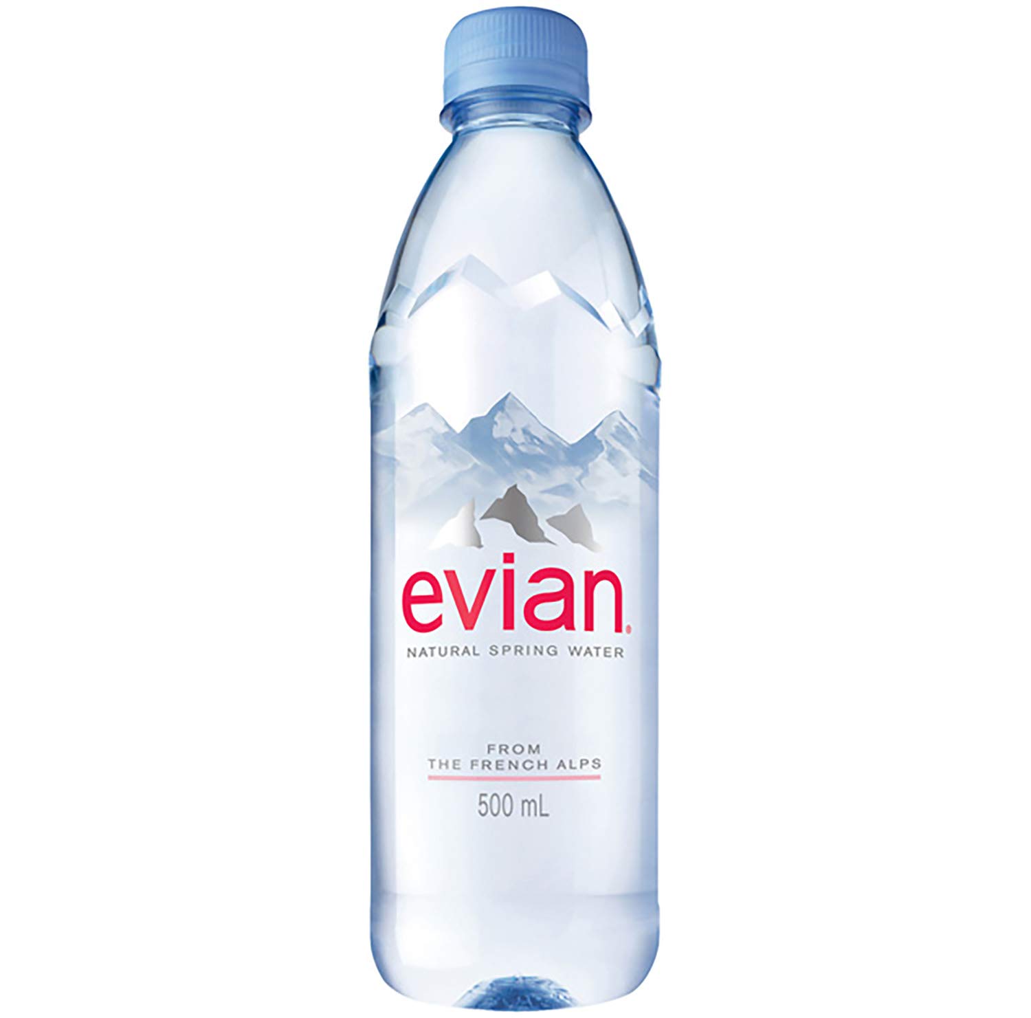
It’s one of the most well-established brands in the premium bottled water market, with a history dating back to 1826. Its long-standing reputation as a luxury water brand is deeply ingrained in consumer minds, making it a go-to choice for those seeking premium hydration. It has a presence in over 140 countries, so its global distribution network is expansive, allowing it to reach a broad audience.
The brand has also made significant strides in sustainability, including its commitment to using 100% recycled plastic bottles by 2025, appealing to eco-conscious consumers.
Fiji Water
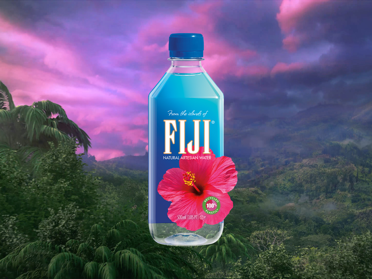
Fiji Water is sourced from an artesian aquifer in Fiji, which gives it a unique selling point. The water is naturally filtered through volcanic rock, imparting it with a distinct mineral profile that is highly marketable. Like Liquid Death, Fiji Water markets itself as a premium product, often found in high-end hotels, restaurants, and events.
Its square bottle design is instantly recognizable and adds to its luxury appeal. It is a globally recognized brand with a strong presence.
Voss
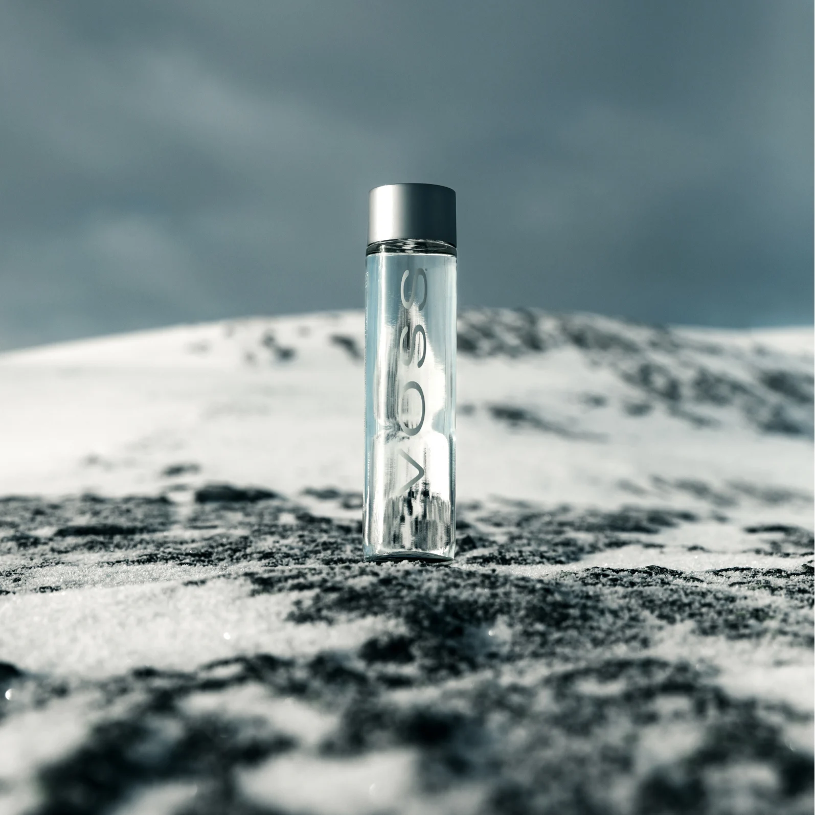
Voss is known for its sleek, minimalist glass bottle, positioning itself as a luxury brand, similar to how Liquid Death uses its bold branding.
It’s perceived as a high-quality water brand sourced from an aquifer in Southern Norway.
The brand has also been associated with celebrities and influencers, aligning it with a luxury lifestyle.
Topo Chico

Topo Chico has developed a cult following, especially in the Southern U.S., where it’s considered an essential beverage. Its strong carbonation and crisp taste set it apart in the sparkling water category.
Beyond being a standalone beverage, Topo Chico is also popular as a cocktail mixer, expanding its consumer appeal.
The brand’s long history, dating back to 1895, and authentic Mexican roots resonate with consumers who value tradition and authenticity.
Smartwater
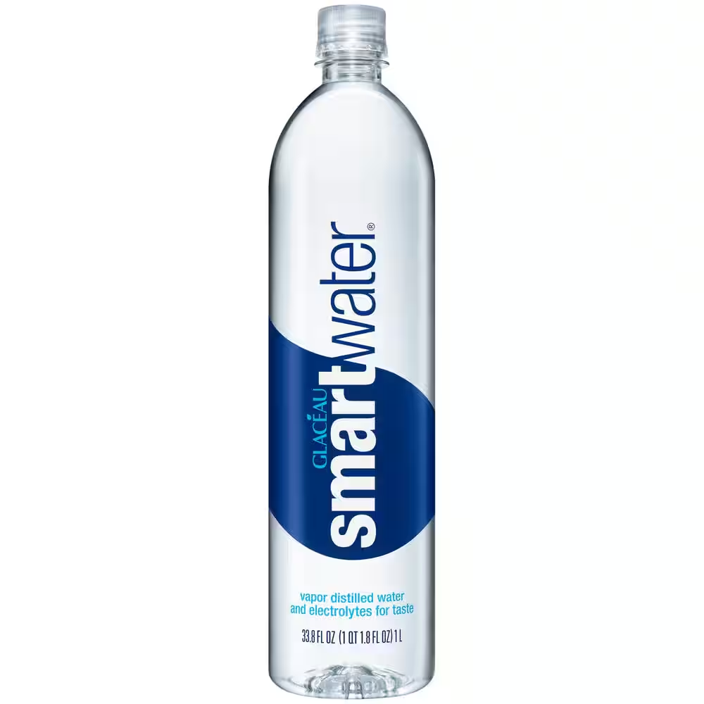
As a product of Coca-Cola, Smartwater benefits from the massive distribution and marketing power of one of the world’s largest beverage companies.
It’s marketed for its vapor-distillation process and added electrolytes, positioning it as a smarter choice for hydration and appealing to consumers looking for “enhanced” water options.
It has a global reach and extensive availability, so it’s easily accessible, making it a strong competitor.
Each of these competitors brings something unique: heritage, premium positioning, health benefits, or cultural relevance. While Liquid Death has carved out a niche with its rebellious branding and focus on eco-friendly packaging, these competitors remain strong due to their established market presence, global distribution networks, and ability to cater to various consumer needs and preferences. Liquid Death’s challenge lies in continuing to differentiate itself while competing with brands with strong consumer loyalty and significant resources.
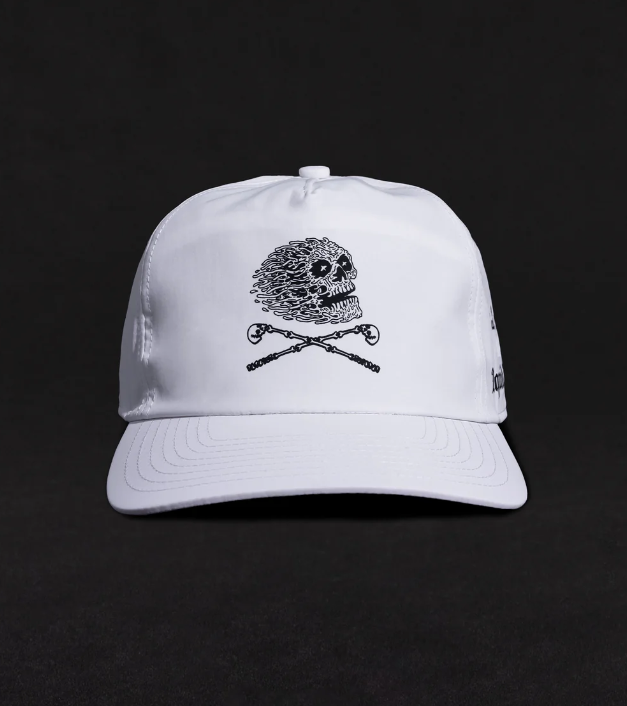
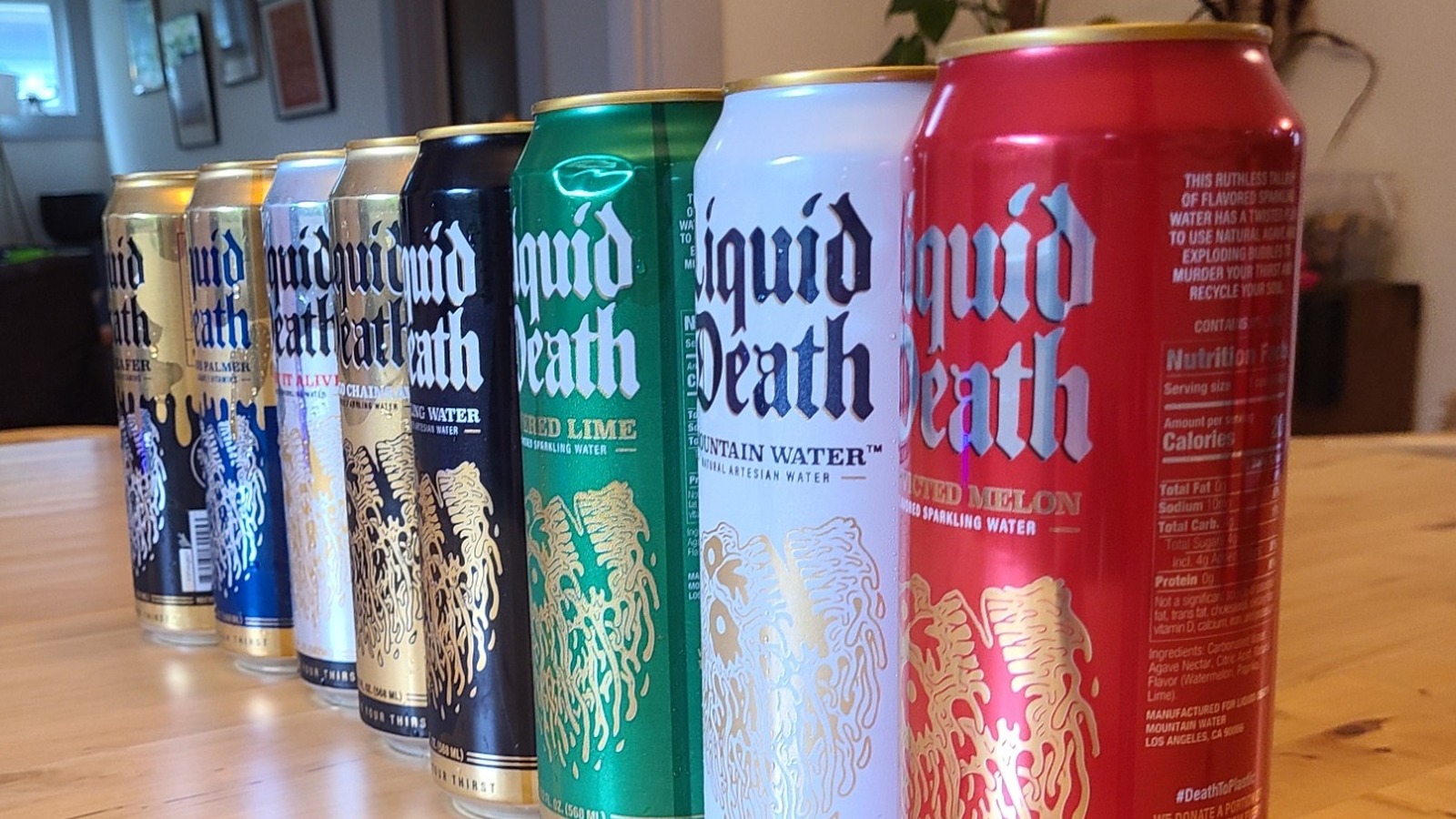
The Liquid Death Logo
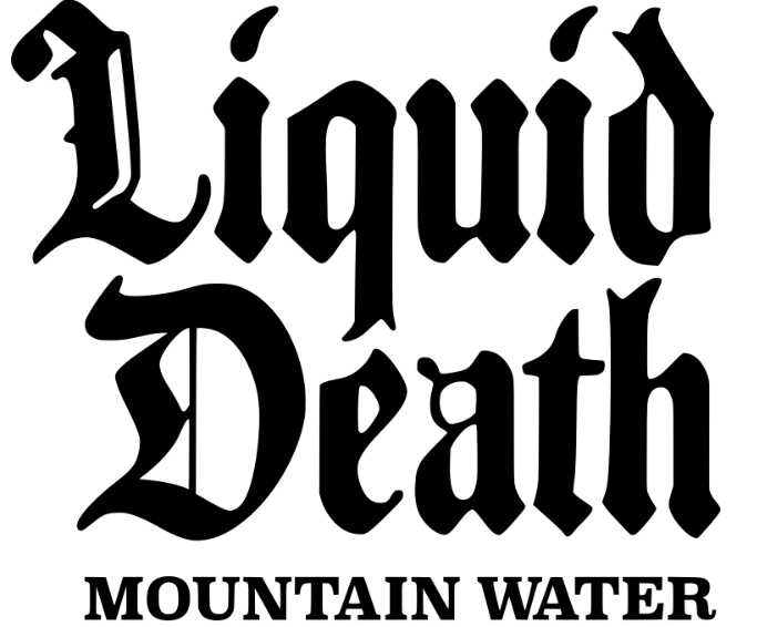
The Liquid Death logo is meant to speak to its target audience – those who flock to alternative concerts, the artists who take the stage, and the tattoo lovers of the world.
It has an edge, and the logo exemplifies it. It’s simple but profound, with a black goth fancy script and smooth-edged typography. Below the brand name is in all a classy serif uppercase font “Mountain Water”, making it clear just what’s inside the can.
Beyond its visual appeal, the Liquid Death logo represents a lifestyle, a rebellious ethos that challenges the norms. The design is more than just a marketing tool; it’s a badge of identity for those living on mainstream culture’s fringes.
Combining gothic elements with refined typography, the logo bridges the gap between edgy rebellion and premium quality. It symbolizes defiance and a mark of distinction for those who crave something different.
Elements in the Liquid Death Logo
Shape
The Liquid Death emblem’s art is clean and simple yet powerful, making it grab its target customers’ attention. The shapes represented are smooth-edged, with a sleek look that contrasts the grunge style of the brand. The contrast exemplifies the brand’s personality – healthy and rough at the same time.
The simplicity of the design allows the emblem to stand out, even when placed in busy environments or with other brands. The minimalist approach does not detract from its impact but instead amplifies the message that Liquid Death is a brand that embraces both modernity and a raw, unpolished edge. This balance between sleekness and grittiness appeals to a broad audience, resonating with those who appreciate a refined and rebellious brand.
Font
The font in the Liquid Death logo is its most defining feature. The brand name is written in a black gothic fancy script that speaks to the alternative crowd, artists, and tattoo lovers.
The script is elaborate yet legible, offering a “rebel” feel, while still being clear. Beneath the brand name, the phrase “Mountain Water” is presented in a classy serif uppercase font.
This combination of gothic script and a serif font strikes a perfect balance.The ornate script with the clean serif font beneath it adds depth and sophistication to the logo, making it not just a label but a statement. This thoughtful design choice underscores Liquid Death’s commitment to being more than just a beverage—it’s a lifestyle brand.
Colors
The Liquid Death logo is monochromatic, with black associated with alternative and gothic subcultures. Black also has a bold and striking look that is easily visible on store shelves. The color palette is kept simple to keep the brand’s name and message as the focus without any distractions.
The minimalist color choice aligns with the brand’s edgy image and creates a powerful visual identity that stands out. By limiting the use of color, the brand emphasizes its rebellious and unconventional nature.
Lessons from the Liquid Death Logo
The success of the Liquid Death logo lies in its deep connection with its audience, effectively resonating with the brand’s target demographic.
By embracing an edgy, simple, yet refined style, the logo captures its consumers’ rebellious spirit and unique identity, making it instantly recognizable and relatable.
The carefully chosen colors and bold font align perfectly with the brand’s identity, reinforcing its image and message across various platforms.
This cohesion between design elements and brand persona strengthens brand recognition and fosters a sense of loyalty and belonging among its audience. Designers looking to create impactful logos can draw valuable lessons from this approach by focusing on crafting visual identities that reflect the essence of the brand and forge a meaningful connection with the intended audience, ensuring that the logo stands out and leaves a lasting impression.