Real Madrid’s Spanish soccer team is renowned for its name and iconic logo. The logo stands out amongst the competition for its use of bright and distinct colors that come together to form an emblem that is recognizable worldwide. This emblem has created a strong brand identity and an aesthetically pleasing team, with easily recognizable elements.
As the team’s reputation has grown, so has its popularity, and they are now known as one of the most famous soccer teams of all time. The team’s success on the field is only part of what has made them so well-known; their long and storied history has also played a major part in their current status. With their impressive wins and extensive history, Real Madrid has become a globally recognized soccer team. The team’s history has been instrumental in helping them reach the popular status they are now known for.
This success would not be possible without the iconic branding of the team, and, more specifically, its logo. The logo has been the most prominent part of its popularity, and it has a long and rich history that has played a major role in the team’s success. This article will not only discuss the team’s history and how far they have come but will also focus on the logo’s history and the elements that make it stand out amongst the competition.
The History Of The Real Madrid
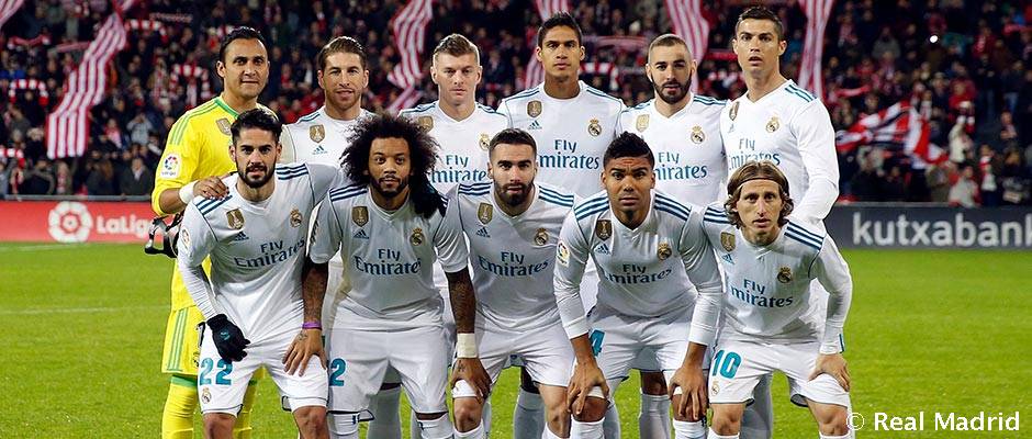
Real Madrid Football Club was founded in 1902 by a group of Spanish football fans in Madrid, Spain. The team was initially known as Madrid Football Club, but the name was changed to Real Madrid in 1920. The team has since become one of the world’s most successful and popular teams, winning a record 33 La Liga titles, 19 Copa del Rey titles, and 10 UEFA Champions League titles.
Real Madrid has also won numerous domestic and international trophies, including the Intercontinental Cup, the FIFA Club World Cup, and the UEFA Super Cup. The team has had some of the greatest players in the history of football, including Alfredo Di Stéfano, Ferenc Puskás, Hugo Sánchez, and Cristiano Ronaldo. Real Madrid is one of the most widely supported teams in the world, with a fan base that stretches across the globe.

1902––1908: The Original Logo
The original logo is a bold and iconic symbol of the team back before the team was even known as a soccer team. The logo was used merely for the Real Madrid Football Club, and its name hadn’t changed yet. This logo comprises a large white letter ‘C’ and a smaller blue letter ‘M’. The letters are set against are shown in dark blue on a clean white background, creating a powerful, eye-catching design. The logo is a reminder of the team’s long and proud history and symbolizes their passionate fan base.
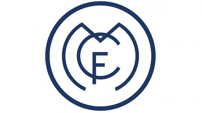
1908––1920: A Change
The second Real Madrid logo, designed in 1908, featured a circle outlined in dark blue with an “F” in the middle, all on a white background. Although the logo has changed slightly in the past years, the original design from 1902 has remained largely intact. The most notable change has been the addition of a crown above the “F” in 1920, which symbolizes the team’s royal status. Additionally, the logo’s colors have been altered over the years, but the basic design remains the same.
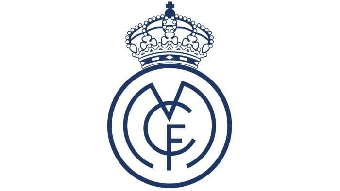
1920––1931: A Crown Is Added
The Real Madrid logo in 1920 was largely the same as it is today, with the only addition being a crown on the top. This crown symbolizes the Spanish monarchy and reminds us of the team’s royal roots. It is a symbol of the team’s prestige and success and is a reminder of the club’s rich history. The crown is the only difference between the 1920 logo and the logo used before it, and it is a reminder of the team’s commitment to excellence.
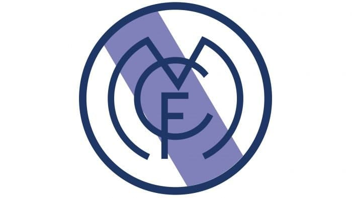
1931––1941: A New Color Added
The Real Madrid logo in 1931 featured a dark blue circle with a white background. Down the center of the circle was a blue strip, which was added to the design in this most recent redesign. The crown featured in the original logo was removed and simplified to only feature the circle and the blue strip. This logo design was used until 1941, when the logo received a new range of changes that helped the logo reach the iconic design we see today.
1941––1997: The Crown Returns
In 1941, the Real Madrid logo was changed to include a crown with more detail, and a few other subtle, but strong features were included. Small diamonds were drawn, and different colors were incorporated, giving the crown a 3D effect. Additionally, the stripe down the logo’s middle was changed from blue to plum purple, further enhancing the design. This improved the design and made it eye-catching and attractive to viewers.
1997––2001: A Few Changes Are Made
The Real Madrid Soccer Team logo’s next change featured a simplified design with larger lines. At the top of the logo was a crown, and the streak in the middle of the circle was a calm blue. The crown itself was also changed, using dull colors and a larger crown than the previous one had. The logo’s overall design remained mostly the same, with only small details changing.
2001––Today
The Real Madrid soccer team logo today is a modernized version of the original, which was first used in 1908. The current logo features a white crest with a bold gold crown on top and the team name written in black on some logo designs. This logo uses the previous elements while combining new and fresh elements to create a striking and classy design. The modern logo is simpler and more streamlined, making it easier to recognize and remember.
What The Colors Of The Logo Symbolize

The colors of the Real Madrid soccer team logo symbolize the team’s rich history and heritage.
The logo’s white symbolizes the team’s purity and integrity, while the royal blue and bright yellow represent the Spanish flag and the team’s loyalty to their country.
The red symbolizes strength and passion, and the crown represents the team’s commitment to excellence and victory. The logo represents the team’s commitment to success and pride in being part of the Real Madrid family.
Why The Font Stands Out
The font of the Real Madrid soccer team stands out for its boldness and its unique style. It features a strong, angular design that is instantly recognizable and gives the team a distinct look.
The font combines traditional and modern elements, with a strong emphasis on the angularity of the letters. The font also features a unique color scheme combined with the logo, using a bright yellow and a deep blue that stands out from the crowd.
The font perfectly represents the team’s identity and is a great way to show off their pride and passion for the sport.
The History Of The Team
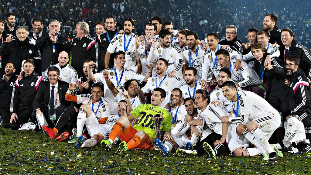
Real Madrid is one of the world’s most successful and well-known soccer teams. Founded in 1902, the team has been a part of Spanish football for over a century. The team was originally founded as Madrid Football Club and was the first team in the country to be formed by a group of individuals.
The team quickly gained popularity and was eventually renamed Real Madrid in 1920. The team has won 33 La Liga titles, 19 Copa del Rey titles, and 13 UEFA Champions League titles. The team has also won numerous other titles and honors, including the Intercontinental Cup, the FIFA Club World Cup, and the UEFA Super Cup.
Real Madrid has also produced some of the greatest players in the history of the sport, including Alfredo Di Stéfano, Ferenc Puskás, and Cristiano Ronaldo. The team continues to be one of the world’s most successful and popular teams, and its legacy as one of the greatest teams in soccer history is well-deserved.
A Few Of The Teams Wins
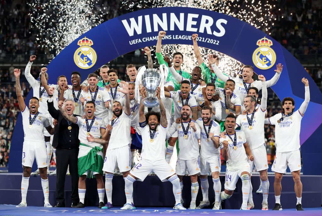
The Real Madrid soccer team is one of the most successful sports teams. They have won a total of 33 La Liga titles, 19 Copa del Rey titles, 10 Supercopa de España titles, a record 13 UEFA Champions League titles, 2 UEFA Cups, 3 UEFA Super Cups, 4 Intercontinental Cups, and 3 FIFA Club World Cups.
These titles are a testament to the team’s hard work and dedication to the sport. They are a symbol of excellence and have become a source of pride for the city of Madrid and its fans.
These titles also show the team’s commitment to excellence and ability to perform at a high level consistently.
Why It’s Important For Teams To Have Strong Logos
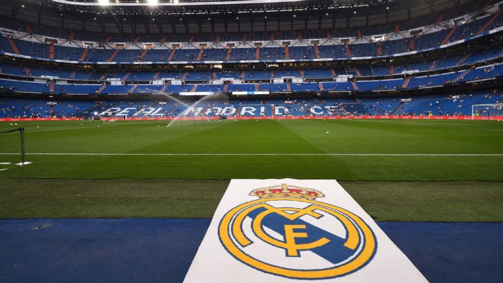
A strong logo is essential to any soccer team’s identity. It is the visual representation of the team and its values, and it helps to create a sense of unity and pride among players, coaches, and fans. A strong logo can also be used as a marketing tool to attract sponsors, increase merchandise sales, and boost overall visibility.
A logo can also create a unique and recognizable brand that stands out from the competition and helps differentiate the team from its rivals. A strong logo is an important part of any soccer team’s identity, and it is essential for teams to invest in creating a logo that accurately reflects the team’s values and mission.
How The Logo Is Incorporated Into The Branding
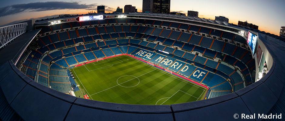
Real Madrid is one of the world’s most successful and recognizable soccer teams, and their logo is a big part of its branding. The logo consists of a gold crown, a royal blue color choice, and branding that effectively combines strong elements to create a well-known team appearance.
This logo is seen everywhere, from the team’s jerseys to their official website, and it is even featured on the team’s official merchandise.
The logo is also used as a part of the team’s social media posts and to create a strong visual identity for the team. Real Madrid’s logo is a powerful symbol of its success and legacy and is a key part of its branding.
Critical Components Of A Successful Sports Team Logo

A successful sports team logo should be eye-catching, memorable, and easy to recognize. It should also be simple and uncluttered, with a limited number of colors and elements.
The logo should accurately represent the team’s identity and values and should be designed in a way that is both timeless and modern.
Additionally, the logo should be versatile, and able to be used in various formats, from print to digital media.
Finally, it should be scalable, and able to be used in both small and large sizes. A successful sports team logo should be designed with all of these factors in mind.
How The Real Madrid Logo Has All These Elements
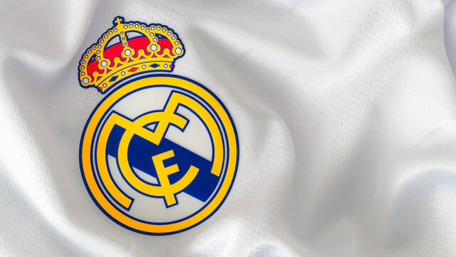
The Real Madrid soccer team logo is an iconic symbol that is recognizable worldwide.
It is an effective logo because it has all the necessary elements of a great logo.
The logo features a crown, a symbol of authority and power, and a circle representing the team’s sport. The logo’s bold and vibrant colors make it stand out and draw attention. The logo’s font is simple yet strong, which helps convey the team’s message. The logo also includes the team’s name, which is important for branding and recognition.
These elements combine to create a powerful, memorable, and effective logo.


