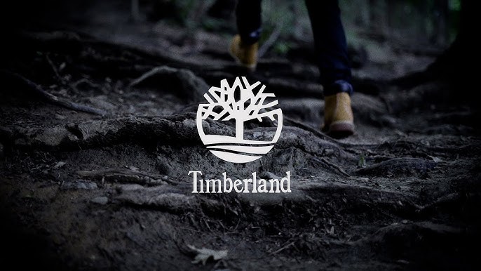
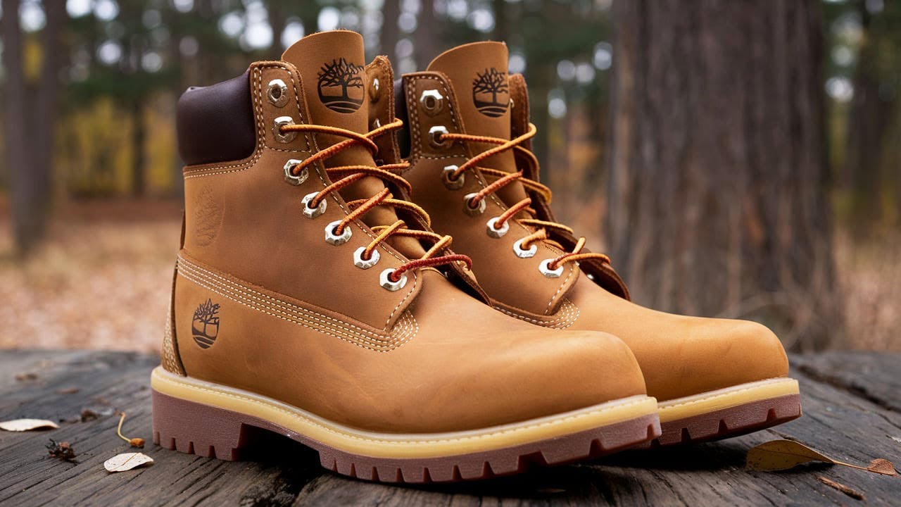
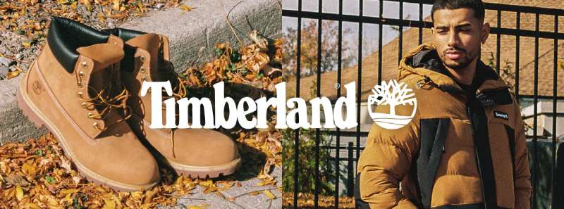
Have you ever looked at a brand logo and felt like it perfectly captured what the company is all about? That’s exactly the case with Timberland, an American outdoor wear manufacturer famous for its sturdy boots, particularly the iconic “yellow boots.”
Over the years, Timberland has been embraced by hard workers, hikers, and fashion aficionados alike. But it’s not just the products themselves that make Timberland so recognizable; it’s also the brand’s emblem: a tree.
And at first glance, a tree might seem like a pretty straightforward image for a company that builds rugged, outdoor-ready gear. However, Timberland’s emblem represents more than just nature—it speaks to the brand’s roots, identity, and environmental commitment.
Interestingly, a rumor in the 1990s tried to paint the tree in a dark light, sparking controversy that the company had to dispel. Yet, Timberland has remained steadfast in its message, consistently emphasizing that the logo is a celebration of the outdoors and a nod to its own name.
Today, we’ll take a close look at:
- How Timberland got started
- What the original Timberland logo looked like
- What changed (and stayed the same) when the logo was updated
- Why the tree is such a powerful symbol for the brand
- The controversy around the logo in the late 1990s
- Where Timberland and its emblem stand today
By the end, you’ll see why a simple silhouette of a tree has become one of the most enduring and iconic images in the outdoor apparel world.
How Timberland Got Started
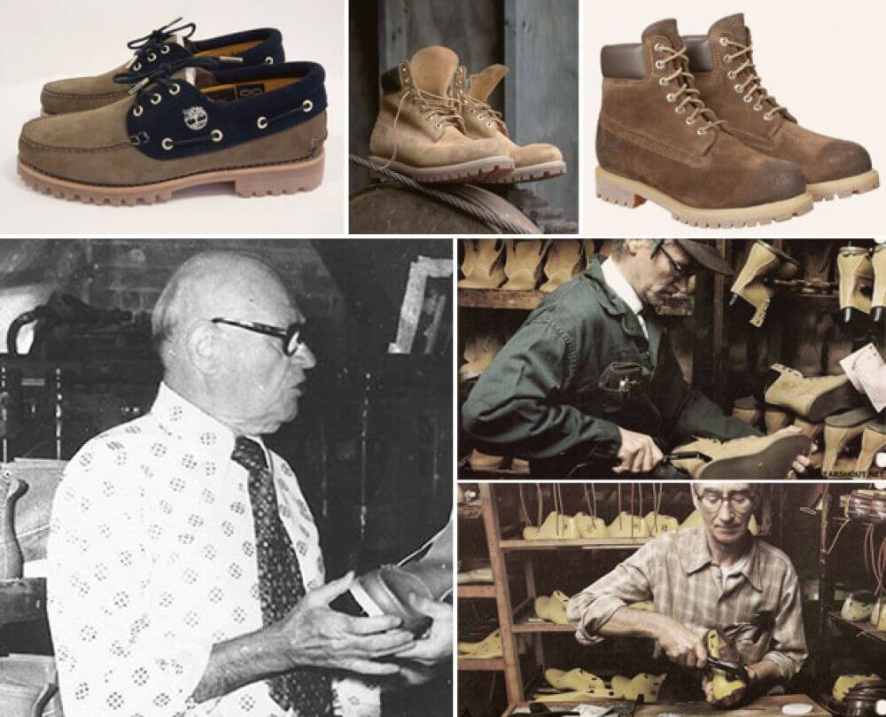
To understand the story behind the logo, it’s helpful to know a bit about Timberland itself. The company’s roots stretch back to 1952, when Nathan Swartz acquired a stake in the Abington Shoe Company based in Massachusetts.
This smaller firm specialized in quality leather footwear, building a reputation for shoes that could handle day-to-day wear and tear.
By 1973, the Swartz family introduced a new type of waterproof boot that quickly turned heads. The design was instantly popular with workers and outdoor enthusiasts because it stood up to rain, mud, and snow like a champ.
But that’s also the year the company landed on a name that captured the spirit of its product line: “Timberland.” The word means “land covered with trees,” an apt description for a brand that leaned heavily into a rugged, natural vibe.
Initially, the company used the term “Timberland” for just one line of boots, but that name resonated so well that it soon became the name for the entire company. This choice reflected the brand’s outdoor heritage.
The forest theme wasn’t just a marketing tactic; it was a statement of identity, a direct nod to life in the great outdoors and the kind of durability you’d expect in that environment.
What the Original Timberland Logo Looked Like (1973 – 1975)

With the success of their groundbreaking waterproof boots, the Swartz family decided it was time to create a logo that mirrored the brand’s direction.
Enter the 1973 Timberland logo: a robust tree with many branches, presented in a single dark color on a light background. Alongside the tree was the brand’s name in a simple, sans-serif font.
- Detailed Tree: The original design showed a fairly intricate silhouette, full of branches, underscoring Timberland’s dedication to forestry, nature, and everything outdoors.
- Sans-Serif Wordmark: The brand name was written in a clean, modern typeface. This gave the logo an approachable yet slightly sophisticated feel, aligning with the high-quality footwear the company produced.
- Monochromatic Scheme: Opting for a single dark color—often black—on a white background kept the design neat and confident.
Even in these early stages, the Timberland emblem effectively suggested a deep connection to nature. Shoppers might spot the logo and immediately think: “These boots are for outdoor adventures.” This first version of the logo helped Timberland establish a distinct identity in a competitive market.
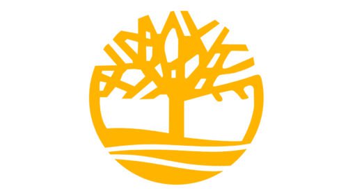
The Modern Timberland Logo (1975 – Today)
Although the 1973 logo captured the essence of the brand, it didn’t take long for Timberland to make a few tweaks.
By 1975, the emblem had evolved into the design most of us recognize today:
- Bold, Serif Wordmark: The brand name switched to a heavier serif font. This change gave the word “Timberland” a sense of heritage and weight, reflecting the rugged, reliable nature of the boots. The serif style exudes both tradition and durability, qualities that complement the brand.
- Slightly Refined Tree: The tree was still front and center, but it received a tidier, more balanced look. While it remained detailed enough to be instantly recognizable, it became a touch more stylized.
- Circular Border and Horizon Line: The tree was now placed inside a simple circular frame, with a subtle horizon line near the bottom that suggests land. This conveys the idea of being rooted in the environment.
- Continuity in Color: Like the original, the palette stayed fairly minimal, often black against a white background. This simplicity kept the focus on the shape of the tree and the brand name.
By taking these steps, Timberland found a balanced logo that could be adapted to all sorts of uses, whether embroidered on clothing, stamped on leather boots, or displayed on store signs.
Over the decades, the company has stuck with this core design, proving just how enduring a strong idea can be when it’s deeply connected to a brand’s identity.
Why the Tree Is Such a Powerful Symbol

You might be wondering why Timberland felt a tree was the ideal choice for their logo.
The name “Timberland,” obviously, is tied to forests, but the reasons for choosing a tree go beyond wordplay:
- Connection to Nature: Timberland’s products are designed to thrive in outdoor conditions—think wet trails, snowy streets, and windy job sites. What better representation of the great outdoors than a strong, flourishing tree?
- Durability: Trees are long-lived and strong, just like Timberland boots. They withstand storms, grow over time, and stay firmly rooted—characteristics that align with the brand’s promise of reliability.
- Simplicity and Clarity: Visually, a tree silhouette is easy to recognize. When paired with the brand name, it becomes a striking image that consumers can recall instantly, whether it’s on a shoebox, a billboard, or a digital ad.
- Heritage and Strength: The brand pairs the tree with a bold serif font that underscores tradition, stability, and durability—traits that Timberland wants to convey in every product.
In short, the tree is more than just a decorative graphic—it’s the core identity of Timberland, something that evokes nature and reliability at the same time.
The Late 1990s Controversy
No brand is immune to rumors, and in Timberland’s case, one rumor in particular gained serious traction in the late 1990s. A poem titled “Clothes” or “FUBU” began circulating on the internet.
It was incorrectly attributed to the esteemed African-American poet Maya Angelou. In the poem, the Timberland tree was essentially called a “lynching tree,” claiming it symbolized a site where Black people were historically hanged.
This rumor went on to allege that Timberland’s founders had ties to the Ku Klux Klan, suggesting a hateful or racist background for the brand.
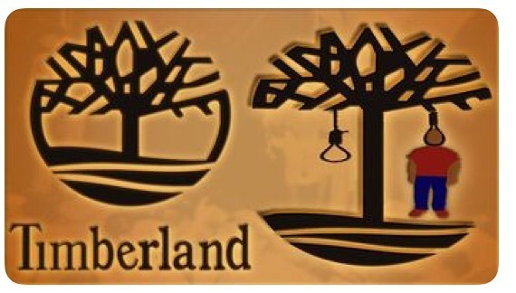
Naturally, this idea ran completely counter to everything Timberland stood for. The company had never conveyed anything other than an appreciation for the environment and a goal of making long-lasting footwear.
Soon enough, Maya Angelou herself spoke out, clarifying that the poem wasn’t hers and condemning the harmful rumor. Still, damaging stories can gain momentum quickly, especially online, and Timberland faced an unexpected challenge: how to correct misinformation that was spreading at lightning speed.
Timberland’s Response
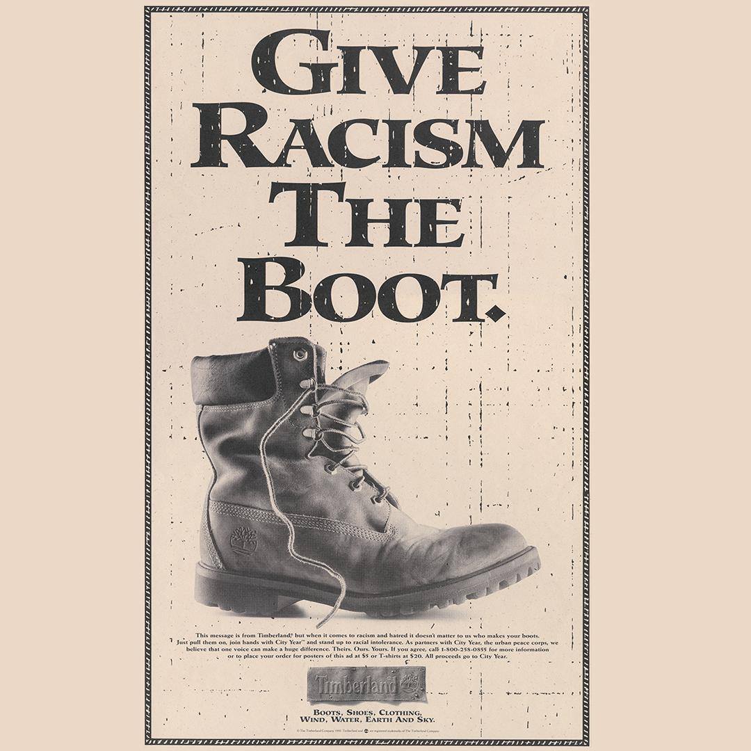
- Public Refutations: Company spokespeople publicly denied any ties to racist organizations or ideologies. They explained the logo’s actual origin—simply a tree reflecting the word “Timberland.”
- Maya Angelou’s Disavowal: The legendary poet explicitly stated that she had not written the circulating poem, thereby removing the false authority that had fueled the rumor in the first place.
- Community Initiatives: Timberland ramped up its outreach programs, engaging more with local communities, emphasizing diversity, and promoting environmental stewardship. These actions underscored that the company’s values were about inclusivity and outdoor exploration, not hatred or division.
Over time, the myth lost most of its momentum, though fragments still pop up in some corners of social media. For the vast majority of consumers, it’s clear the Timberland tree is exactly what it appears to be: an emblem of the outdoors, rather than a symbol of racial violence.
Where Timberland and Its Emblem Stand Today
Given the controversy, you might wonder how Timberland’s reputation has held up. In fact, the brand remains as strong as ever, with people around the world still embracing its footwear and clothing.
That famous tree logo is a big part of the story, acting as a visual reminder of Timberland’s focus on the outdoors and durability.
- Consistency in Design: Unlike many other brands that completely overhauled their logos as trends changed, Timberland opted to stick with what worked. By maintaining a relatively consistent look, the company built a strong association between the product and the emblem.
- Relevance in Pop Culture: Timberland boots have shown up in everything from music videos to high fashion runways. Hip-hop icons, pop stars, and designers have all styled Timberlands in unique ways, expanding the brand’s influence beyond the typical “outdoor gear” market.
- Environmental Initiatives: Over the years, Timberland has also focused on sustainability, reforestation, and community development projects, adding substance to the tree symbol. The logo is no empty promise; the brand invests in projects that align with the values it represents.
- Broad Appeal: Whether you’re a rugged adventurer trekking through the woods or a city dweller needing sturdy, stylish boots, Timberland’s image resonates with a wide variety of consumers. Its tree emblem speaks to both fashion and function—no small feat in the competitive world of apparel.
All these factors mean the Timberland logo has not just survived—it has thrived, morphing into a cultural mainstay. Its strength as a piece of brand identity lies in its simplicity, authenticity, and the consistent message it conveys.
Timberland: A Logo That Stands the Test of Time
It’s quite rare to see a brand hang onto one logo for so many decades with minimal alterations.
But Timberland’s tree emblem is a prime example of the power of a well-chosen image.
From its earliest appearance in 1973 to the present day, it’s stayed true to these ideals:
- Instant Recognition: The silhouette of the tree next to the bold “Timberland” wordmark is hard to miss. It works on small product tags, big posters, and everything in between.
- Clear Values: From day one, Timberland has wanted consumers to recognize its deep outdoor roots. That’s why a tree—sturdy, natural, and visually strong—makes total sense.
- Authentic Story: The brand name literally references “land with trees,” and that’s exactly what the logo highlights. It doesn’t feel forced or gimmicky; it feels logical, even organic.
- Handling Misinformation: The controversy in the ’90s tested Timberland’s resolve and forced the company to clarify its mission and identity. By using facts, community engagement, and open communication, Timberland reemphasized what its logo truly meant.
- Timeless Design Principles: Simplicity and versatility are crucial. With the Timberland emblem, you get a shape that can adapt to different marketing materials, color schemes, and platforms without losing its impact.
For design and branding enthusiasts, Timberland’s journey shows just how a powerful logo can be born from a straightforward concept. The brand not only aligned its design with its mission but also stayed consistent, allowing that image to become iconic. And in a world where corporate logos undergo repeated facelifts, Timberland’s approach underscores the value of getting it right the first time and then sticking to your guns.