The UPS logo looks a lot different than it did when it was first created in 1916.
Starting from humble beginnings, the small Seattle messenger company has grown exponentially into a well-known multinational shipping, receiving, and supply chain management company.
After more than 100 years of rich history, UPS has changed its logo several times, each depicting some key similarities and some key differences.
The Beginning of UPS
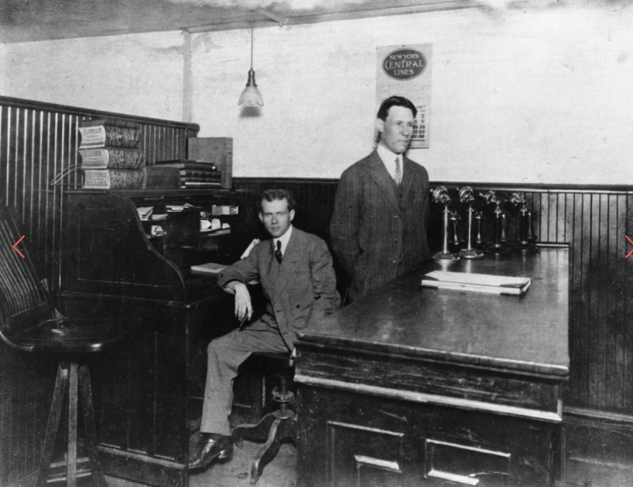
The story of UPS started with just $100. In 1907, Claude Ryan and Jim Casey — who were just teenagers at the time — started with nothing more than a Seattle saloon basement with a $100 loan from Ryan’s uncle.
The pair opened what began as “American Messenger Company,” where they would deliver packages and messages in the area, whether it be by foot, bicycle, or streetcar.
The very small business made quick growth. They started by convincing other boys in the Seattle area to buy uniforms and follow a behavior code for customer courtesy.
The company had already gained 100 messengers by Christmas of 1912. Their fast growth prompted them to merge with McCabe’s Motorcycle Delivery Service in 1913. Under this merging, the company was renamed from “American Messenger Company” to “Merchants’ Delivery Service.”
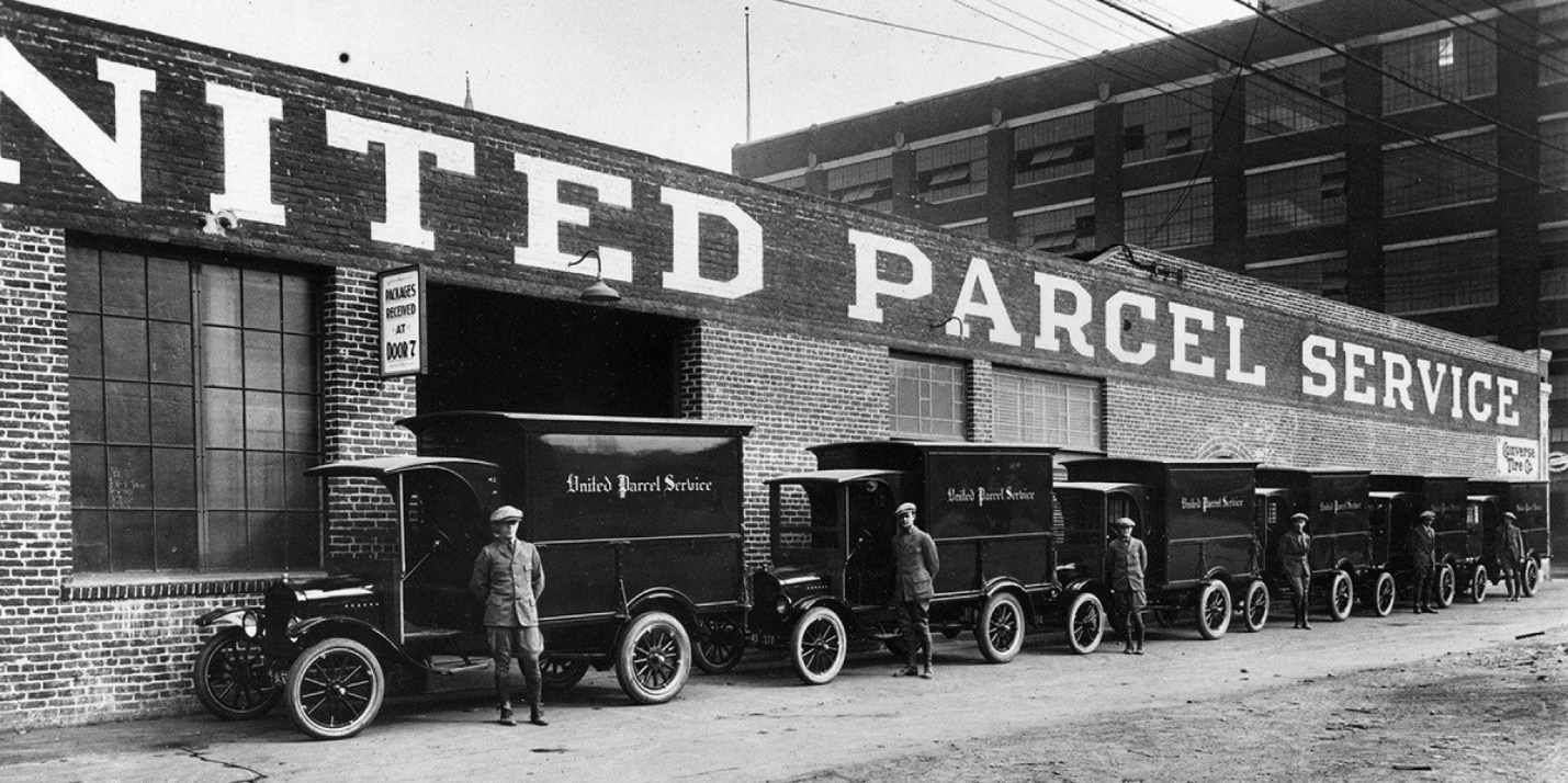
This same year, the pair bought their first car — a 1913 Model T Ford. It wasn’t until 1919 that the company made an expansion into San Francisco and rebranded to what the company is known as today — the United Parcel Service, more commonly known as UPS. Just 11 years later, the company had already expanded all over the West Coast and New York City.
The First UPS Logo
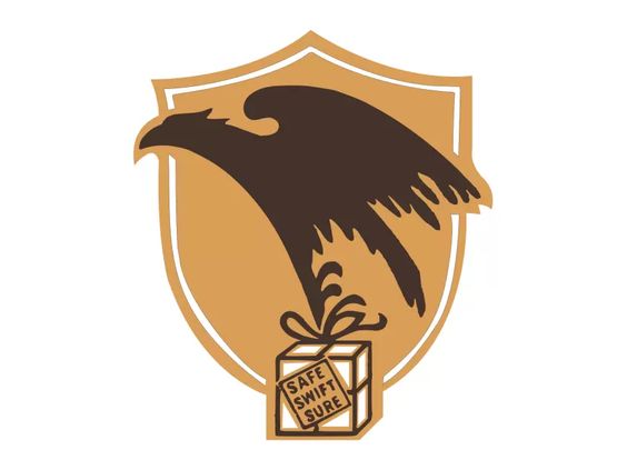
The first UPS logo was released in 1916. The logo was created by Casey when the company was still “Merchants’ Delivery Service.” It featured a dark brown eagle carrying a package in its talons.
On the box being carried by the eagle read the message “Safe, swift, sure.” This is the only variation of the logo that the eagle ever made an appearance in.
Additionally, the logo had a large bronze/gold shield for its background — an official symbol of the logo that has remained in all variations of the logo even in the present day.
This logo was created only a short time after “American Messenger Company” merged with McCabe’s Motorcycle Delivery Service in 1913. It still wasn’t until 1919 that the company was renamed to “UPS.” However, this same logo lasted from 1916 to 1937.
The 1937 Logo
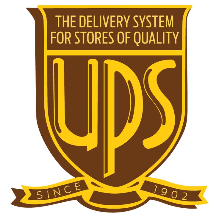
In 1937, significant changes were made to the UPS logo. The company decided to go with a simple brown and gold color scheme, and in place of the eagle were the large letters “UPS.”
This was the first time the company put the “UPS” letters on the logo, which became necessary at the time as the company continued to grow rapidly. The font was well fitted to the inside of the shield shape, with the letter “P” extending down to its point.
Additionally, the “Safe, swift, sure” slogan was removed. Instead, The top of the logo read “THE DELIVERY SYSTEM FOR STORES OF QUALITY,” and the bottom of the logo read “SINCE 1902” on an attached ribbon. This would remain the company’s official logo for nearly 25 years before it would be changed again in 1961.
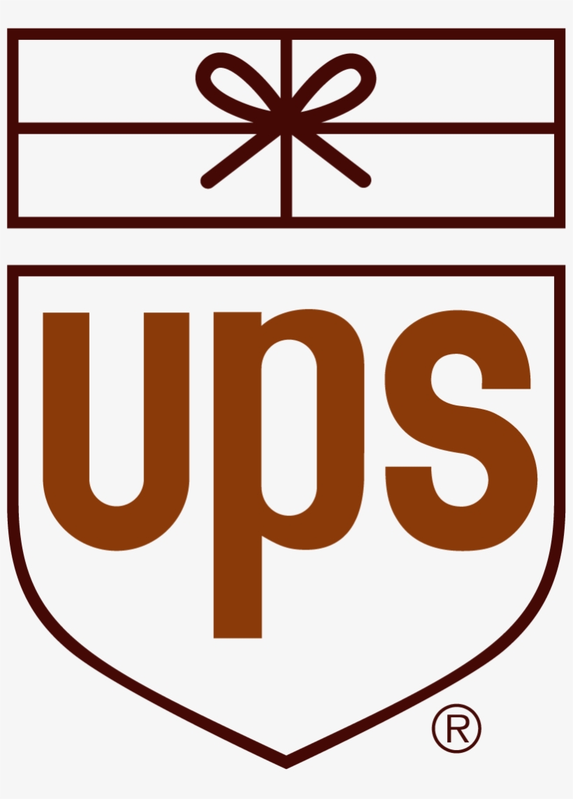
The 1961 Logo
Another version of the UPS logo was released in 1961. This time, it was a much simpler design. It featured only a single color for the outline, often shown as either black or brown.
All the other words were also removed, and the top of the logo instead featured a rectangular package with a similar drawing style to the package in the eagle talons featured in the company’s original logo in 1916.
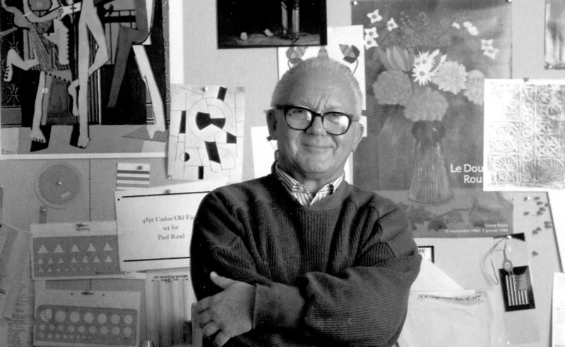
One other major difference between the other two previous logos and the 1961 logo is that it was not designed by Casey.
Instead, it was designed by Paul Rand, who was a very renowned graphic designer at the time.
He was also credited with the creation of other popular logos, such as the IBM and ABC logos. He also went on to work with Steve Jobs on the creation of the NeXT logo. For his UPS design, Rand decided to take a more humorous approach. By adding the parcel to the top of the logo, he created a more comical and memorable logo for the company.
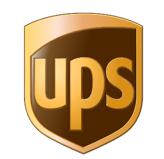
The 2003 Logo
2003 was a big year for the UPS logo. Significant adjustments were once again made to the logo, creating a logo that looks much more similar to the one we see today.
The company decided to keep the design of the logo itself simple. However, they added back in more color. This variation of the logo featured the shield with more minimalistic “UPS” lettering with brown and gold colors. The company also added shading to the logo to give it a more shiny, realistic, 3D appeal.
This logo also included a stronger contrast of colors, making the minimalistic elements of the logo stand out even more.
The package icon was removed, and the remaining shield now featured a curved and more contemporary shape. This variation of the log better reflected the company, which had continued to grow rapidly, eventually branching out into ground, air, ocean, and rail freight services. UPS also began to provide business mail functions and was working directly with thousands of retail stores.
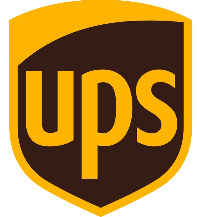
The Current UPS Logo
The Current UPS logo, created in 2014, has some striking similarities to the previous 2003 logo.
In fact, it was shaped exactly the same. The only differences between this logo and the previous version were the colors and shading. In the 2014 logo, the company decided to remove the 3D effect and also make a switch to darker colors.
The main color of the brown was changed to a very dark brown color, and the gold resembles a more dark yellow-like color.
Elements Of The UPS Logo
The UPS logo has many different elements, many of which have remained within multiple logo variations throughout the years.
Font
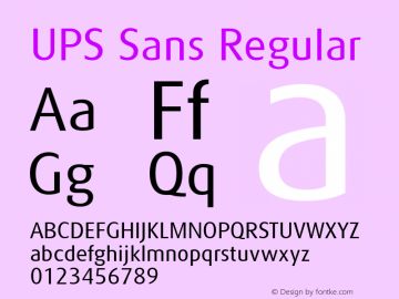
The current UPS font has been the same since 2003. It is a custom-created font for the brand called “UPS Sans” — a similar font to Yanone Kaffeesatz Bold. While similar fonts are available, UPS Sans is not available for public use or download.
UPS Sans is a sans-serif font with a simple but unique pointed edge to some of its letters. It is more modern compared to some of the company’s previous logo fonts.
The earlier UPS logos contained serif typefaces and thinner letters, with perhaps the most unique variation being in 1937, where there were interior lines within the letters to create a more 3D appearance.
Shield Shape
The shield shape has been a part of the UPS logo since its first variation creation in 1916. For more than 100 years, the shield has been strongly associated with the image of the brand.
It represents the reliability the brand had boasted since the beginning, as well as protection and reliability for the packages they are responsible for. Additionally, the shield now also stands as a representation of the company’s heritage.
Even though both Casey and Ryan have been gone for decades now, the shield still remains as a reminder of their work and earlier days of the company.
Parcel Shape
The parcel shape had made an appearance in both the original UPS logo and the 1961 Paul Rand version. Although it was later removed again, the simply drawn symbol represented the work of the company, and even added a little humor to the symbol that created a more memorable image for the audience.
Color Scheme
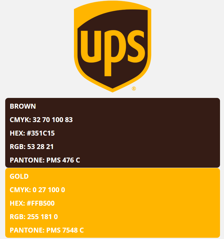
Throughout the years, UPS has remained mostly true to its original color scheme.
The primary colors for the logo remained gold and brown, with the exception of some black, bronze, or occasional white added depending on which logo variation.
The Paul Rand version of the logo in 1961 took a more minimalist color scheme approach, but this was the only exception. The following two logos would also follow the same previous brown and gold color scheme.
Lessons To Learn From The UPS Logo
Through its many changes, there are many things that can be learned from the UPS logo.
Recognizable Colors
The UPS colors have largely remained brown and gold over the years. The brand is still easily recognized by those colors today.

Although the brown color for the UPS was only initially chosen because of its strong ability to hide dirt and could be easily incorporated into their trucks and uniforms, the color also reflects the brand’s reliability and continuity.
Gold is a strong contrast to brown and helps showcase the brand’s success in the industry. It also reflects the company’s success, and heritage, and helps them stand out from their other competitors in the industry.
Staying True To Heritage
Although the official UPS logo today looks very different from the original one created in 1916, there are still some strong similarities. The logo still features a very similar color scheme and includes the highly recognizable shield in its background.
The shield has remained in every logo variation for the more than 100 years the business had a logo. The parcel has also made a couple of different appearances in their logos. All of these features show the company’s pride and dedication to its heritage, making it one of the most respected and well-known delivery companies even still today.
Incorporating Symbolism
UPS started over 100 years ago as just a small messenger company operating out of a small Seattle saloon basement. Today, it has grown into an American multinational shipping, receiving, and supply chain management company.
Through the company’s many years of rapid growth, they have included symbols within their logos to reflect that. The shield, which has been a constant element since 1916, symbolizes protection and reliability — core values that have guided UPS throughout its expansion.
The evolution from an eagle carrying a package to the simple, bold “UPS” lettering also represents the company’s journey from a local messenger service to a global leader in the industry.
The consistent brown and gold color use also reflects the brand’s humble origins and creates an image of stability and prestige.
Even as the logo has been simplified over time to adapt to digital media and global markets, it has maintained key elements that honor UPS’s heritage while showcasing its growth into a worldwide corporation.
Adapting To Modern Times
As time has progressed, more modern logo trends have included less distracting features and have focused more on readability instead of packing logos full of different elements. UPS has kept up with those trends.
Its first two logos were the most complex, including extra words, colors, creative fonts, and features like the ribbon and eagle. In 1961, the logo was made much simpler, removing all of the extra colors and elements aside from a rectangular package at the top of the shield symbol.
The last two variations of the logo have remained more simple and to the point, simply featuring the letters “UPS” on a shield with a black and gold color scheme.
Including Customized Features
In addition to the highly symbolic elements of the various UPS logos, the brand has also had some custom logo work done over the years, going the extra step to make them stand out. In 1961, the company had its third official logo custom-made by a reputable designer at the time, Paul Rand.
His custom design helped further boost the brand’s reputation and make them stand out against competitors. In the final two variations of the logo, UPS also has a custom font made called “UPS Sans.” These customizations helped the brand’s logo become even more recognizable and gave it a more professional-looking appeal.
From a Seattle saloon basement-based messenger company to a multinational company, UPS has been through many changes over the last century. Through all of their changes, their logo has changed, too, becoming one of the most recognizable examples of a successful logo evolution today.