Wendy’s, famously known for the query ‘Where’s the Beef’, has been a favorite for generations.
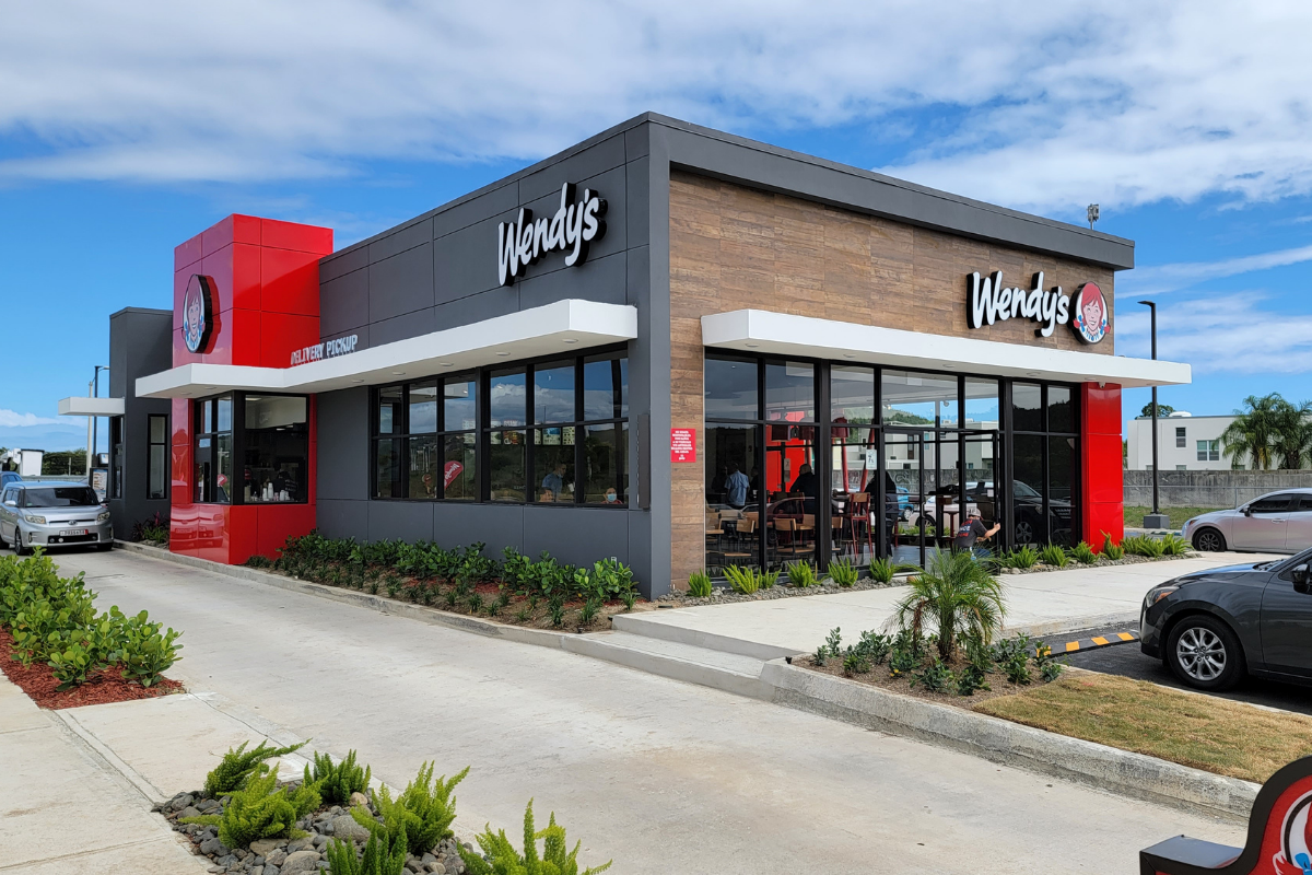
Their logo, seen on signs high in the sky along highways, invites kids and adults to pull in for fast food and Frosty’s.
Established in 1969, Wendy’s is known for its trademark square patties in round buns.
Despite subtle changes over the years, the logo remains a powerful symbol. Discover what makes the Wendy’s logo an enduring icon that has stood the test of time.
About Wendy’s
Chef David Thomas began his career in the fast food industry as a franchisee for Kentucky Fried Chicken, where he boosted profits and created the KFC logo we all know.
But he had bigger dreams, opening his own fast-food restaurant in Columbus, Ohio, offering hamburgers, rather than competing directly with KFC. He named the restaurant Wendy’s, after his daughter Melinda’s nickname.
Thomas successfully led Wendy’s to become a big player in the industry until 2009, when the company merged with Arby’s.
Today, the combined brand operates over 10,000 restaurants across two dozen countries.
The Wendy’s Logo Over Time

Wendy, who frequently appeared in the restaurant’s commercials, inspired the logo.
The logo features an image of Wendy as a child with upturned, bowed ponytails.
From the beginning, Wendy has been central to the brand’s identity; her red hair and wholesome smile give the logo a down-home feel.
Despite the debunked theory that the word “Mom” is hidden in Wendy’s shirt collar, many still hold on to the belief.
While the logo has maintained its original color palette and style, it has undergone several iterations, emphasizing different elements in various formats and sizes. The most significant logo was in 2013.
Melinda Thomas, or Wendy as she was known, inspired the Wendy’s logo.
The Wendy’s Logo Through The Years
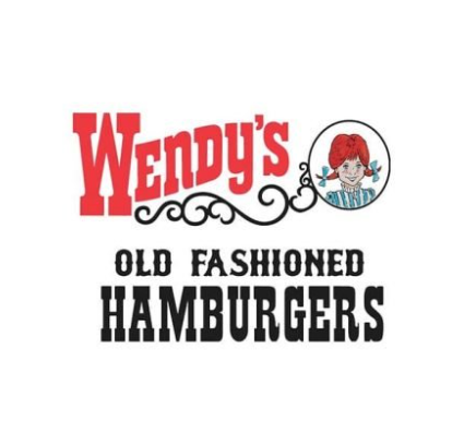
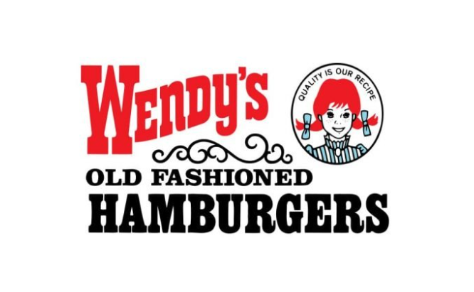
Original Wendy’s Logo
The original 1969 logo expertly used white space, keeping the design clean and crisp. The name “Wendy’s” was boldly displayed in red at the top left, beside an image of the namesake within a black framed circle.
Below the brand name, a thin ornamental line separated it from the phrase “Old Fashioned Hamburgers”, with the last word in a larger, black script font emphasizing the brand’s offerings.
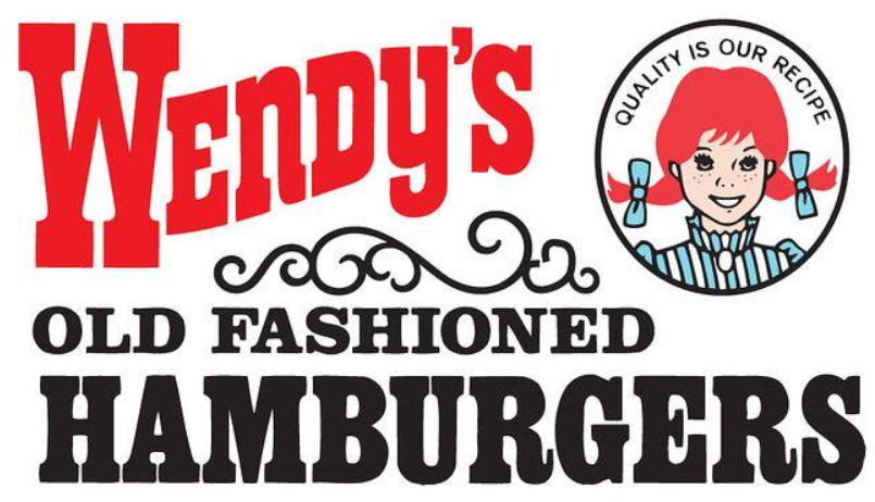
The Wendy’s Logo 1971 – 1974
The updated 1971 logo featured increased spacing, widening the gap between the ornate line and the phrase “Old Fashioned Hamburgers.”
The motto “Quality is Our Recipe” was added inside the circle with Wendy’s image, emphasizing the brand’s commitment.
The brand’s signature colors, red and black, remained prominent.
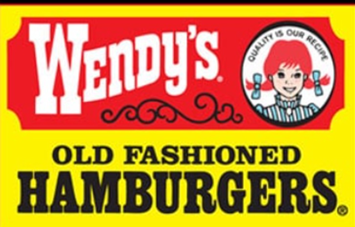
The Wendy’s Logo 1975 – 1978
In 1975, the company altered the Wendy’s logo with subtle yet impactful changes. The word “Hamburgers” was emphasized with a bolder typeface, drawing more attention to the core of its offerings.
The phrase “Old Fashioned” was reduced. Wendy also received a makeover; her face was better defined and her features sharpened. The interior fill color of her face was changed to white, enhancing the contrast and brightness of the logo.
The Wendy’s Logo 1978 – 1982
The 1978 update offered a vibrant take on the logo, with bold yellow becoming the prominent color. The emblem was framed in a rectangular shape, featuring the brand name on a red nameplate in a striking white typeface.
The nameplate also included Wendy’s iconic image and ornate scrollwork. The phrase “Old Fashioned Hamburgers” was centered just beneath, keeping the brand’s commitment to the classic fast food tradition.
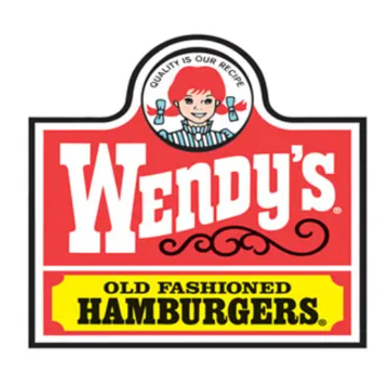
The Wendy’s Logo 1982 – 2013
In 1982, Wendy’s introduced a softer logo design that lasted over two decades. The logo featured a rounded top that showcased Wendy’s image centered.
Red became the dominant color with the brand’s name highlighted in a bold, crisp white typeface accompanied by scrollwork.
A yellow accent remained, filling the nameplate for “Old Fashioned Hamburgers” in black font positioned at the bottom section of the logo.
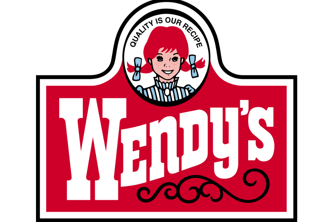
The Wendy’s Logo 2007
While the previous logo remained in use until 2013, an updated version was introduced in 2007.
It’s a streamlined take on the 1982 logo, omitting the bottom section, along with the phrase “Old Fashioned Hamburgers”.
By this time, the brand had already firmly cemented its offerings in the minds of consumers.
The new design takes a modern approach, focusing solely on the brand name with a simplified red and white logo featuring the Wendy’s wordmark in white and Wendy’s image, outlined in a thin black line.
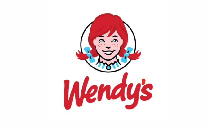
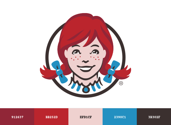
The Current Wendy’s Logo
Since 2013, in-store and online visitors have been greeted by a refreshed, more streamlined Wendy’s logo.
The brand preserved its iconic Wendy’s image, framed in a circle with a subtle black border. The new design features a zoomed in Wendy, her hair playfully spilling out of the circle.
Below, the Wendy’s wordmark is in a vibrant red sans-serif font with a modern and approachable feel. This redesign also sparked the theory that “mom” is subtly hidden in the folds of Wendy’s collar, but the brand says this was never their intention.
The Wendy’s Logo Main Design Elements
Color
The color palette creates an emotional connection with audiences. The bold red is more than just vibrancy; it also catches your attention and sparks energy, excitement, and anticipation.
It invites you to stop for a delicious snack, setting the tone for an enjoyable dining experience.
The calming blue brings balance, symbolizing trust, reliability and comfort. The warm yellow adds cheerfulness and familiarity, like the atmosphere of a friendly neighborhood spot.
Font
Wendy’s font choice is a deliberate nod to their brand personality – casual, approachable, and full of character.
The font’s playful curves and whimsical style are fun and light-hearted, like the word Wendy’s was written by hand to close a personal note.
The design reinforces Wendy’s as a friendy, down-to-earth place where customers can just drive through for a good meal. It’s not just a font; it’s an extension of Wendy’s identity, personifying the brand’s values of warmth, hospitality, and nostalgia.
Wendy’s Image
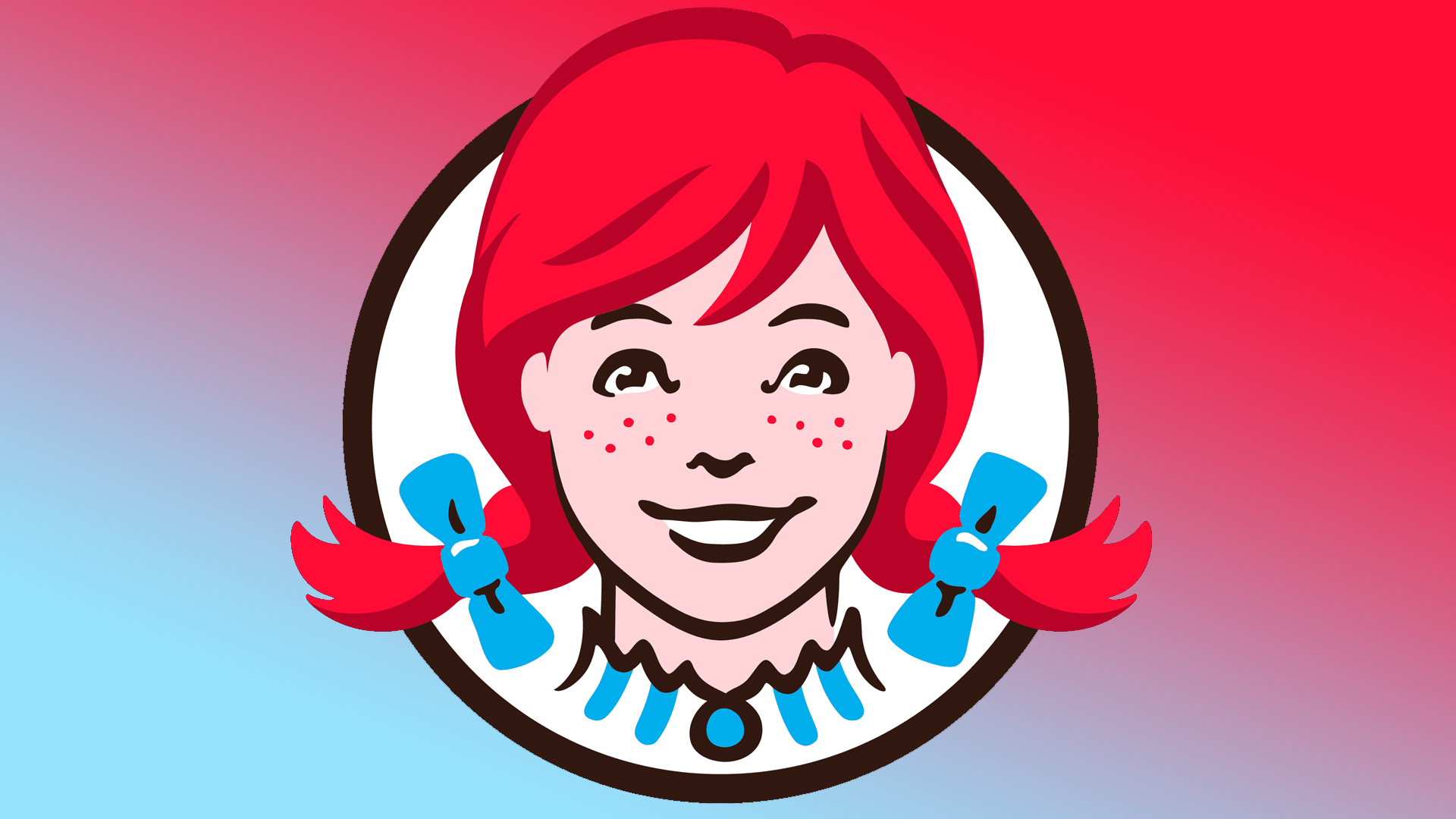
Maintaining Wendy’s image is a brilliant move. It symbolizes tradition, family, and simpler times.
It reminds us of cherished memories, and the comfort of familiar, homemade meals. Keeping the image connects the brand to its roots.
Lessons learned from the Wendy’s Logo
The Wendy’s logo has had decades of iconic brand recognition through careful designs and subtle refinements to keep up with the times.
Its consistent visual elements and thoughtful redesigns ensure the Wendy’s logo remains distinctive and memorable.
Designers can draw inspiration from this logo’s evolution and refine their own creative work.